Mad Men design heroes – Milton Glaser

Mad Men design heroes – Milton Glaser
Matt Rudd Inspiration
The truth is, I wasn’t an expert on Milton Glaser when I unexpectedly got the chance to spend an hour with him back in 2013. I knew he was responsible for the ‘I Heart NY’ logo, and that he was a towering figure in the history of graphic design.
We sat in his canary yellow meetings room, in the studio on East 32nd street which he had moved into nearly 50 years earlier. Surrounding us were mugs with the ‘I Heart NY’ logo and the post 9/11 ‘more than ever’ version; Brooklyn Brewery bottles; single-handed clocks, framed New York Magazine covers. Most striking of all was a set of four watercolour paintings, sitting on the wall two by two, forming a representation of Piero della Francesca’s 15th century portrait of Federico da Montefeltro.
We chatted for a while and then wandered into the studio – a tidy, welcoming room with lots of books and intriguing paraphernalia pinned to the walls. It felt like a place for making things. The sound of children at playtime drifted up from the school next door, simultaneously building and soundtracking an upbeat, energetic atmosphere.
I was drawn to a series of coloured patterns on the wall. Glaser explained that these were rug designs. He had started working with an Oregon-based carpet company seven years before and the collaboration had led to a 34-piece collection which had been hand-woven and hand-died using traditional methods in Nepal.
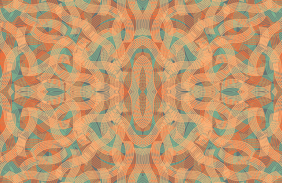
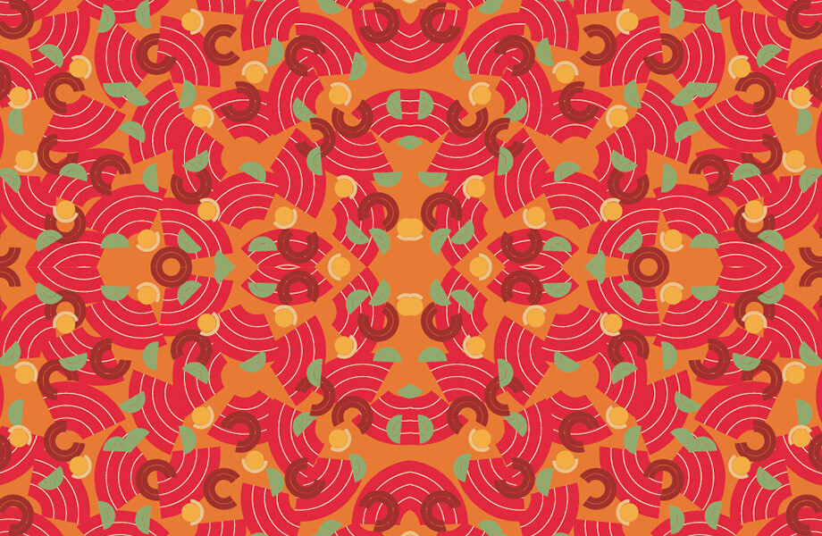
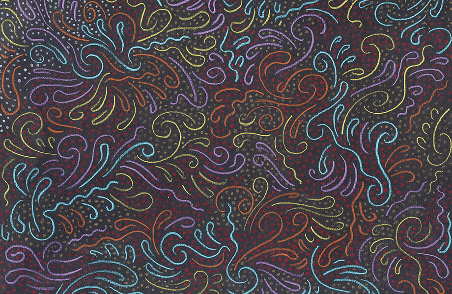
A young designer sat at a computer called up some photos of the rugs. They were gorgeous. I realised later that this project reflected many of the things that made Glaser interesting – it was exemplary of his mission to avoid comfort zones or set styles. Starting this project at 76 years-old, he had patiently developed a feel for the medium, realising that his first designs were too complicated for hand weavers, and learned, for instance, that you could create patterns by looping and cutting knots and changing the way light bounces off the material.
As well as Glaser’s desire to work in new ways, the eclectic set of designs in the rugs spoke of his endless curiosity with the world, and his belief that ‘the whole visual history of the world’ was his resource. The rug designs had elements of Tibetan symbolism, natural forms, grids that looked like computer games, Chinese dragons, and patterns based on bits of torn paper, which looked a bit like Matisse’s late work.
It’s this drawing from the visual history of the world, and especially from art history, that I strongly relate to. The history of art is an endless treasure trove, where an infinite number of styles, techniques and forms of storytelling can be discovered. To borrow Glaser’s phrase, art has the ability to ‘move us to attentiveness’ and so in studying art, we are learning about tried and tested methods for engaging people’s attention.
This curiosity about the artistic world helps me to understand why Glaser’s seven decades or so of work have been so varied. He has designed cultural and political posters, magazines, illustrations for countless publications, newspapers, book covers, logos, record covers, children’s books, drinks identities, supermarket and toy shop identities, restaurants, typefaces, and of course funky clocks and gorgeous rugs. There have also been art projects, like his Piero Project, a big collection of artworks inspired by one of his all time favourites, Piero della Francesca. The show was displayed in the Renaissance artist’s hometown of Arezzo, 500 years after his death.
I love Glaser’s restlessness. He’s right when he says that ‘the great enemy of art is the institutionalisation of belief, like style, or like taste’. By bringing his experience and wisdom to new platforms time after time, he has been able to avoid staleness and to bring fresh perspectives to many creative disciplines.
One of the things that has enabled the scope of Glaser’s career is his love of drawing, and as such, his ability to readily translate ideas to paper. Probably his second most famous piece of work (after the NY logo) is his Bob Dylan poster, where we see a dramatic profile silhouette of the singer – a psychedelic drawing of the voluminous, curly hair, and type spelling out DYLAN, set in Milton’s own Babyteeth typeface. All these elements combine into a superb whole, capturing Dylan’s thoughtful nature, the vibrant glory of his music and the hazy spirit of the times. It’s no surprise to hear that Glaser drew, again, from art history with this piece: a Marcel Duchamp self portrait was his inspiration for the silhouette profile and Islamic painting informed the way he did the hair.
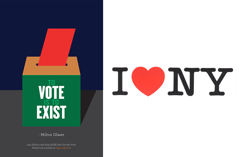
To vote is to exist (left): During the 2016 US election campaign Milton Glaser was one of a number of designers imploring the population to vote. I heart NY (right): Loved since 1977, the logo uses the rounded slab serif ITC American Typewriter (which was never actually a typewriter font).
There is a graceful, fluid, informal quality to much of Glaser’s work, which I love. ‘The creative process is essentially a blind process,’ he says, ‘where you do not pre-structure and you have to allow information to arise in a spontaneous way, uncontrollable by the will.’ He often seems to avoid imposing rules and structures on his work, or at least he comes up with new rules and structures every time. This makes a lot of sense to me. Be as knowledgeable and informed as possible (in general, and about the specific requirements of the project) and then allow the subconscious to play a major role in the creative process. This approach has given rise to all sorts of playful and surprising results in Glaser’s work, like the crazy cylindrical typeface which he drew for a film festival, or the beautiful semi-abstract illustration he did for the record cover of Igor Kipnis and Thurston Dart’s Music For Two Harpsichords.
Nobody seems to be able to talk about their work with more clarity than Milton Glaser. This makes me love his statement ‘doubt is good’ all the more. I had often interpreted doubt in my creative process as weakness, and envied other designers who seemed to approach design with steadfast certainty. He has explained that his first solution when asked to design a mark which read ‘I Love New York’ incorporated the word rather than the heart shape. The client approved the design, but Glaser was doubtful. In a taxi a day later, he made the sketch with a red crayon on an envelope which now sits in the Museum of Modern Art, where ‘Love’ is represented with a heart symbol and ‘New York’ simply with NY. This second go at the logo has been credited with more than tripling New York’s visitor spending from $500 million in 1976 to $1.6 billion in 1977, and is possibly the most famous logo ever made. Allowing for doubt in this creative process was clearly a good thing.
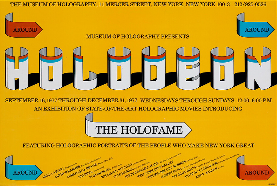
Hologram Shadow (above): Despite declaring himself ‘not a type designer’, Milton Glaser has created a swathe of stylised letterforms across his work - like Hologram Shadow.
Another thought that Glaser often shares is that designers should only work for people they like. Younger graphic designers in particular might see this as a pipe dream, but I think it’s something we all should aspire to. ‘Clients that you like’ are clients who you are happy to talk to a great deal, not just at the beginning and the end of projects; people who help make the design process joyful and energetic. They understand that a creative process incorporating ‘doubt’ is more likely to lead to a great result; and have the sort of approach that enables the best possible dovetailing of their expertise with yours.
This kind of relationship must have been part of Glaser’s incredible journey, allowing him time and again to move into new territories. Discussing about the process of designing a children’s store in New York, he recalled: ‘I went about it in a totally amateurish way, making little paper mock-ups to demonstrate my ideas to the contractors. After considerable confusion, it all worked out.’ I suspect it was the best looking toy shop in New York, and the only one with a smaller front door for children and a bigger one for adults. Because the client had faith in Glaser’s creative ability and his adaptability, there was a brilliant and fresh result for the client and the designer.
I’m still not sure you would call me an expert on Milton Glaser, but it was a pleasure to meet this amazing New Yorker. I have loved digging into his story in the years since our meeting. I find myself energised and encouraged by the work he has done and the things he has said. I hope I can carry on working for a few more decades with at least some of his spirit of adventure, thoughtfulness and joy.
Matt Rudd is founder of Rudd Studio.
This is our second article in the Mad Men era design hero series. Read about Jason Smith’s design hero, Herb Lubalin.