A drop shadow, a flourish and a flash of inspiration

A drop shadow, a flourish and a flash of inspiration
Jason Smith Inspiration
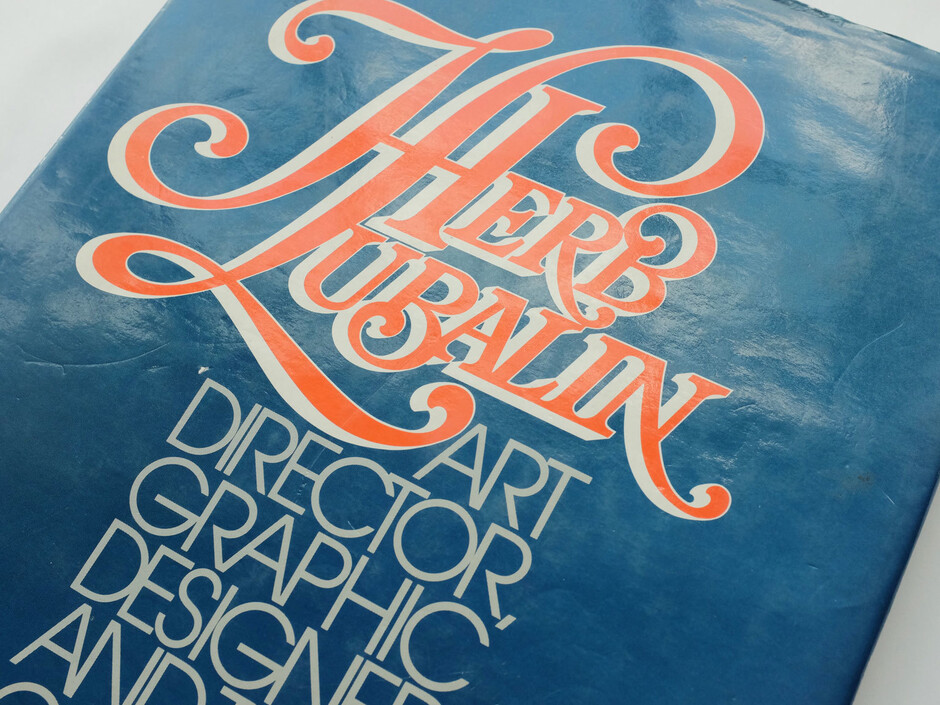
Ask me where and when the seed of Fontsmith was first sown and I might well turn to a book on the studio shelves. Herb Lubalin: Art Director, Designer and Typographer was published by Rizzoli in 1985, collecting together logos, letterheads, mastheads, posters, publications, advertising, book jackets and typefaces from the 40-year career of one of 20th century design’s most influential figures.
In 1992 I was studying Calligraphy, Lettering & Signwriting at Reigate School of Art. I’d been introduced to the work of Herb Lubalin by one of my tutors, Ben Manchipp. A female friend and fellow student also happened to own a book on Lubalin, and thereby secured my devotion, at least for a time. I was like, wow, this is amazing. All of it was hand-drawn, none of it was digital or based on existing typefaces.

Compared to the kind of typographic developments that were firing up other design students at the time – the New Wave movement of digital type anarchy and the editorial work of Neville Body – the highly ornamented Lubalin look might have seemed terribly dated to many of my contemporaries. I never discovered Brody until I left college, I was purely into lettering and letter shapes and signwriting. This book was my introduction into graphics, almost, and to how letters could work together to form a logotype or packaging label… Doing things to letters to make them work as a single unit. Lubalin himself described his craft as ‘designing with letters’.
The book mysteriously came into my possession. And several flashes of life-changing inspiration followed. Lubalin’s art direction of magazines such as Avant Garde and Eros, which drew widely from art, illustration and photography, made me realise there’s a big world out there of really talented, specialised people that spent time creating commercial art for the public. And I realised I could be one of these people.
But it was Lubalin’s logos that had the biggest impact. The thing that made me go wow was the Mother & Child logo – the most famous logo that’s never been used (designed for a magazine that was never launched).

That ampersand within the ‘O’ just epitomises how typography can convey an idea, a message, an emotion and an intelligence. That, and his other logos, showed me why people pay designers for ideas, not for decoration, and that I could create an idea with letters; I didn’t need a symbol or colours or a style.
I talked about that for months with friends, family, anyone who’d listen. They were like, ‘Yeah, it’s good, get over it, Jason.’
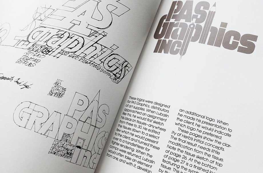
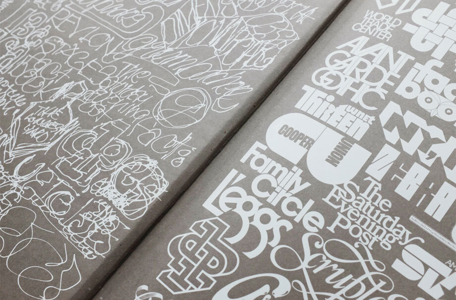
The Mother & Child mark and all of Lubalin’s other logotypes started life as a rough sketch, of the kind collected on the book’s inside front cover.

He’d use these sketches to convey his visual ideas to colleagues such as Tom Carnase, who had the craft skills to transform them into artwork. That thing of turning a sketch into a beautiful piece of lettering really resonated with me. It wasn’t just about crafting letters; it was about crafting an idea into a beautiful piece of design.
I developed an eye for design and shape and lines that hopefully makes a difference in Fontsmith’s work. That attention to detail and balance stayed with me, and it’s something I try to pass on to the guys in the studio.
All we can say is, thanks, Herb.