FS x Middlesex: Top Secret
FS x Middlesex: Top Secret
Pedro Arilla Inspiration
We had so much fun last year at Middlesex University that we decided to repeat our collaboration on the typography module conducted by Andy Gossett.
At MDX University, BA Hons Graphic Design 3rd year students have to design a typeface as part of their curriculum. This is quite unusual and not an easy thing to do for sure — and we were very intrigued to see how the audacious creativity of the youth got along with our old friends the letters. To be fair, Middlesex are definitely doing something right with this project if Phil Garnham (Fontsmith Creative Director) studied here almost 20 years ago and ended up making fonts for a living.
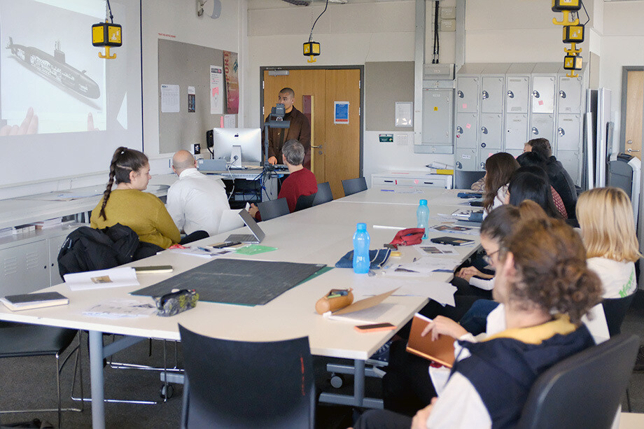
So, for the second year in a row, we got on the Northern line, arrived at the Hendon campus and got lost (again) in the corridors before we found the classroom. Once there, it was truly amazing to see the passion for design these students feel and how much expressiveness with no boundaries they are able to bring to letter shapes.
The creative brief:
The students attended a recent exhibition at the London Science Museum called ‘Top Secret: From ciphers to cyber security’ about communications intelligence and codebreaking devices. The students were asked to choose an object, system or process from the exhibition and create a brand for it which would then form the basis of the associated font.
Concept workshop
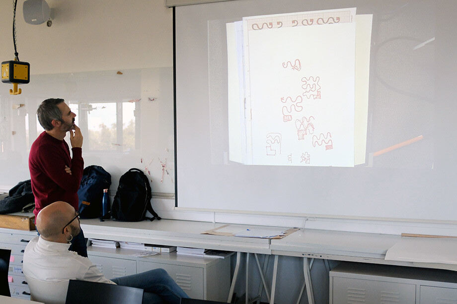
Phil and I made our visit on week three (of a six-week creative process) to help steer initial creative thinking. The purpose was to guide the students through the process of creating a typographic system by pointing out aspects of structure patterns, black and white balance, legibility issues — and graphic beauty.
Most of the projects were purely ‘display’ type style. The first step was to discuss with the students which route to follow among all the proposals (most of them at a very early stage) and later on try to dig into the true potential of those shapes. Some students needed to emphasise the flavour in their designs; others needed to push the shapes back to a safer place; and for some it was just a matter of letting them keep going.
The typefaces:
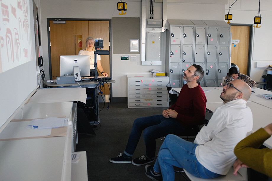
Over the course of a further three weeks under the guidance of Andy Gossett the students developed their conceptual thinking into alphabets of A–Z, figures and basic punctuation. Each typeface was submitted for review and we can now share the most successful projects. Before we get on to the winners, let’s start with the five projects that we think reached a very high standard:
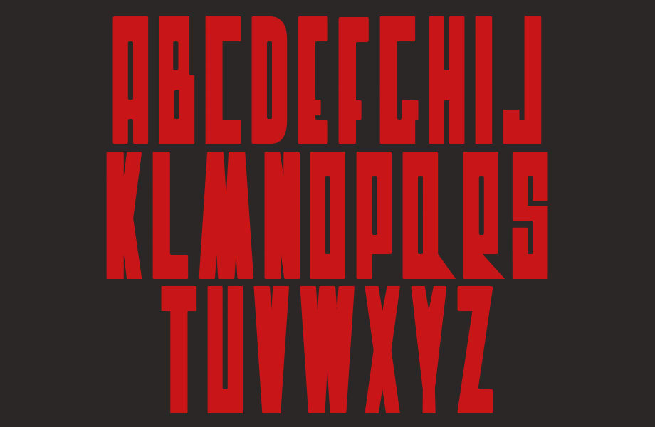
Mikaela Birath
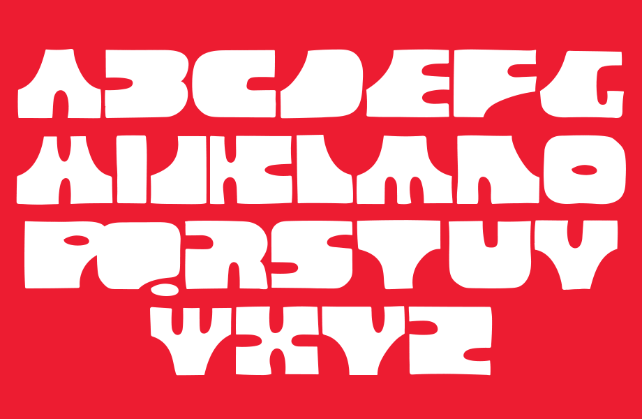
Johanna Furst
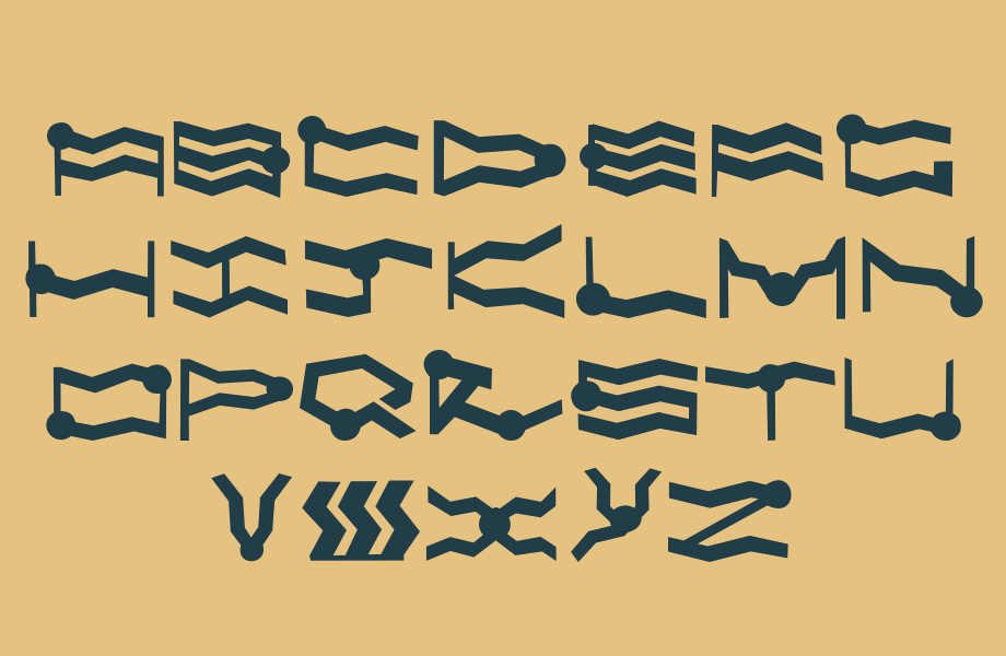
Ashwini Marathe
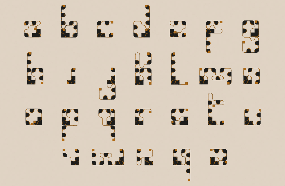
Carolina Paio Myhre
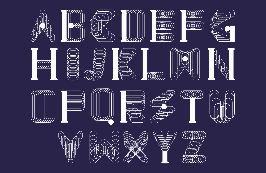
Jia Xuan Foong
And the winners are… (drum roll):
Here we are with our Top 3 font projects as chosen by Fontsmith. Congrats to all three designers! They will receive a goody bag of type specimens, posters and a copy of our TypeNotes magazine. All the good stuff!
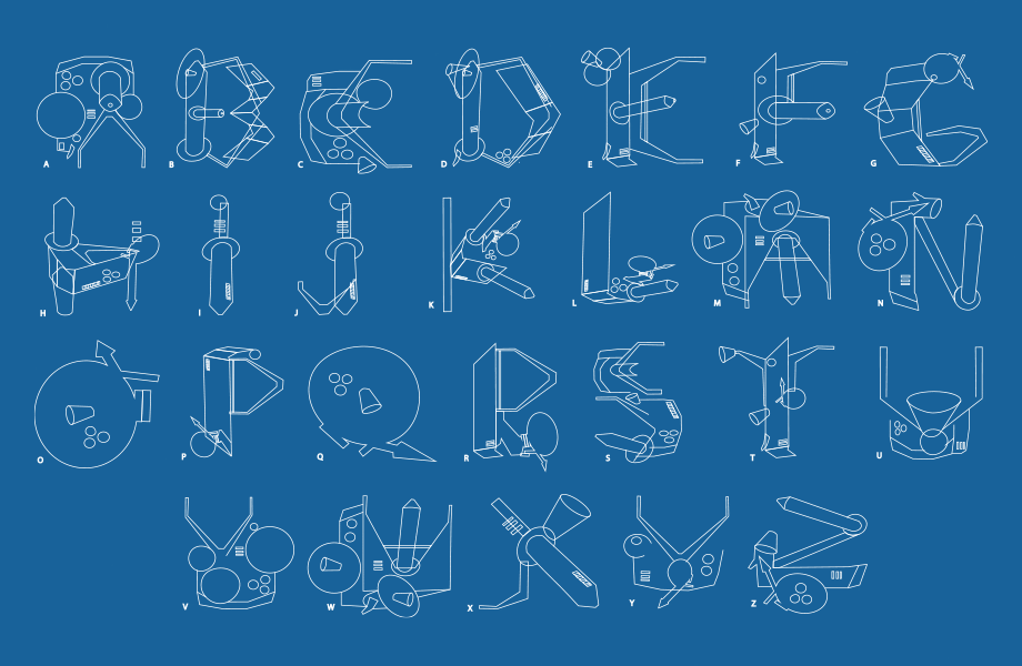
Meda Mankute
This typeface was inspired by a satellite called ‘Zircon’. It was going to be the first spy satellite, with the purpose of discovering Soviet Union secret messages. I was inspired by the construction and physical look of it. I was trying to represent that in my typeface by focusing on complex shapes and combining them into upper case letterforms.
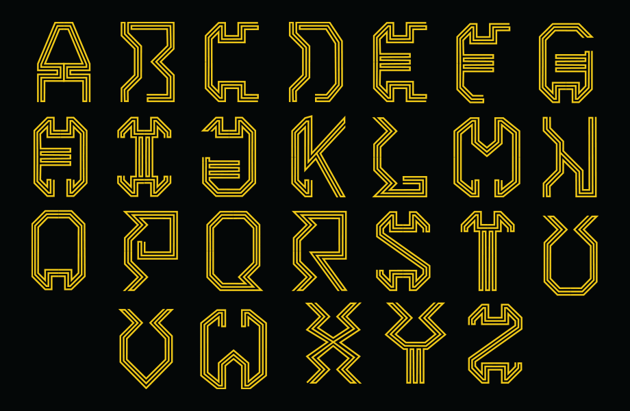
Nuno Da Silva Penas
‘Snowden’ is a contemporary display typeface inspired by the laptop used by Edward Snowden which had stolen secrets on the NSA and CIA that was smashed during his arrest. This revealed the dynamic lines and shapes of the circuit boards. The 3 different weights Light, Regular and Bold make the font more usable.
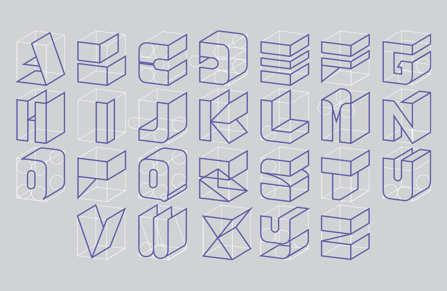
Yong Wei Leong
‘Frame’ typeface is inspired by a British cipher machine which was used in 1943. The wordmark ‘Frame’ was created to symbolically reflect the complicated big machine, with puzzle-like elements showing depth through the box grid lines. It also contains the idea of the ultra-secret locked inside. The letters were created following a box grid, using lines and shape to create a visual combination with 2D and 3D. Two versions of the font are available, the original and one with the box grid.
Final congrats to everyone
We would like to congratulate all the students for such an amazing job on their first typefaces. You cannot imagine how much we enjoy going over there to talk with the students at an early stage — and afterwards receive the typeface finished and polished. It’s very interesting to witness how the projects evolved. Huge congrats to everyone involved!