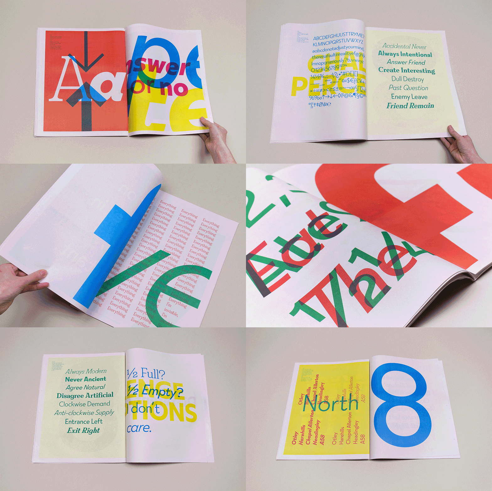
Typeface duo FS Split Sans and FS Split Serif are the contrasting types
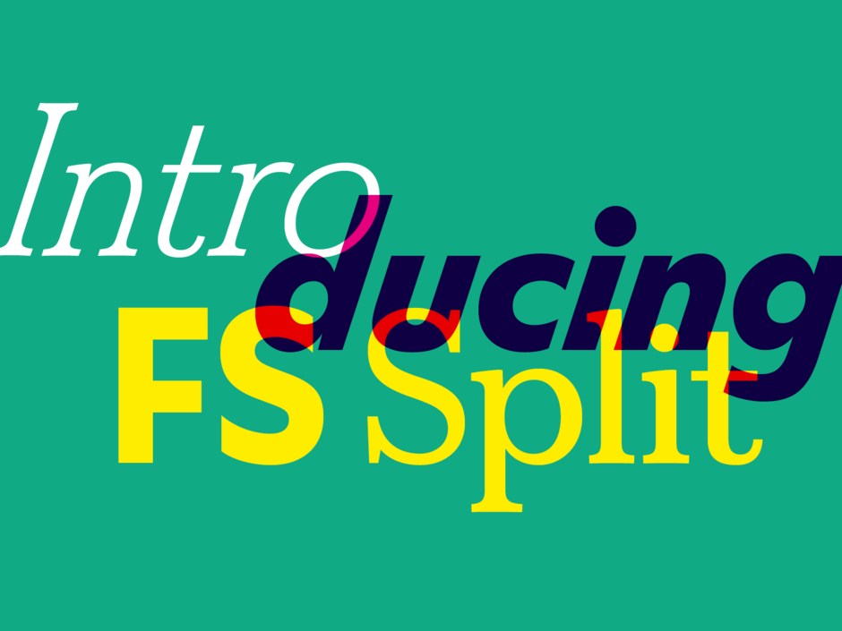
Typeface duo FS Split Sans and FS Split Serif are the contrasting types
Fernando Mello New typefaces
FS Split was initially born out of a want from our founder, Jason Smith, to design a fresh, unexpected sans and serif that would add something new to Fontsmith’s existing library. We wanted to create something different, less ‘perfect’ and ‘fine-tuned’, which would stand out from the thousands of digital, geometric types that already exist.
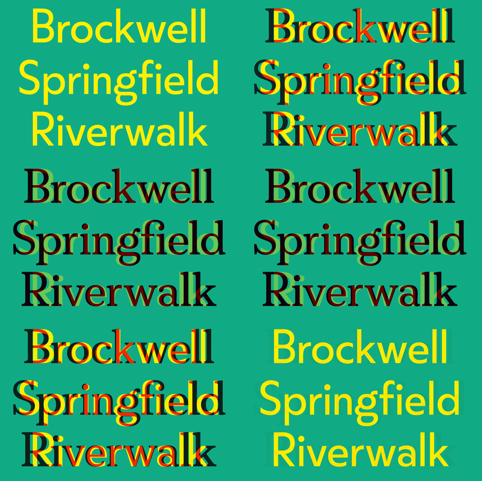
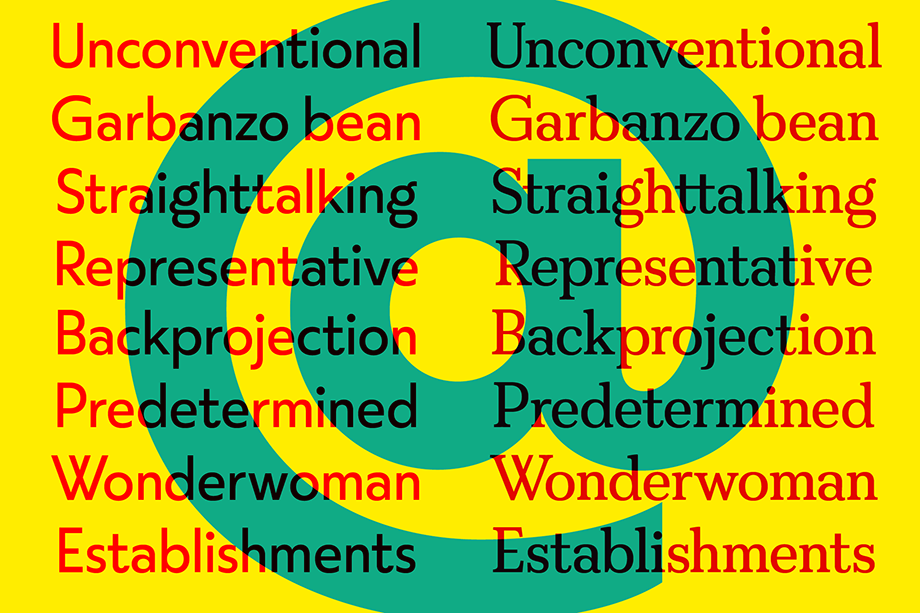
The aim was to design something in-vogue but unpolished – after compiling moodboards of current visual trends, looking at architecture, furniture and cars, I created the first sketches for FS Split Sans in Adobe Illustrator, taking cues from geometric types but adding in twists and turns.
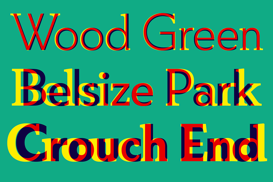
Some of these included a distinctive double-storey lowercase ‘g’; eclectic proportions, where round characters are wide but straight ones narrow; long descenders and ascenders, and a cap-height that aligns with the latter; dramatic dots on ‘i’ and ‘j’; oversized top counters such as on ‘B’ and ‘3’; and some peculiarly-shaped letters, like ‘W’ and ‘t’.
I played around with weight, first creating a very heavy black, which we thought would work well for display – but we decided to keep it simple and settled on light, regular and bold, as we didn’t want to overshadow the lighter weights.
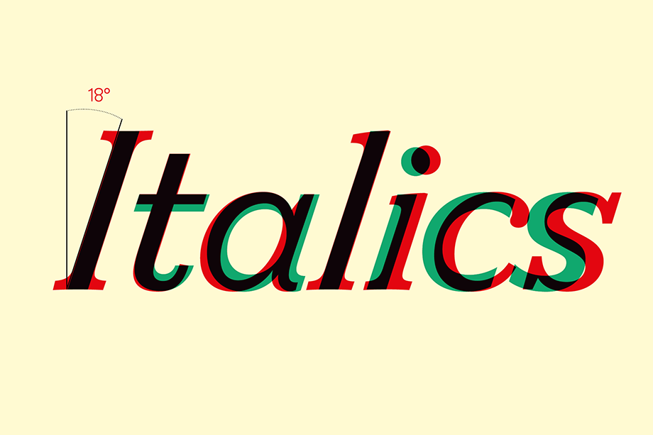
Then came one of the quirkiest parts of the design – we created the italics font, opting for a dramatic 18-degree forward-slant angle. Rather than giving it a calligraphic or cursive style, we kept it true to the Roman sans. Giving it such a bold angle moves the italics variant beyond its original purpose, which is to help words or phrases stand out, and makes it a wonderful font in its own right. It’s stylish and works brilliantly for headlines, pull-quotes and even logos and corporate branding.
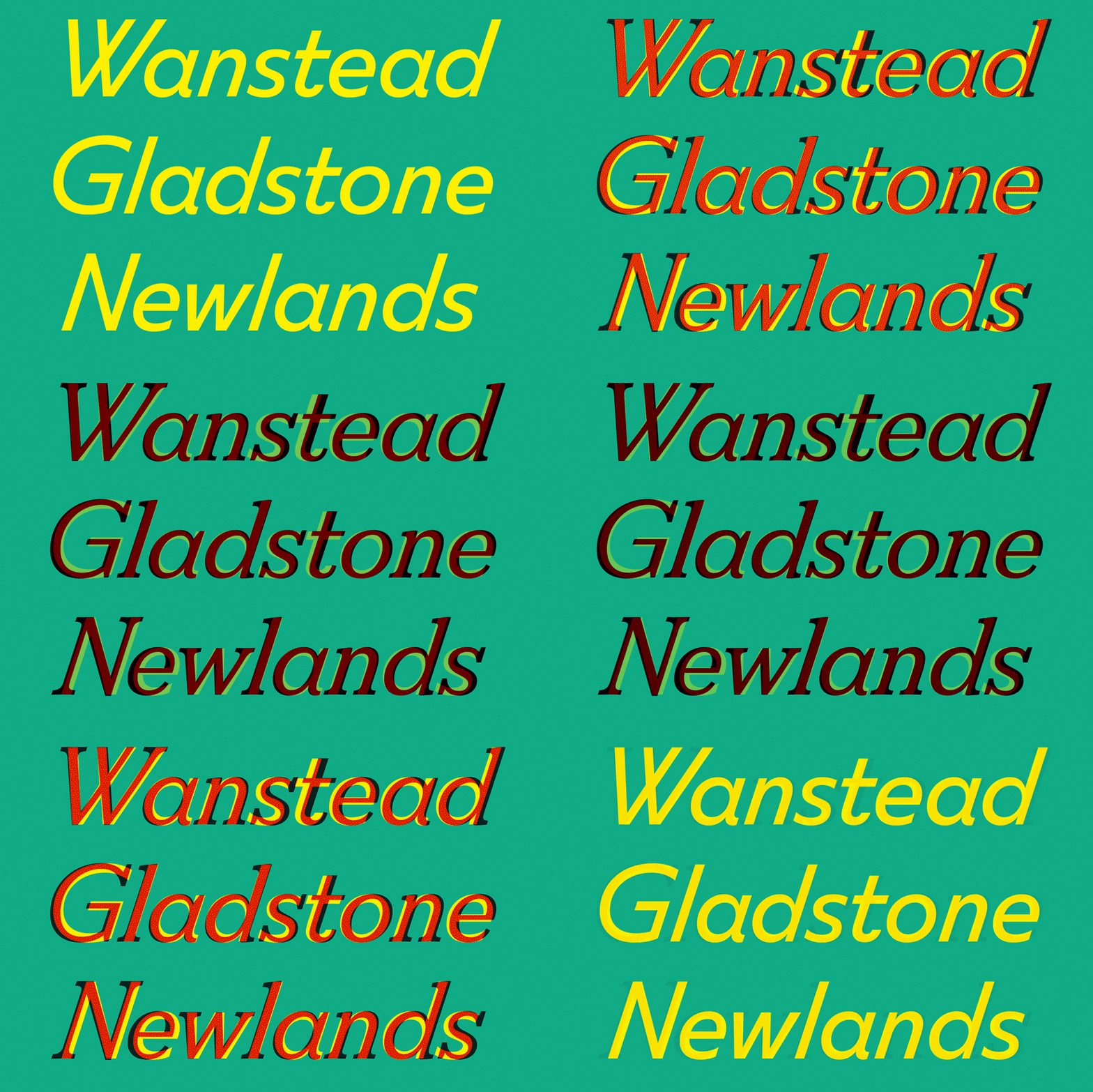
It was then that Jason asked me to think about what a serif version of FS Split might look like. We designed the serif to have the same eclectic letter widths as the sans, as well as similar quirky character details and shapes, and that stark italics angle. There are differences though – the serif is more dramatic, with a bigger contrast between weights, inconsistent counter sizes and terminals of various shapes.
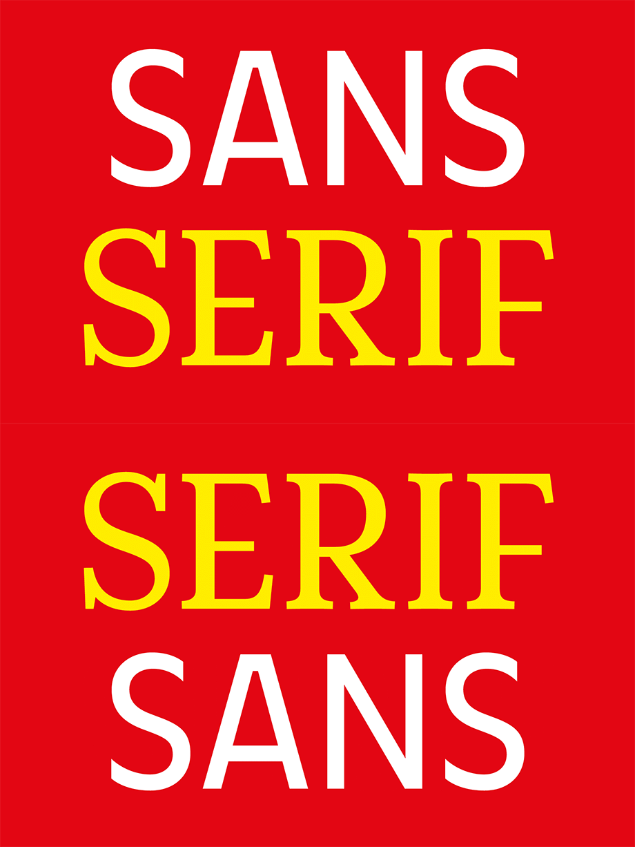
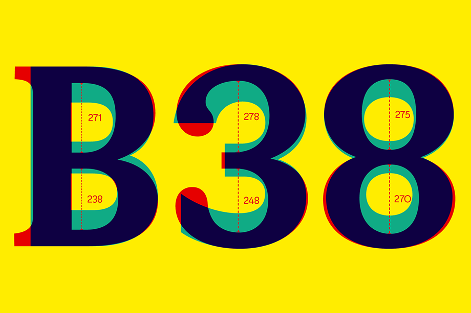
The result is two typefaces that are simultaneously complementary yet contrasting – they work really well together but also have their own personalities. This ‘love hate’ relationship and duality is what inspired the name, FS Split.
Together, they bring an unusual balance, and provide a versatile type palette for designers. Similar proportions and dimensions offer ease of use as they can share the same design space but distinctive features also bring difference and quirkiness.

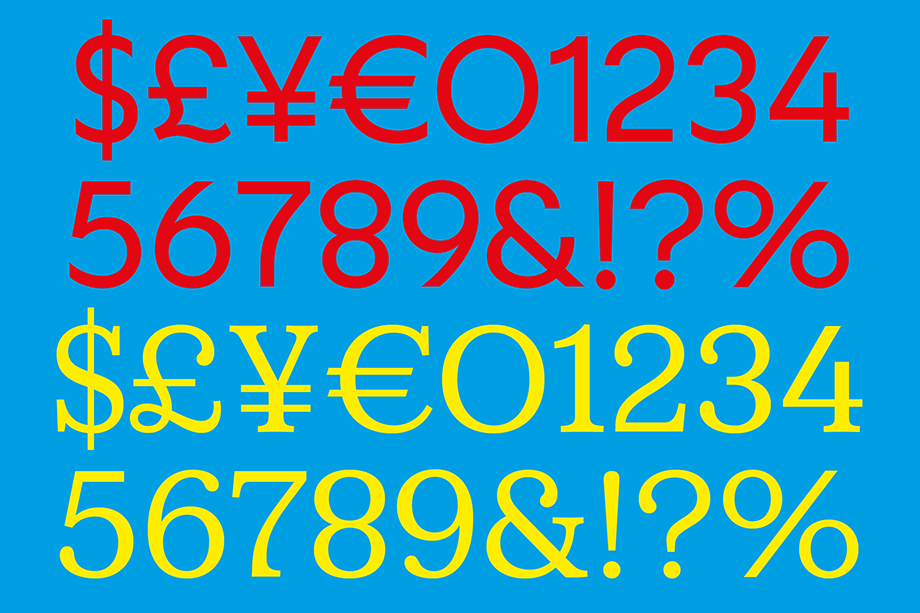
Although FS Split started out as a project to create a fresh, modern new sans, it has developed into a broad type family that can bring so much variety to everything from magazines and packaging, to websites and branding. The conflicting yet harmonising nature of sans and serif should give designers the tools they need to be both bold and subtle, eclectic and ordinary, contemporary and classic. FS Split Sans and FS Split Serif are available to try and buy separately or together as a Bundle containing all the styles.
