MADE.COM unveils brand refresh with a trio of Fontsmith typefaces
MADE.COM unveils brand refresh with a trio of Fontsmith typefaces
Pedro Arilla Fontsmith in use
In August 2018 online design brand MADE.COM contacted us to help them with the typography for their upcoming brand refresh. The roll out was planned for December to coincide with the launch of a brand new website and their end of year sale which has just gone live today.
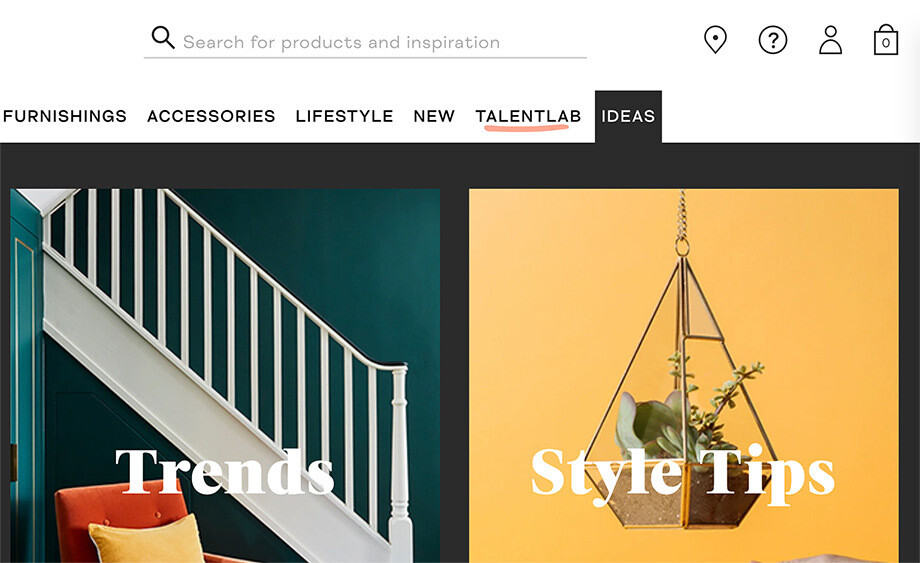
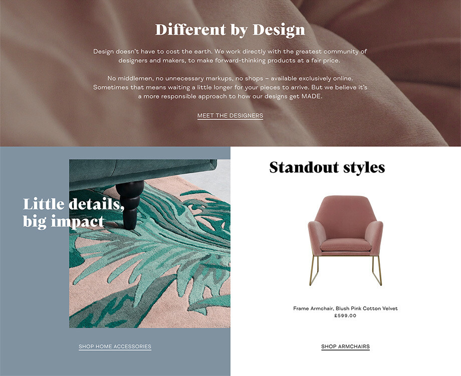
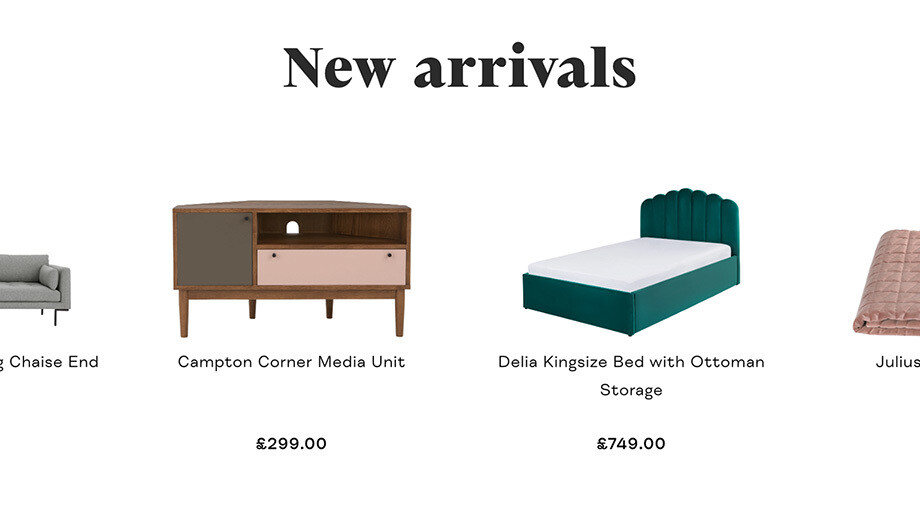
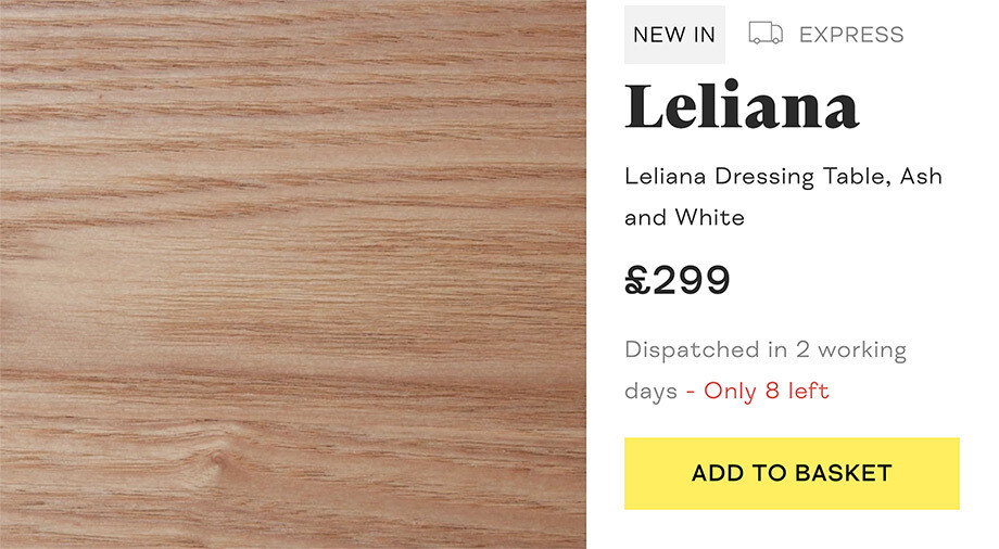
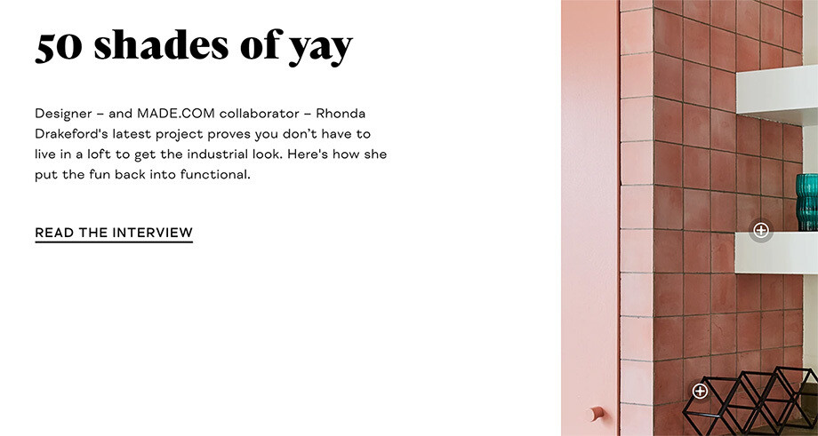
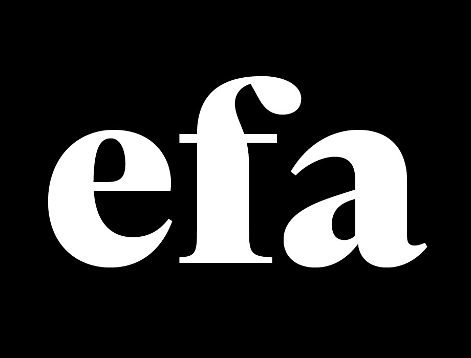
For headlines, MADE.COM were looking for something fresh, sharp and magazine-esque. Fontsmith typeface FS Neruda was chosen for this task. FS Neruda Black is playful, lively and quirky yet solid and suave. A delicate poster font style of a serif with a homely aroma: just like MADE.COM’s furniture.
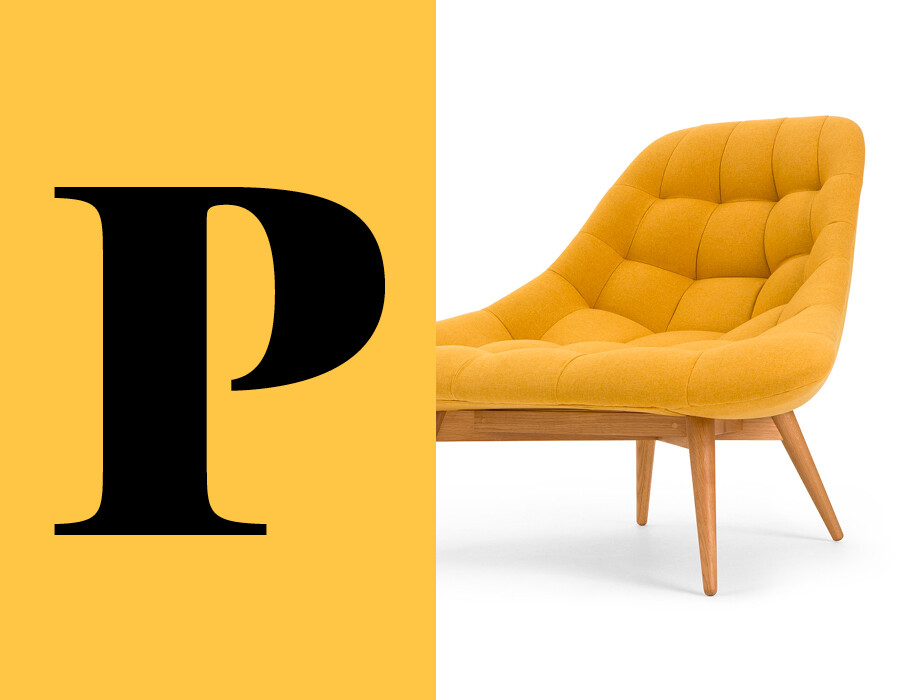
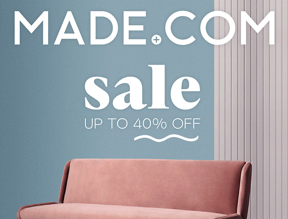
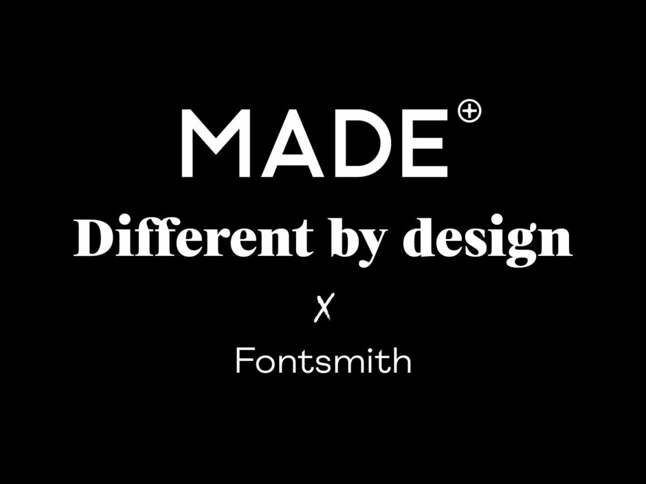
With so many brands still opting for clean geometric sans serifs online, the right contemporary serif presents an opportunity to standout from competition. We have seen a lot of homogenous design online over the years but recently there has been an increase in brands that want to stand out from competitors and typography is a good way to do that. MADE.COM is different and wanted to differentiate itself — and typography plays a crucial role here. It’s not a coincidence that “Different by design” is their new strapline. A confident statement that needed a positive new typographic voice; a voice that would bring vigour, fashion and distinctiveness to the brand.
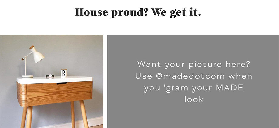
Our upcoming sans serif FS Meridian (launching early next year) was the perfect companion for FS Neruda. Used as a subheading and body copy font, it stands out due to its distinct construction, contemporary tone, confident shapes, wide proportions and tall ascenders and descenders.
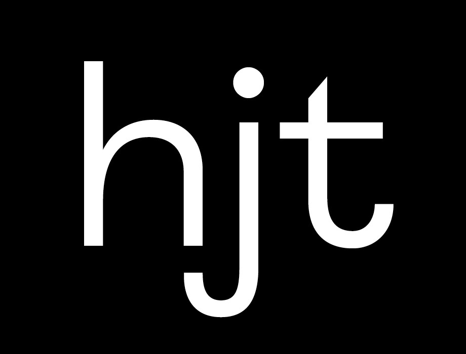
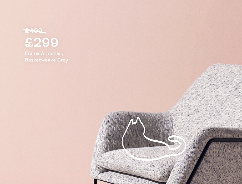
FS Meridian presents a subtle design focused counterpoint to the impersonal geometric trend. By selecting this font MADE.COM have injected an element of dynamism into their identity.
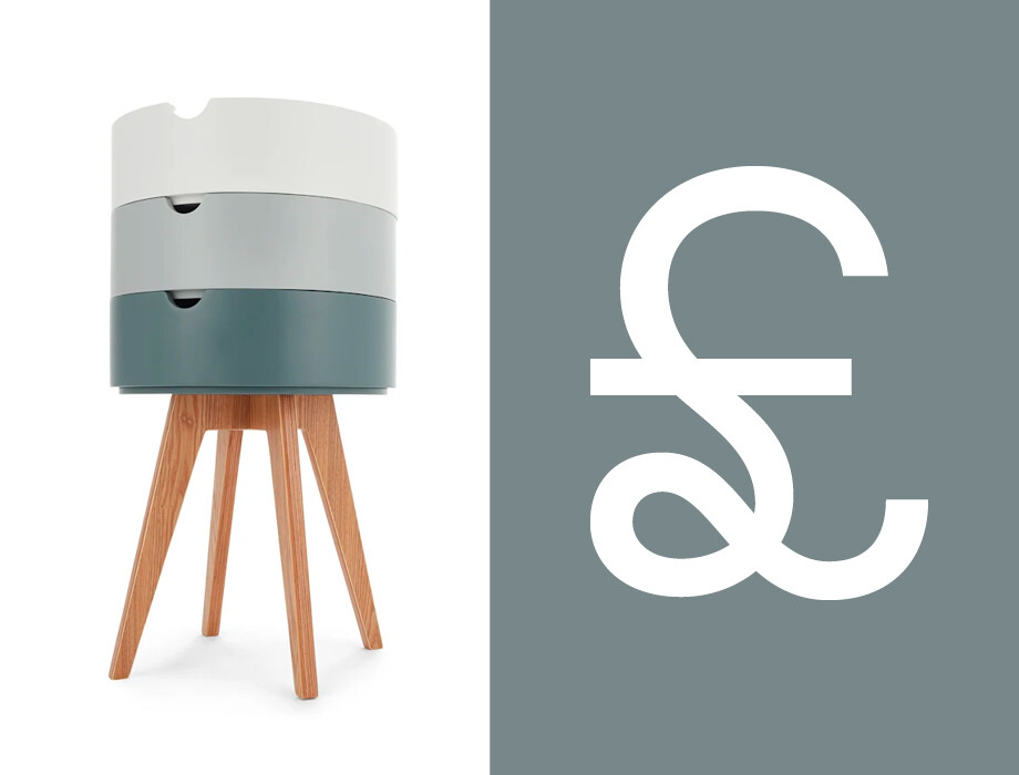
Script font FS Sammy was chosen to complete the typographic system. It will be used for special touches on the MADE.COM website and marketing materials (to be rolled out in 2019).
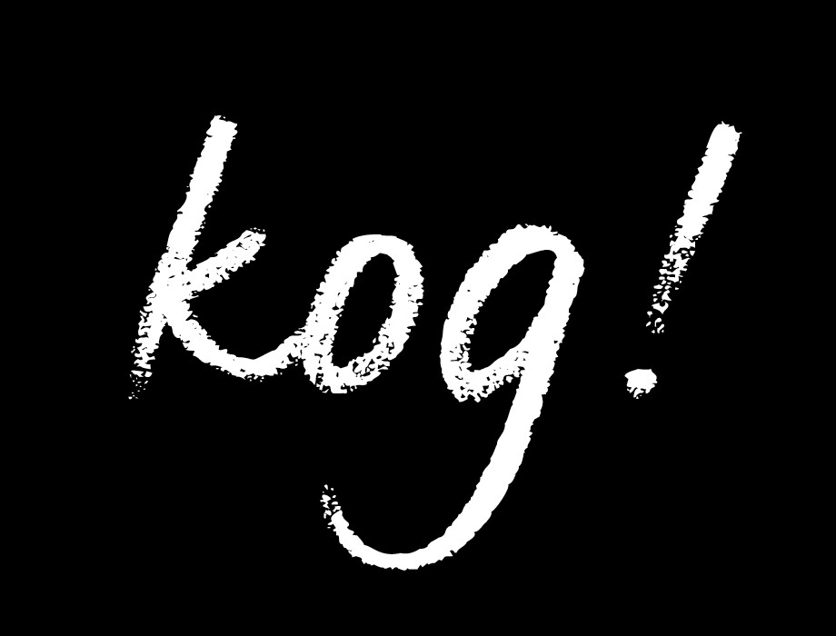
Digital design benefits from the warmth and honest personality of the human hand making FS Sammy the perfect choice to add a touch of authenticity.
From a typographic perspective, pairing fonts can be one of the most challenging and important parts of a rebranding project. The truth is there are no rules to follow and we need to harmonise different voices to get the perfect tune. Adding contrasting typefaces such as FS Neruda and FS Meridian helps to create a sophisticated and distinctive balance.
