FS x Middlesex: The future starts here
FS x Middlesex: The future starts here
Phil Garnham Knowledge share
Today’s BA Hons Graphic Design students are exposed to a huge breadth of visual possibilities and media. For those with a keen eye on typography the allure of type design as a graphic discipline and as an unexpected career path brings out a thirst and desire to create letter shapes, to experience that first taste of excitement when typing your own font on the keyboard.
Creating a typeface as an integral part of a BA Hons design curriculum is a rare thing indeed, to my knowledge only a handful of art schools focus in with their own type design specific module. Middlesex University is one such school which has been encouraging a deeper understanding of letterforms in its undergraduates. It’s a worthy endeavour at BA level and I was very fortunate to experience the opportunity myself first hand some 18 years ago on the typography module introduced by Andy Gossett on the course led by Lillian Lindblom and Phil Healy.
It was on a recent lecturing visit to the Hendon campus where Andy and I forged the idea of a Fontsmith collaboration to support the 3rd year students studying the type design module. The aim being to incentivise creativity with letterforms through studio critique and by providing the more enthusiastic students with a platform to showcase their type design work. Today the projects are complete and we can present the process and results.
The Creative Brief:
The recent V&A exhibition “The Future Starts Here” brought together future technologies and objects of the near future. The students were required to choose an object from the exhibition and name it, create its brand, consider the tech and its intentions, then create a distinct wordmark to form the basis for a brand-new typeface design.
Concept Workshop
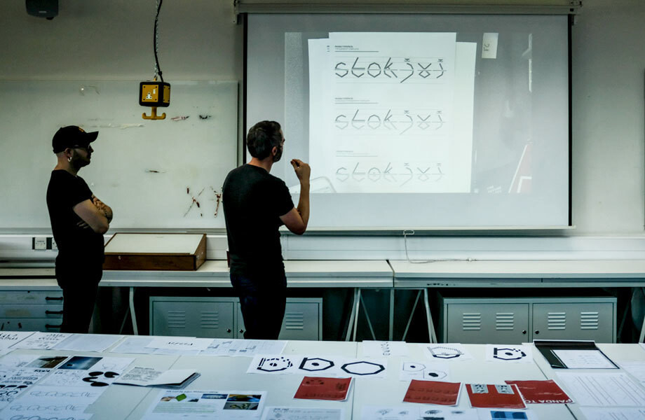
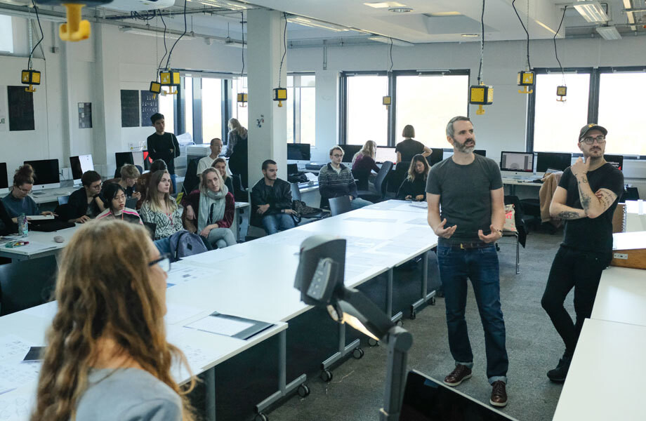
Fontsmith designer Pedro Arilla and I visited the university on week three (of a six-week creative process) to help steer initial creative thinking. The aim being to guide the students towards ideas that would lend themselves to interesting and unique letters and type designs. These brands needed standout designs, underpinned by an idea linked to their tech background, and legibility was a key factor in determining the type’s viability in a commercial sense.
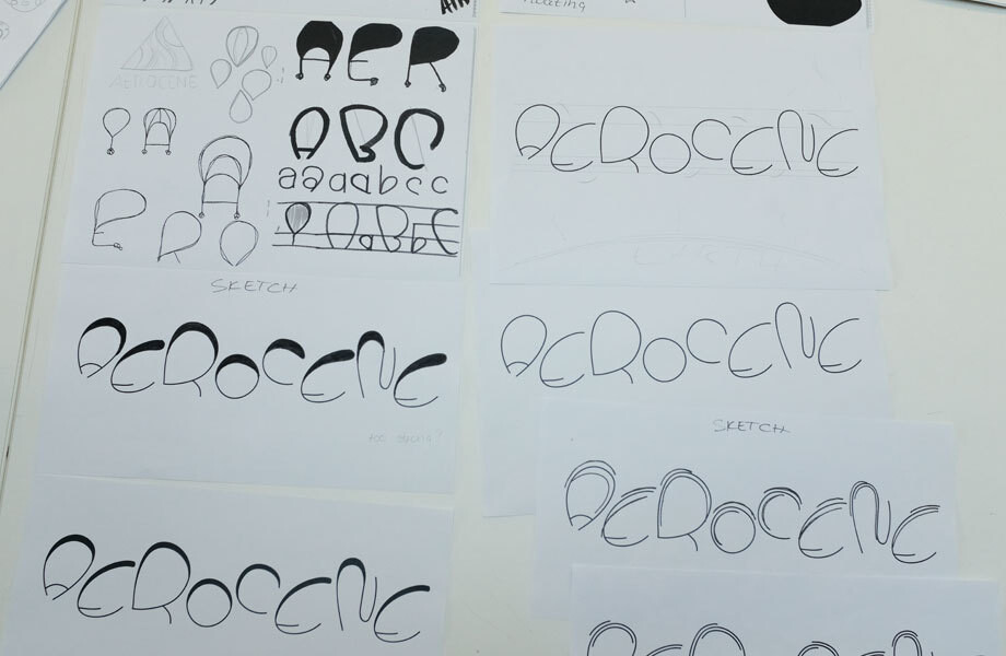
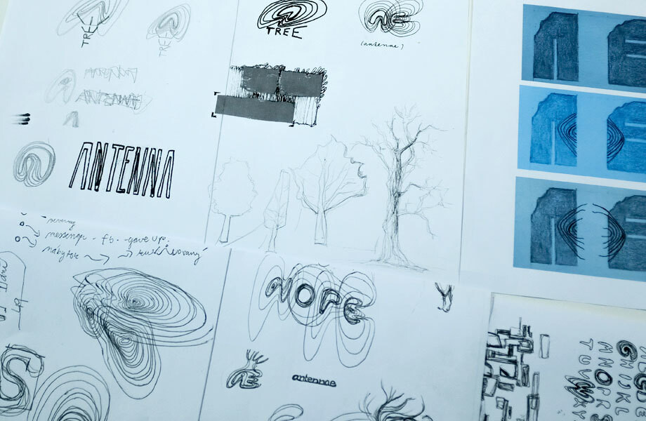
The first steps of this process really opened our eyes. There was understandably a tendency to focus on the core skeleton of the letters with many of the designs being light and linear. In many cases type veered towards illustration as a way of bringing type, brand and content together as one graphic entity.
We encouraged the students to look beyond the surface and consider appropriateness, to add weight to the skeleton, to explore the black shape and then look out to the white, to balance the letters. We highlighted areas where typographic character is born, the proportions, the junctions, the terminals, the relationships, contrasting forms, all the ingredients that make-up the flavour of a distinct typeface. But really it was clear the aim here was to create a ‘display’ type style and with display faces anything goes.
The Typefaces
Over the course of a further three weeks under the guidance of Andy Gossett the students developed their conceptual thinking into alphabets of A-Z, figures and basic punctuation. Each typeface was submitted for review and we can now share the most successful projects.
Noteworthy:
Better Shelter by Mohummed Miah
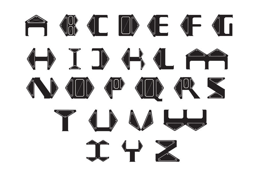
Voyergar by Yumeko Otsuka
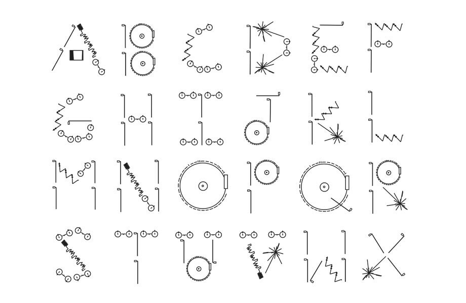
Made In Space by Keer Lin
Silkleaf by Preksha Bokaria
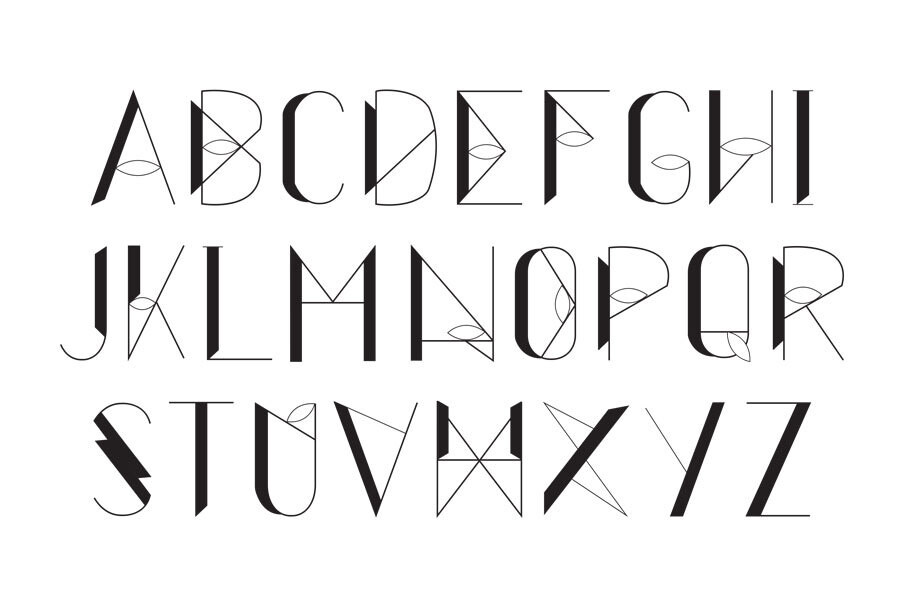
Spiral by Settakit Aryawanna
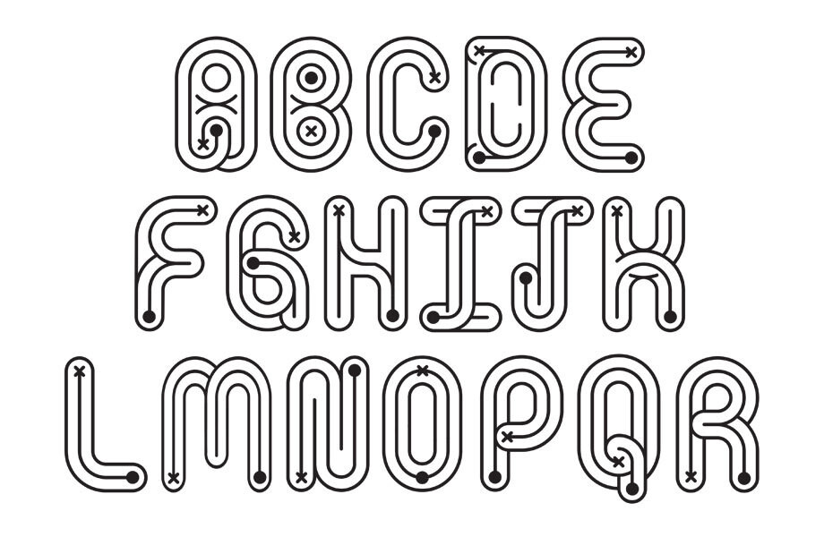
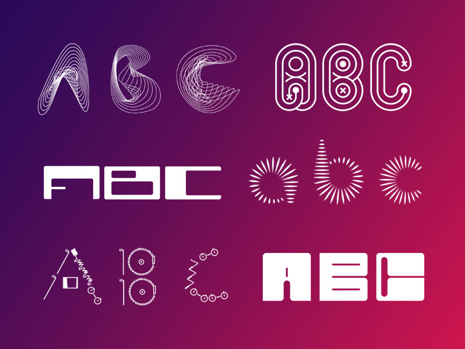
The top three projects given the award for best font as chosen by Fontsmith:
Antenna by Iveta Rihova
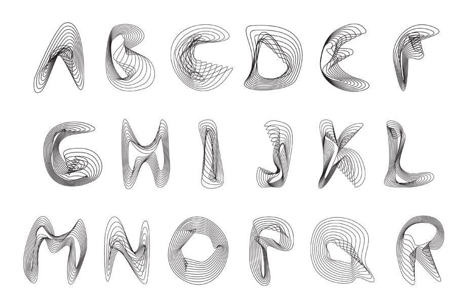
‘Antenna;is the “Living Network” project from VA Museum exhibiton: The future starts here & now. Tree antennas can function as source of alternative communication in an oppressed society. The font is created out of fluid, organic, free form lines, representing tree ring pattern as well as signal transmission. Whispering trees converted into letterforms with abstract approach shall bring the world of nature and technology together.’ Iveta Rihova
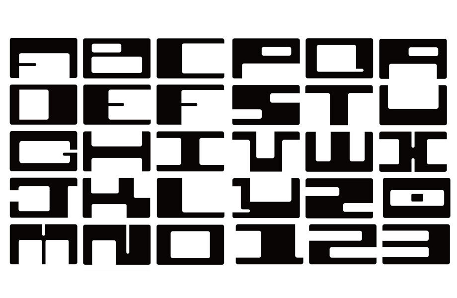
Cubesat by Phillip Block
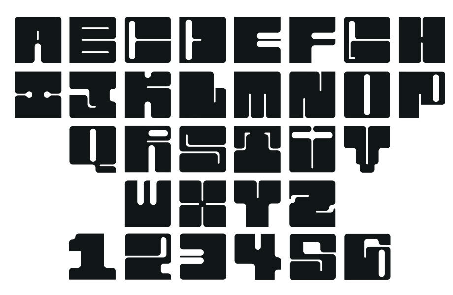
‘My typeface was developed around Cubesat, a standard for affordable and efficient satellites in a tiny 10cm cube form. I wanted to capture the dense, tightly packed nature of the technology with an extra bold monospaced typeface, with at least 3 alternates for each letter to convey the modularity of Cubesats, in the way they stack together and can be outfitted for any number of orbital research. A bit of an 80s retro-futurism style made sense, as well as being an aesthetic I like, the idea of cheap mass-production satellites feels pretty futuristic to me.’ Phillip Block
Protei by Blanca Guàrdia
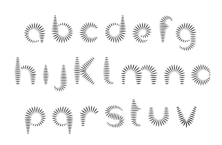
‘Protei is inspired by a prototype of a self-driving sail boat that collects oil spills from the sea. The main characteristic of this boat is that the hull can change its shape in order to optimize the wind that the sails catch. The font resembles the hull of the boat and transmits the idea of movement, letters can change and become new ones to create new words.’ Blanca Guàrdia We would like to congratulate all the students for such an amazing job on their first typefaces, getting stuck into a project like this and sharing work with a foundry is a daunting task. The level of curiosity and effort all round in exploring the limits of type was fantastic to witness and as the final works attest there was a huge degree of experimentation to achieve the final types.
Huge congrats! Team Fontsmith.