FS Neruda: The Smart Type
FS Neruda: The Smart Type
Pedro Arilla New typefaces
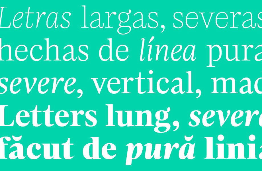
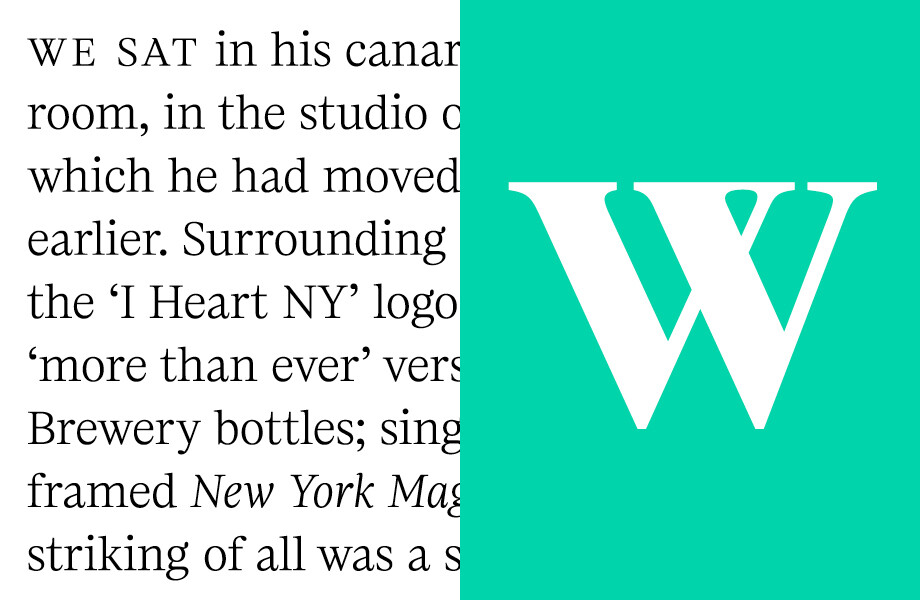
FS Neruda takes its name from Chilean poet Pablo Neruda, described as “the greatest poet of the 20th century in any language”. As such, it’s a font that references the very best literary typeface traditions. Smart, sharp and classical, FS Neruda bridges the gap between the classical and the offbeat. It’s clear and legible in body text, and in larger sizes becomes a different beast – livelier, quirkier, but no less sharp. This font started life in the world of newspapers and books and is the perfect storytelling typeface for savvy, inquiring readers whether in printed journals, hard news, short online missives or poetry.
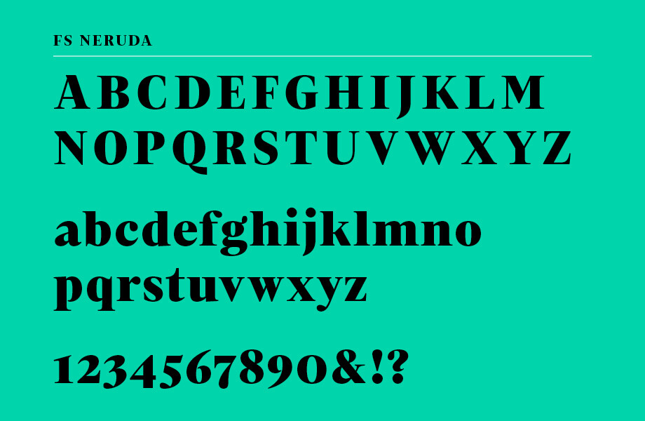
This is a truly classic typeface designed with long text setting in mind, thanks to its large x-height, and short ascenders and descenders. Influenced by typefaces such as Times, Sabon and Baskerville — notably their thin serifs and contrast — I aimed to make FS Neruda comfortable for the reader in texts such as novels and poetry. That means it has a genteel, yet open feeling, while also being a space-saver in fitting more characters on each line than the typefaces that inspired it.
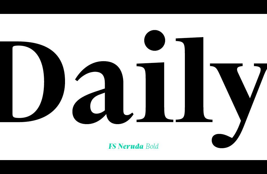
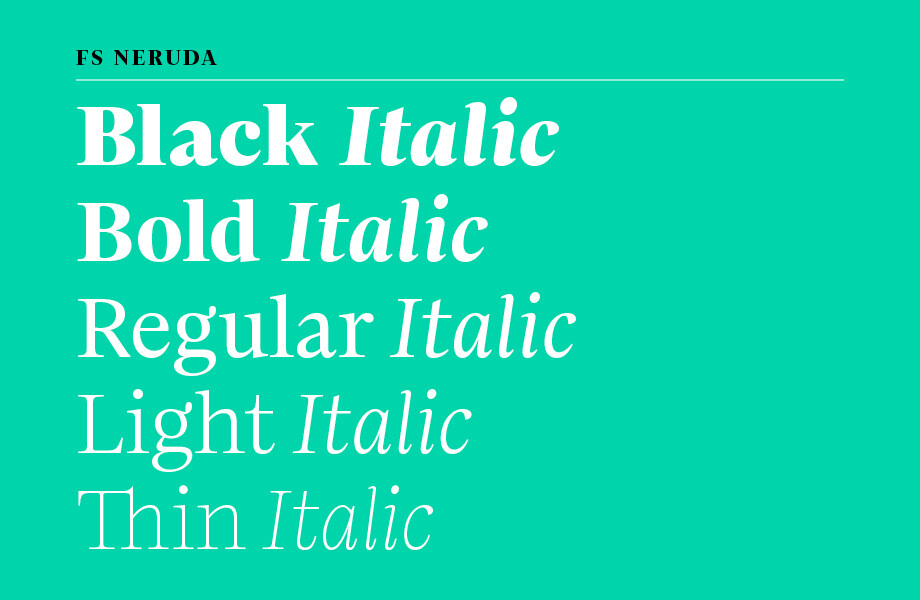
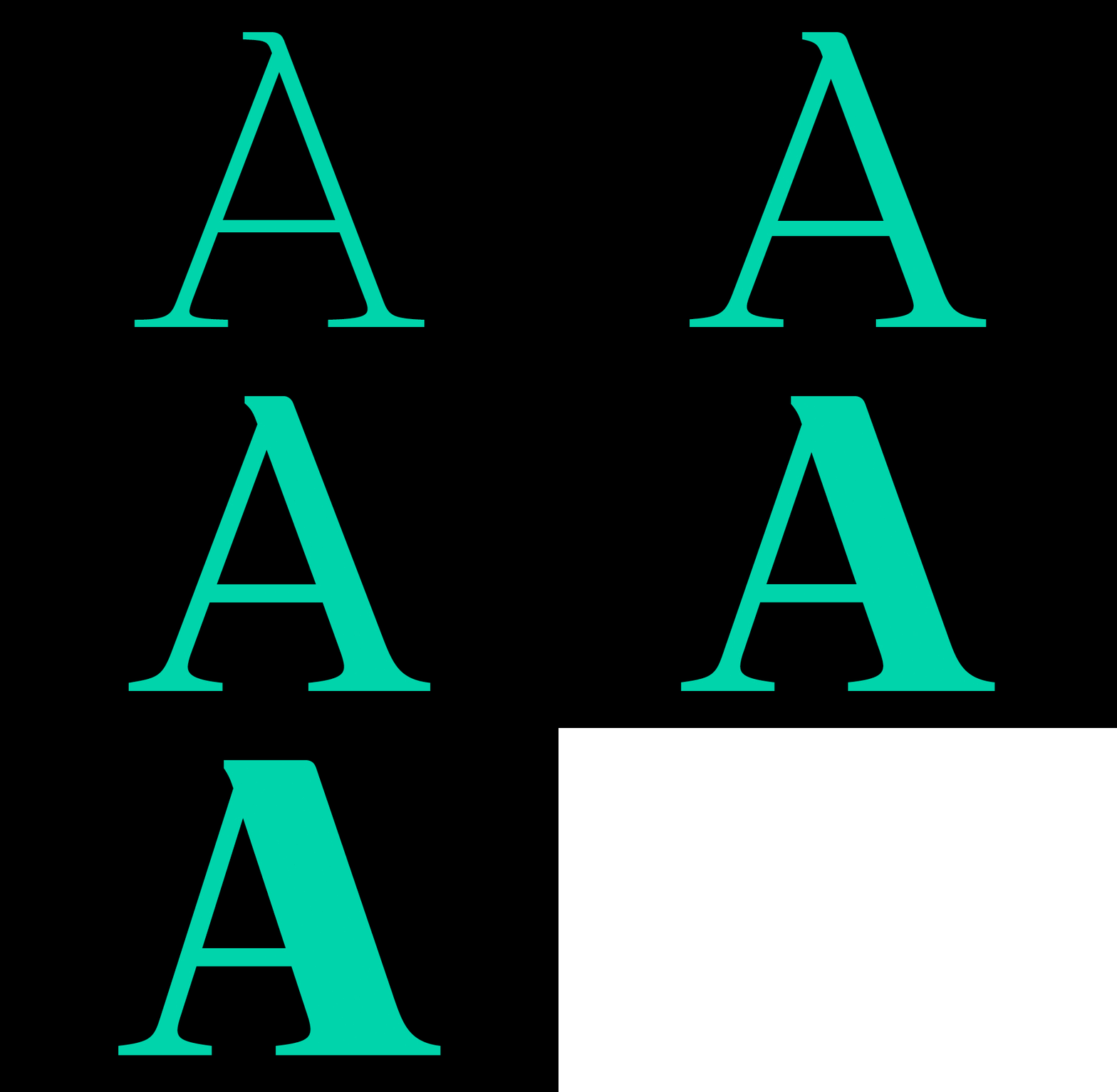
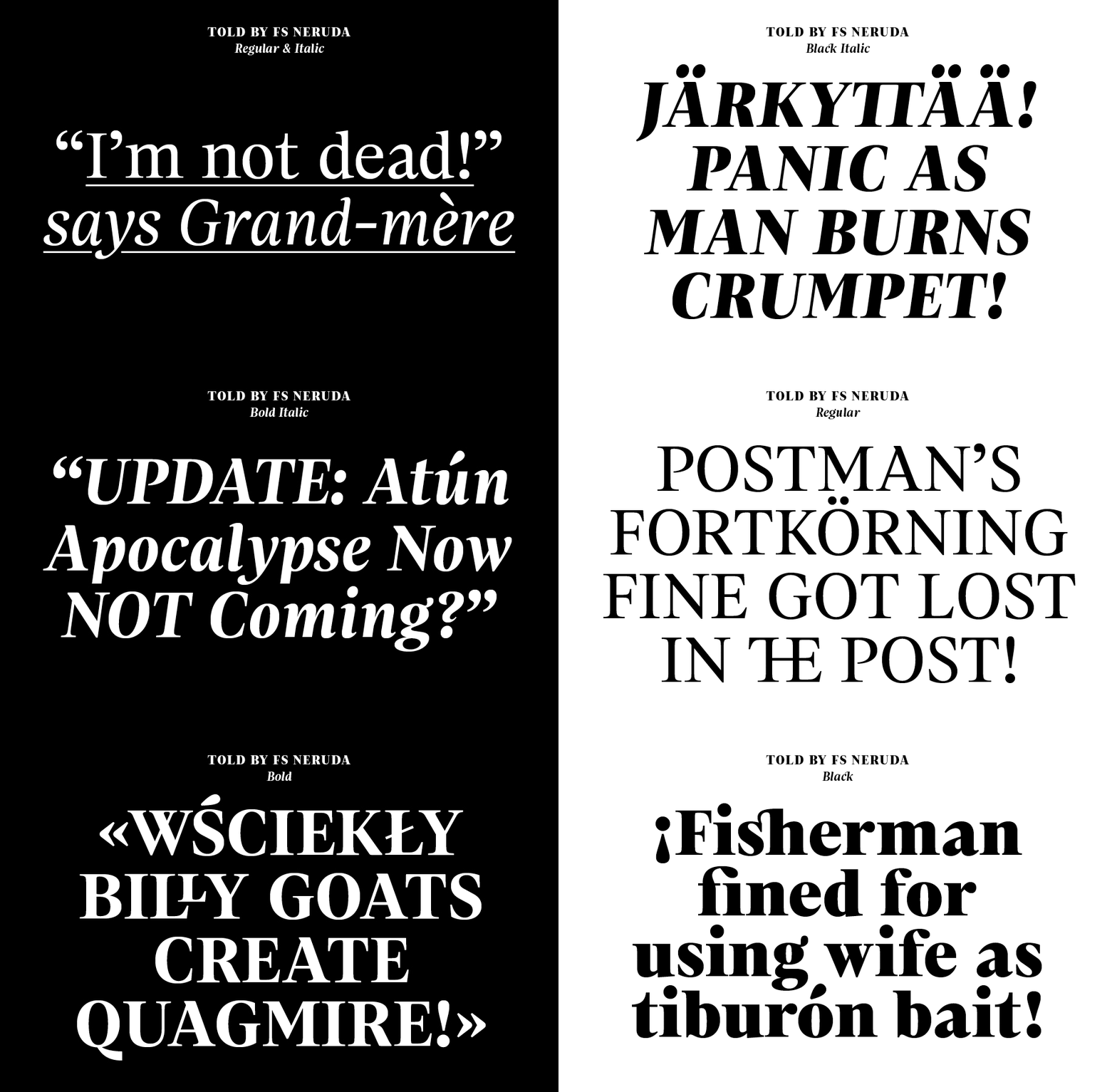
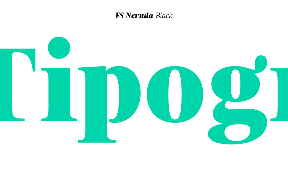
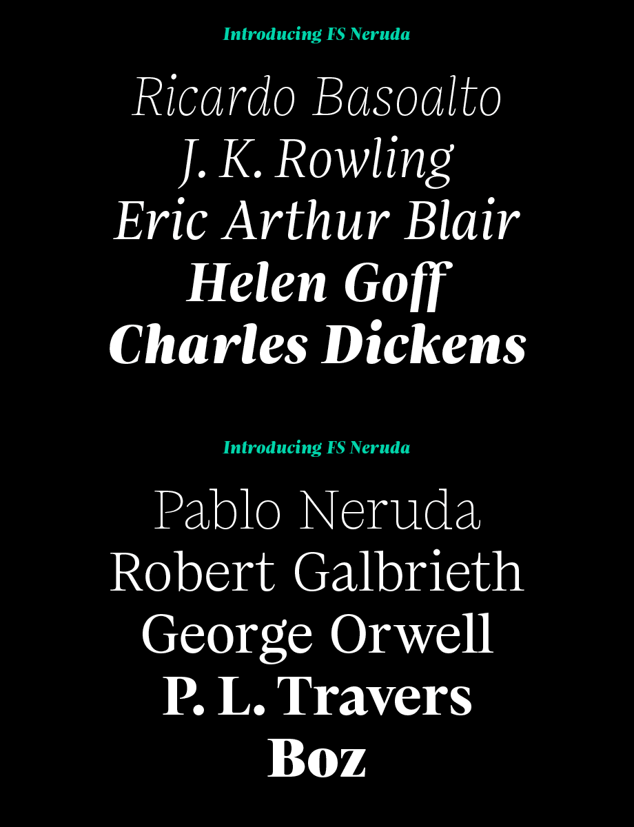
Furthermore, the construction and details of the letterforms differ across each of the five weights, with each cut separately to evoke different flavours: Thin is typewriter-like, Light is classy, Regular is canonical, Bold is robust, Black is magazine-esque.
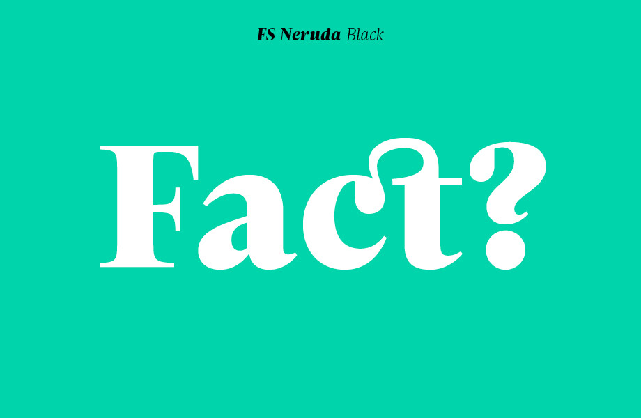
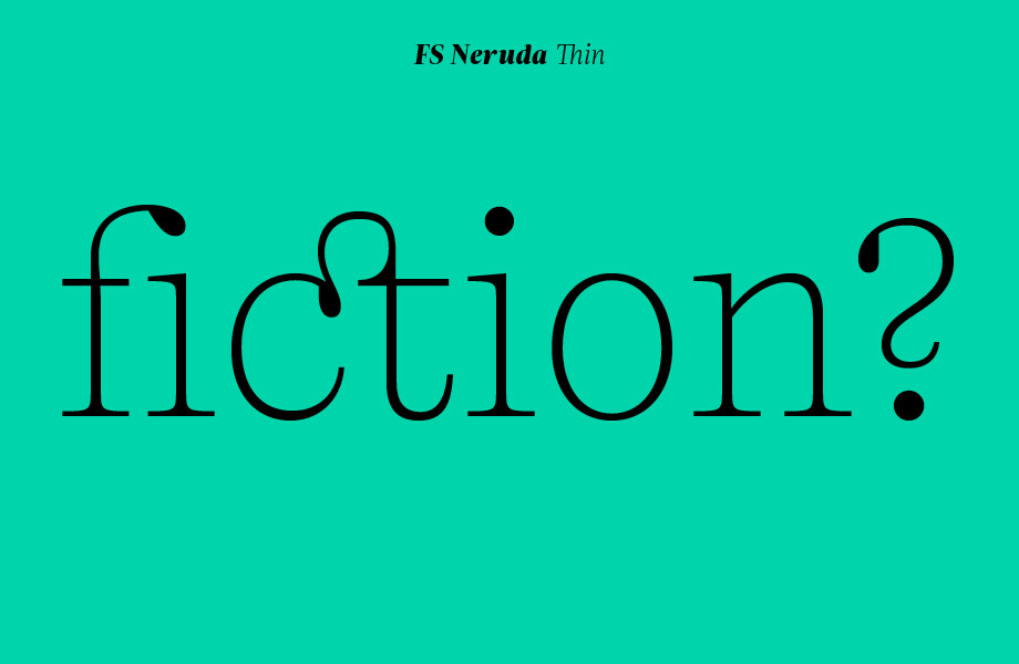
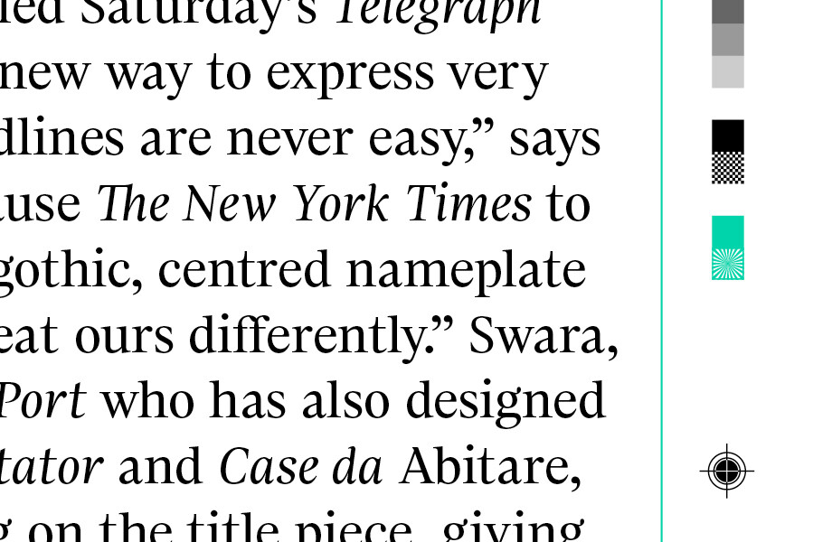
FS Neruda was designed to look conventional and work perfectly at text sizes, but is so beautifully crafted with a few small, suggestive touches visible at bigger sizes that make it distinct and glowing at display uses. My goal with this typeface was to achieve simplicity. FS Neruda is available in five balanced weights; but also boasts a radiant italic companion, a wide set of small caps, lower and uppercase ligatures, case punctuation and spacing, four sets of figures, and some ageless typographic symbols such as manicules, fleurons and teardrop crosses.
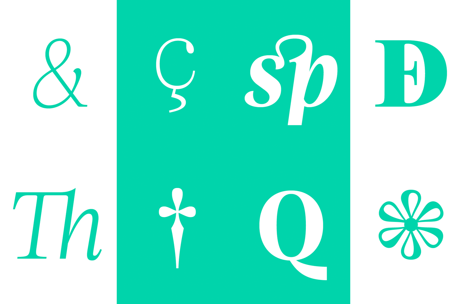
This typeface mixes suave, sharp confidence with a sense of fragility and quirkiness. It’s knowledgeable, informative and idiosyncratic; one for readers and enquiring minds. It feels like an instant classic — contemporary but timeless. As the Chilean master might say, FS Neruda “arrived at the spacious nave of books, at the sailing typography”. Let’s cruise the seven paper seas with a serif as flag.
Test drive and buy FS Neruda now.