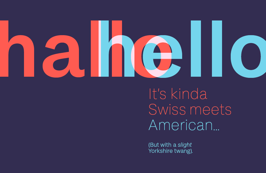
FS Koopman is kinda Swiss meets American, with a slight Yorkshire twang
FS Koopman is kinda Swiss meets American, with a slight Yorkshire twang
Tamasin Handley New typefaces
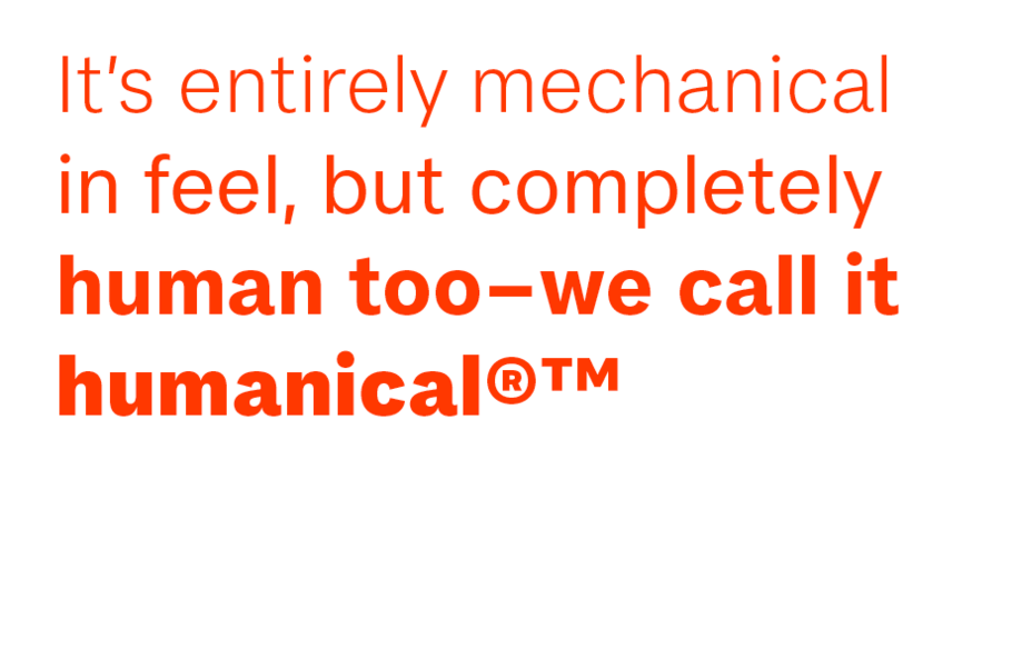
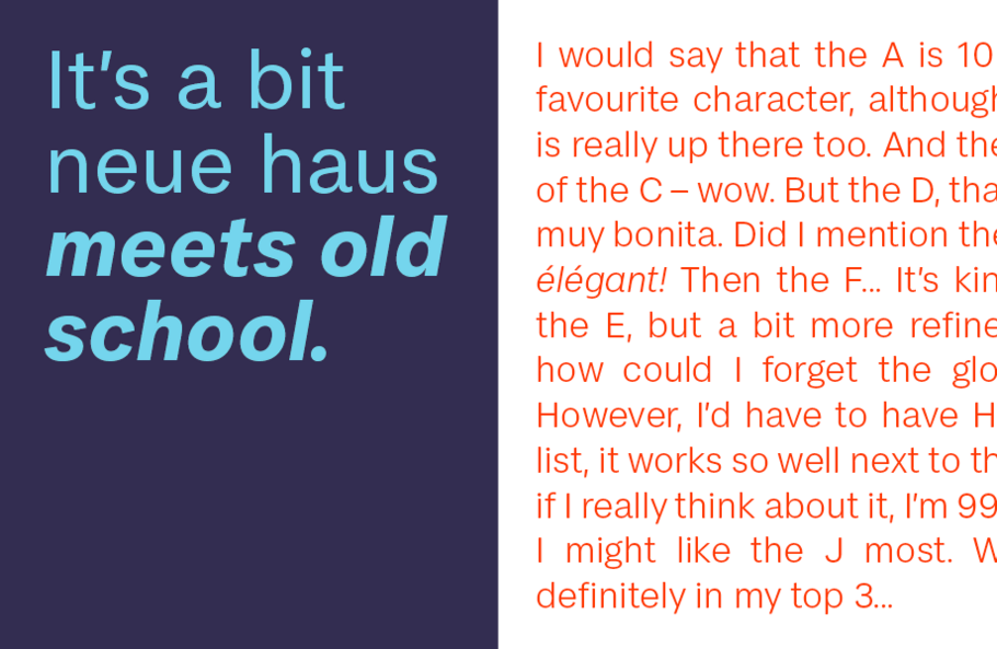
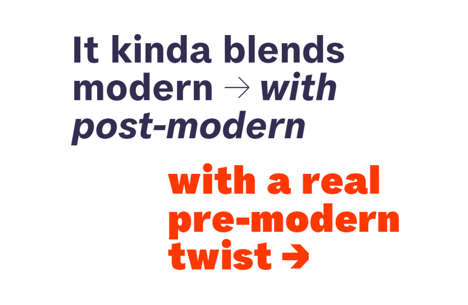
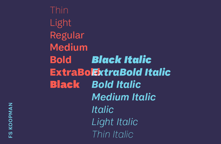
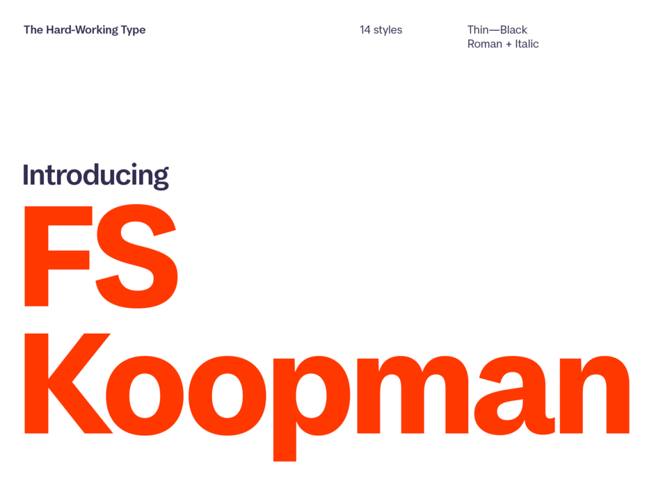
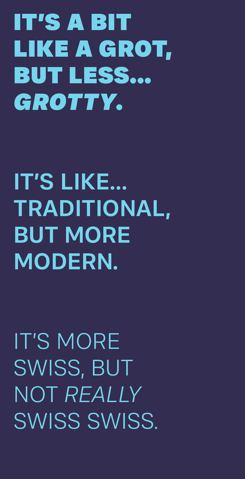
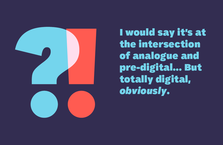
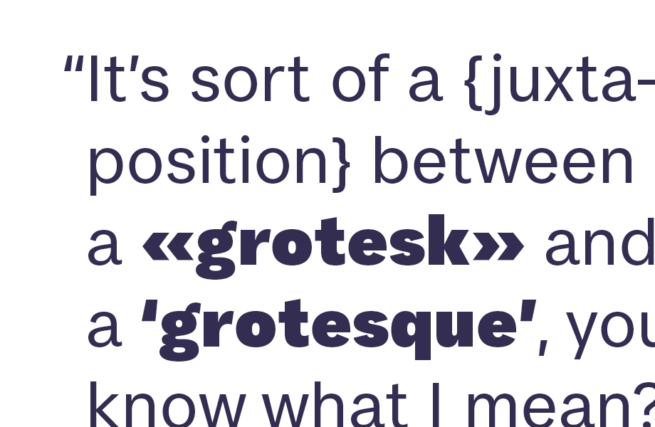
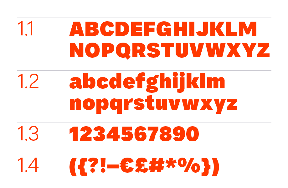
FS Koopman is the latest addition to the Fontsmith library. Designed by Andy Lethbridge and Stuart de Rozario with creative direction from Jason Smith, it draws on a range of inspiration; Swiss grotesk, American gothic and English grotesque. The fact that it is slightly difficult to define using typical descriptions gave rise to a playful and slightly tongue-in-cheek launch using typographic jargon.
In this article Andy and Stuart talk about how the typeface came about, the design and the launch campaign.
It’s quite unusual to have two Fontsmith designers working on one typeface, both having creative input. How did this come about?
Andy Lethbridge (AL): I had been working on FS Koopman for some time before Stuart got involved in the project. It was a design that I’d hit a wall with and decided to park for a while. I would dig it out every now and then and tweak things here and there but I wasn’t completely happy with it. I felt it was missing something but wasn’t sure which direction to take it. I showed it to Jason and he felt it was a good base and so we decided it could be interesting to get Stuart’s input and try to finish it as a team.
Stuart de Rozario (SD): It is quite unusual to have two or three designers working on a library font project but I see FS Koopman as Andy’s baby as he had already designed the basic structure. I was like the step-father nurturing someone else’s child and crafting a new personality for the design. My role came about 50% down the line. Because Andy had hit a wall he was happy for me to push the tone of voice in a different direction.
How did you decide on the direction the typeface would take?
(AL): We had set out to make a new grotesque that combined features from the early Swiss/European/American and British sans serifs. But we all still had our favourites and preferences. I had a soft spot for early Swiss and German designs, Stuart liked the look of some of the very early British grotesques and Jason really enjoyed the classic American gothics. As a team we were able to bring all these ideas and preferences to the table and work out how to combine elements into a fresh approach.
(SD): This genre is saturated in the market place, so the three of us had an interesting challenge of designing something new.
Did you have any creative differences? How did you deal with them?
(AL): There are many areas within type design that are subjective and different designers have different ways of doing things. I think at one point we may have disagreed on the positioning of the acute accents but apart from that it was a smooth process.
(SD): When you have two or three creatives involved there can be issues that crop up, proper fisticuffs, but not here. In the early stages we had discussions over whether the basic style would go European, American or British grotesque, so we all had our input and put our thoughts into one big melting pot and tah-da!
A bit like a band on tour, everything was alright on the night. Actually Jason gave me a free reign to do my worst and Andy was also happy to let me conjure up something new.
How would you describe FS Koopman?
(AL): To me FS Koopman is a hybrid. It’s a workhorse with a dash of Swiss grotesk, a splash of American gothic and a pinch of early British grotesque. In combining these categories we’ve managed to retain the reliable functionality of the grotesks, the robust confidence of the gothics and the quirky charm of the grotesques.
(SD): FS Koopman is like a Swiss Army knife, the basic skeleton has a strong solid structure, the tone of voice is approachable and the details are human.
What are your favourite elements of the design?
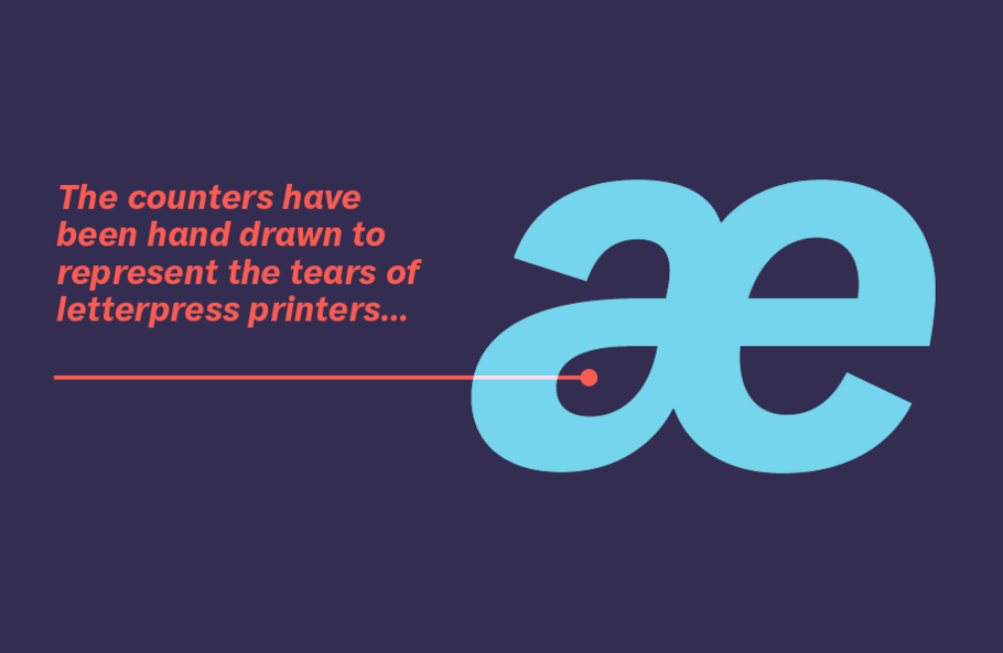
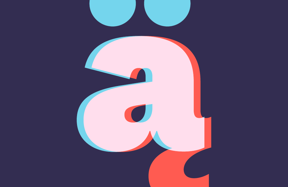
(AL): My personal favourite is the lowercase ‘a’. It’s always the letter I draw first and is therefore where many fundamentals of the design are worked out. In this case I think it manages to feel functional but not sterile.
(SD): It’s always difficult to pinpoint a favourite element but the overall tone of voice is something I am proud of and excited about. Generally grotesque ‘a’s’ tend to be quite often a focal point in this genre, I wanted this ‘a’ to be something with distinction and personality – and it certainly has both in abundance. The ‘a’ is my favourite glyph followed by the ‘£’.
What makes this typeface different from other grotesques on the market?
(AL): The grotesque/neo-grotesque genre is a crowded one and packed full of Helvetica-ish clones so the idea that first initiated the project was to create a new grotesque family that was just as functional and usable but retained some personality and warmth. I think FS Koopman accomplishes this and brings something different to the table.
The launch campaign mocks font jargon, why did you decide to launch the typeface in this way?
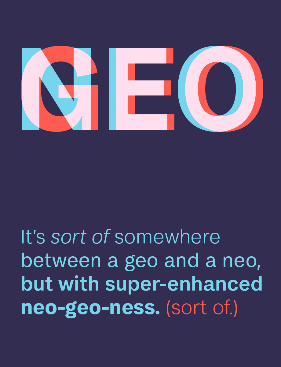
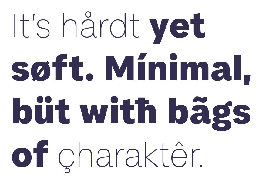
(AL): Type design is definitely a pretty niche field and with this comes a whole lexicon of peculiar words and phrases. You’d often hear Stuart or I saying things like “I like this ‘c’ but could it be a little more grotty, not grotty grotty, but just a touch more grot”. The type of thing that if a stranger overheard they may think we were speaking a different language. The most amazing part is we’d usually both know exactly what the other meant. This jargon gets a little ridiculous sometimes but we thought it might be a nice way to present the fonts, and relates back to the hybrid concept behind it all.
(SD): Agree with what Andy said. We sit side by side in the studio and have good banter, he takes the piss out of me and I out of him. I’m the older brother and he’s a young whipper snapper. We are a little bit chalk and cheese in some ways, he likes certain designs / typefaces which I can’t stand, but generally we have similar vision on how typefaces should be designed.

What can it be used for?
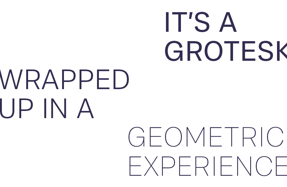
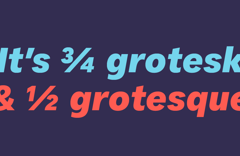
(AL): FS Koopman is definitely a workhorse. It’s practical, functional and versatile and can therefore be used just about anywhere.
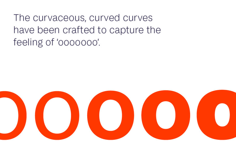
(SD): FS Koopman is a gentle, approachable, humanistic grotesque and doesn’t have the harsh proportions of other grotesques around. The texture is soft and the details are smooth rather than brutal. This allows for a multi-faceted typeface which looks completely different in a formal or expressive setting, small text or large-scale branding.
What does it pair with?
(AL): I like a lot of contrast when pairing fonts, so for me I think FS Koopman would look great alongside an elegant serif, something like FS Brabo could look great. Or even FS Siena could work really nicely.
(SD): I agree FS Brabo is a good match.
Test drive and buy FS Koopman.
