Behind the scenes: Tools of the Trade with Richard Kindersley
Behind the scenes: Tools of the Trade with Richard Kindersley
Emily Gosling Inspiration
“What’s amazing is when you’re brought up with something all around you, you don’t see it, you take it for granted,” says Richard Kindersley, discussing his formative experiences working at his father’s lettering studio. “What I found there was this idea that you could think of something in your mind, and then make it in your hands. That just electrified me.”
That was the moment Kindersley Studio suddenly became a family concern, with Richard continuing the legacy his father David had left behind. The elder Kindersley studied as an apprentice with Eric Gill, and founded the Kindersley Workshop (later the Cardozo Kindersley Workshop) in 1945. He made a name for himself as a renowned stone and letter-carver and typeface designer, creating fonts including Octvaian, a street-sign alphabet for the Ministry of Transport, and sculptural commissions such as a relief carving of Sir Philip Sidney for St Paul’s Cathedral.
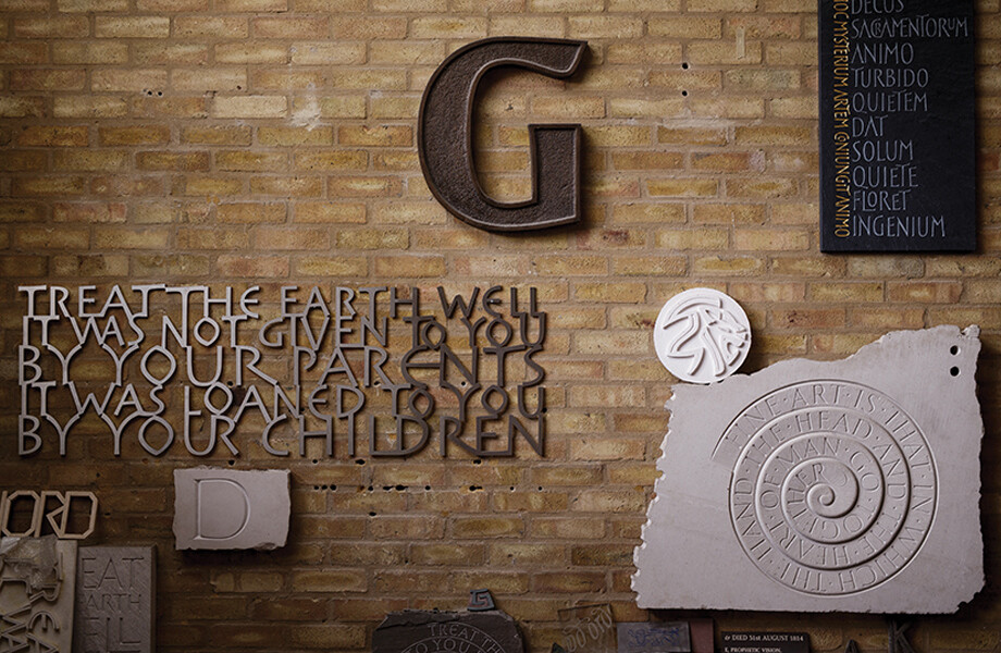
Richard Kindersley’s career is no less impressive. He set up his own studio in the capital in 1970, nestled in an unassuming street near Vauxhall in south London from which he still works today. Among the projects that have emerged from this little spot are commissions for Tower Bridge and the M25 Bridge, St. Paul’s Cathedral, Westminster Abbey, the V&A Museum, and numerous beautiful stone artworks bearing quotations from the likes of TS Eliot, Kindersley’s favourite poet alongside Philip Larkin.
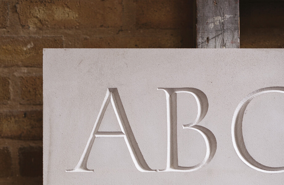
The studio is split across two floors divided by a dusty spiral staircase: the ground floor acts as the main workshop, and houses numerous chisels, mallets, pencils, papers, and drawing implements like rulers; while the top floor is a vast workshop of books focusing mainly on sculpture and typography. While he does use computers for font design occasionally (favouring Fontlab software), Kindersley is resolutely an advocate of working with his hands.
“I trained with my father, and I did sculpture at Cambridge School of Art for the same thing – making things. In some contemporary craft ideas people are trying to automate craft, but I think it must remain a very simple process, thinking about something and imagining it. You use your imagination to make it, I think is really important.
“Craft can’t be machine made. The ‘craft’ bit is the human intervention in the making process, which has all sorts of other qualities: when you makes something you might be relaxed, or you might be tense, or you might be happy, or you might be upset – and all this background vibrato goes into the making. If you show people a bit of very nice craft making, the first thing they want to do is touch it, and I’m sure they’re getting some sort of feedback from the maker in doing that. The more quality there is in the making, the more people want to touch it, pick it up, feel it or whatever; so I think that’s really important.”
It seems others agree: Kindersley points to the resurgence in recent years to deal in tactility and hand-crafting as helping drive a boom of sorts in recent years for hand-carved lettering. When he first started out, there were only four or five other “really good” people working like that, he says – now there are around 20-25, and a third of those are women.
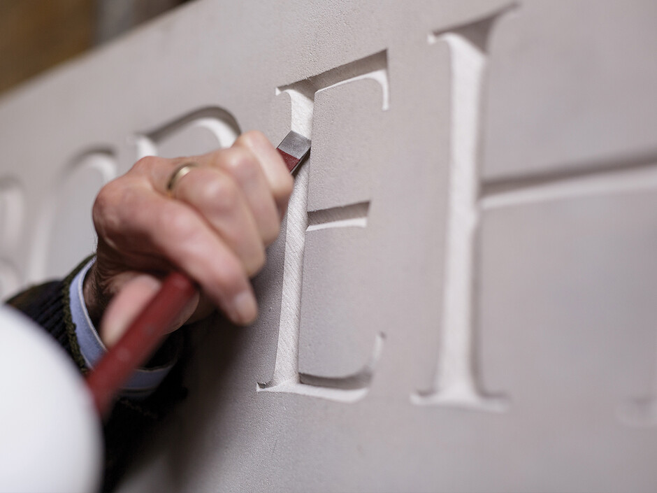
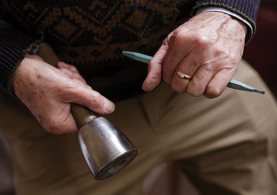
The main tools Kindersley uses in the making process are his chisels, tipped in tungsten carbide for sharpness, and mallets in various weights, which are today made of nylon (these would have been in wood in the past.) The first step for any project is presenting a scale drawing for the client, showing the “basic ideas” of what he wants to do and mapping out the size of the work and of the letters. Once that has been agreed, a full-sized drawing is presented, along with the stone itself if a stone carving has been commissioned.
“Once we have the stone we finish the drawing,” Kindersley explains, “as there’s this interplay between the drawing and the surface.” The drawing is then transferred onto the surface of the stone using carbon paper. “And then we go over with a pencil just to adjust it,” he says. “If you’re drawing a design on a piece of paper it’s one thing, but if you’re drawing on a stone it has bumps and things, and weaker bits and strong bits. You have to adjust the lettering to work around that.
“There’s a relationship between the style and the letter on any given material: the very coarse stones have to have a very bold letterform onto it, but working with very fine stones like slate is almost like metal engraving – you can do anything. I’m always interested in the relationship between the surface of the stone and the inscription on it. It’s like a duet: you have the voice of the stone, and the voice of the lettering, and what you need to do or attempt to do is meld those two together so they’re both singing together equally.”
For the carving itself, he works from the bottom of the stone up to keep the drawing free from stone dust and ensure that rogue hands and elbows aren’t rubbing off any of the design.
Kindersley’s studio is currently busy with his biggest project to date: a D-Day Landing memorial in France, bearing inscriptions of 23,000 names of soldiers killed during the Normandy campaign. “It’s an awful lot of people, it’s terrifying,” says Kindersley. “As there are so many letters we couldn’t do it by hand, it would take years, so we’ve designed a special typeface which can be machine cut.
“It’s very difficult and slightly dishonest to design a typeface that looks hand-carved, but what I’ve tried to do is just give a little sparkle to the inscription. The sparkle of hand-carving is that all the letters are slightly different depending on your mood, your attitude and so on when you’re carving. So I’ve tried to add little bits to the lettering to reintroduce that sparkle.
“Modern warfare is horrendous in that you have these incredibly efficient machines designed specifically to kill people, so what I was trying to do in my designs is to use lettering which is humanistic, which is the opposite. You see a lot of war memorials which use very blunt lettering, and I think they’re reinforcing that aspect. A memorial should be reflecting the humanity, so you need to use type which has humanity built into it.”
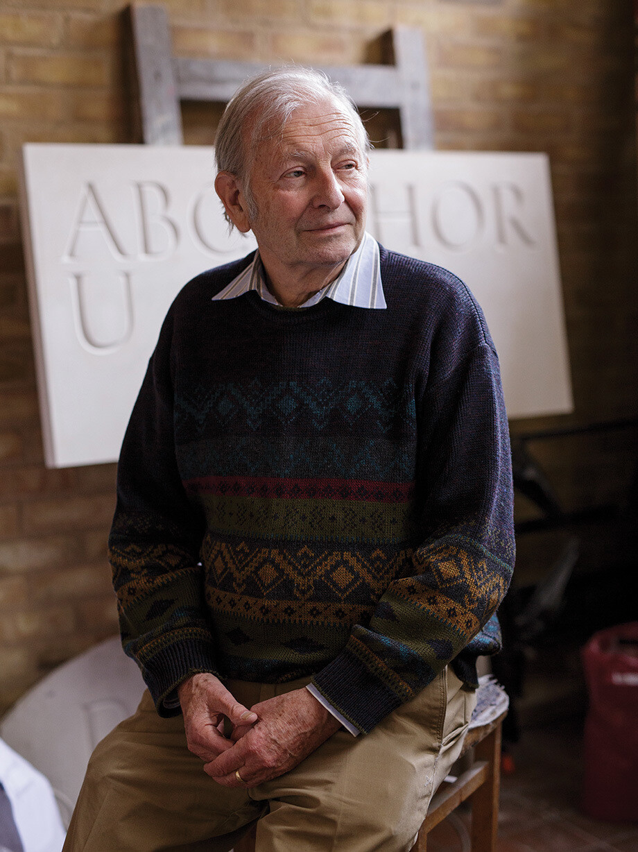
Having been at the helm of his studio for more than 45 years now, it’s wonderful to see Kindersley’s work thriving, and him working on projects that are so thoughtful, valuable, and rendered with such specific skills. I suggest that it would be easy to assume that such traditional methods and commissions would be diminishing, rather than thriving. “The opposite is true,” he affirms.
“We all need food and sleep and all the other basics, but we also need art or a touchstone to things that are creative. That’s just as good for you as Weetabix in the morning – it’s really important, and people don’t always understand that. So perversely, the more things that are mass produced, the more interest there is from people for things that are made by hand. There’s that yearning, so art and craft today has never been more popular.”