Fontsmith launch FS Benjamin with 'Sounds of London' by DixonBaxi

Fontsmith launch FS Benjamin with ‘Sounds of London’ by DixonBaxi
Tamasin Handley New typefaces
FS Benjamin is a new flared serif typeface consisting of 12 styles ranging from Light, Book, Regular, Medium, SemiBold and Bold with Italics. The typeface is inspired by the contrasts of London and named after Big Ben. The font was designed by senior type designer Stuart de Rozario with creative direction from Fontsmith founder and creative director Jason Smith.
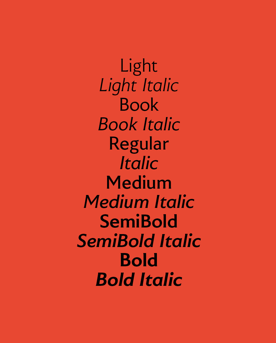
The typeface itself has clear, delicate letterforms, punctuated with brutal chiselled angles. With a pure and crafted feel to the forms the typeface has traditional roots but has been designed to work in a contemporary setting.
Walking around London Jason Smith was inspired by the old mixed with the new. Glass, steel and modern architecture was juxtaposed against the traditional signage and coats of arms seen around The City. His surroundings sparked an idea to make a modern design based on the kind of alphabet that would traditionally be carved from stone.
Stuart de Rozario took inspiration from engraved inscriptions of a bygone era and added a modern pen-written twist.
Designed with archetypal proportions of x-height to cap height and ascender to descender ratio, the typeface feels familiar and highly legible. Character definition across letterforms which can be confused like the (‘B’, ‘3’ and ‘8’) or the (‘1’ and lowercase ‘l’) make the font more accessible.
Fontsmith approached DixonBaxi to collaborate on the launch campaign with a simple brief. Show the typeface in an unexpected setting. Push the boundaries and show how a traditional design can work in modern applications.

The idea of London – with its contrast and diversity, immersive and visceral energy – as a symphony of noise, unexpected contrasts and vibrant expression inspired the font from its conception. The ‘Sounds of London’ was a concept born out of this idea. Consequently, the name FS Benjamin came from the most iconic sound in London, the great bell on the Houses of Parliament in Westminster ‘Big Ben’.
The entire DixonBaxi team took to the streets over several weeks to capture a huge mix of sounds, noises and snippets of conversations at different times of day, from the commute to the weekend in the park and to lesser known parts of London.
In collaboration with Zelig Sound, they produced a unique track that remixes these field recordings into a soundtrack of London which has been pressed into a limited-edition vinyl. Side A features one track that is a fusion of conversation, looped-noise and sound-design to create an immersive soundscape that captures the essence of city life. While Side B is 10 minutes of raw field recordings. These take on a new life when abstracted from their natural environments – challenging perception of the familiar.
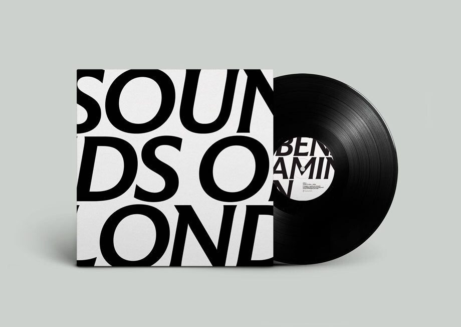
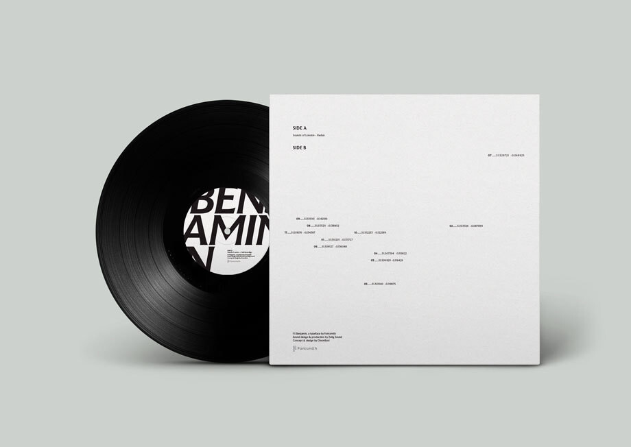
The record cover features a close crop of the words ‘Sounds of London’ set in FS Benjamin, while the reverse features co-ordinates of where the sounds were recorded, laid out true to their location on a London map.
A limited run of 100 vinyls were produced. The first 20 sales of FS Benjamin will come with a free copy and the rest will be available to purchase from the Fontsmith Shop.
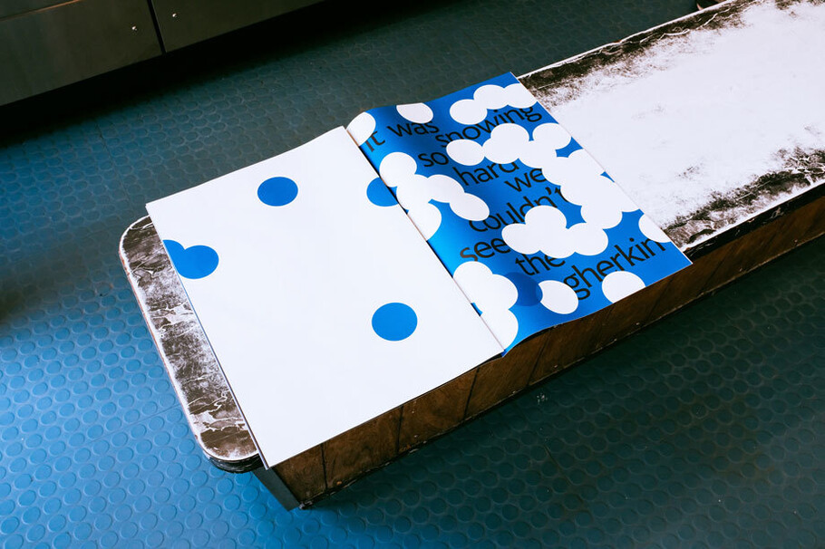
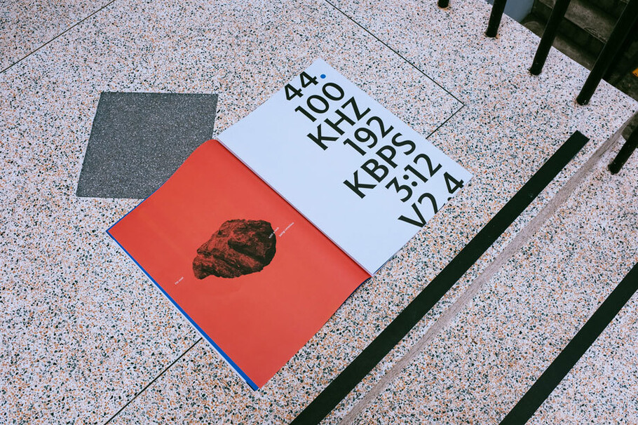
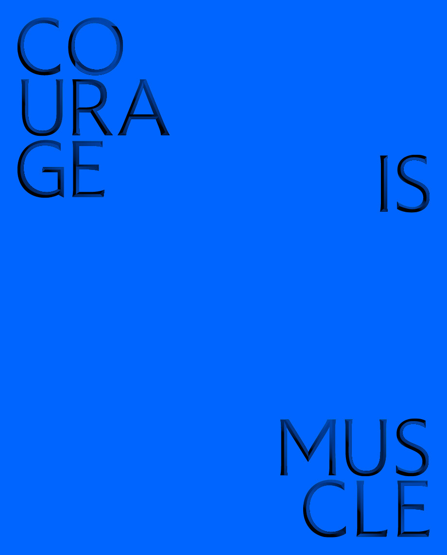
Alongside the vinyl is a large-format unbound booklet. The sounds, and overheard snippets were transcribed and expressed typographically to form a unique printed piece to showcase the font. A dramatic range of expressions were created, from quiet to loud, ambient to conversational, testing the font to the limits of legibility while respecting the need to demonstrate its ability to work in a modern way. For one of the posters, DixonBaxi ran the soundtrack through the letterforms themselves, distorting the letters to create unique compositions.
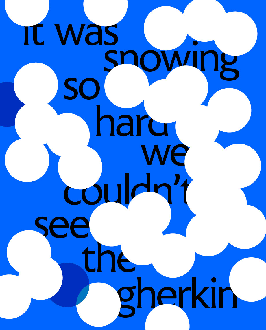


An eclectic colour palette was created to balance tradition and modernity, while the layouts are deliberately unstructured to represent the restlessness of the city. Collaborating closely with Push Print a tactile experience was created from the scale of the format to the choice of the recycled stock and the way it is packaged ready to be sent to creatives across the UK.

Fontsmith founder Jason Smith said: ‘Much of the typography we see today is so similar. I thought what if we created a typeface with traditional roots but modernised it to sit amongst the punk and noise of the streets of London. Old with new. Business with busyness. This is what London is all about. A huge mix. Everything sitting next to one another in a buzzing busy culture of society and work.’
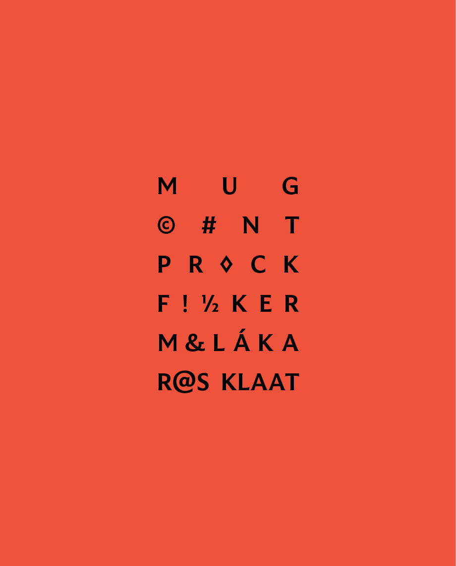
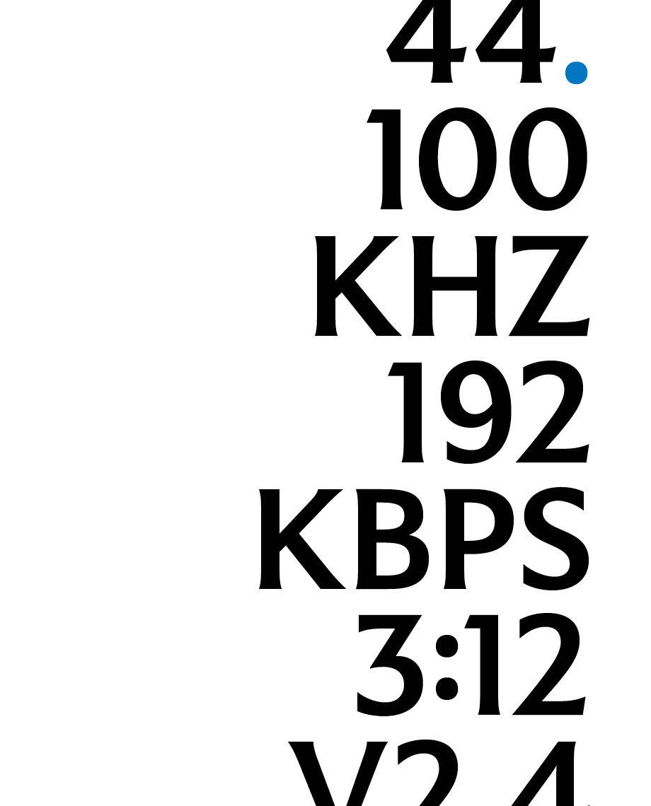

The FS Benjamin ‘Sounds of London’ posters make up the booklet which is available to purchase from the Fontsmith Shop.
