Custom type for UEFA Europa League
Custom type for UEFA Europa League
Phil Garnham Custom fonts
Way back in the summer of 2016, Turquoise Branding invited us to collaborate on a pitch to rebrand the UEFA Europa League 2018—21 competition.
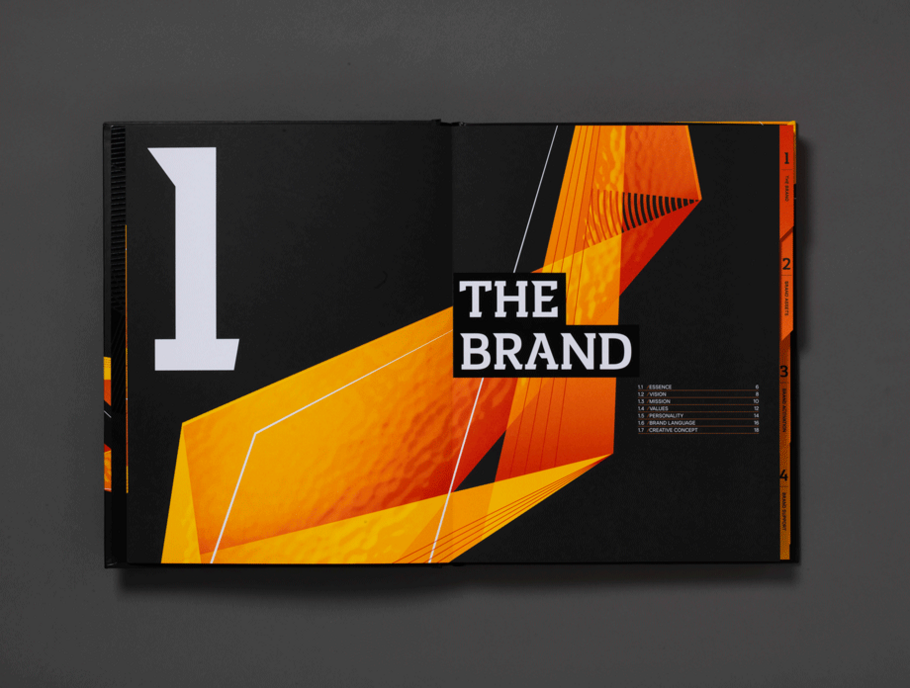
Turquoise were developing an angular symbol for UEFA, a wave of energy that passes through and unites all visual elements of the identity. They were looking to create a bespoke typeface that reflected this theme, one that could embody the spirit of the dynamic proposal and become synonymous with the competitions values. A typeface that could communicate energy, ambition, spark and positivity.
Born from the shape of the Europa League cup, which features triangular, hammered metal sides, the identity and our typeface inherited this aesthetic.
Our brief was to create a bold headline typeface, for use large scale. It needed to create an impactful brand experience and most importantly be highly recognisable.
After receiving our briefing from Turquoise we immediately investigated our slab serif typefaces and how they could be manipulated to express the brands energy wave angularity at varying degrees.
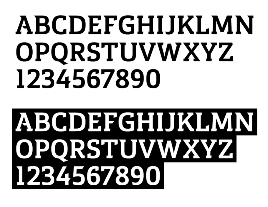
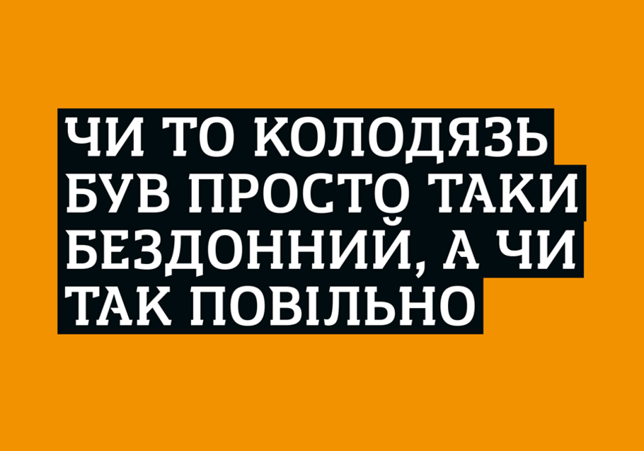
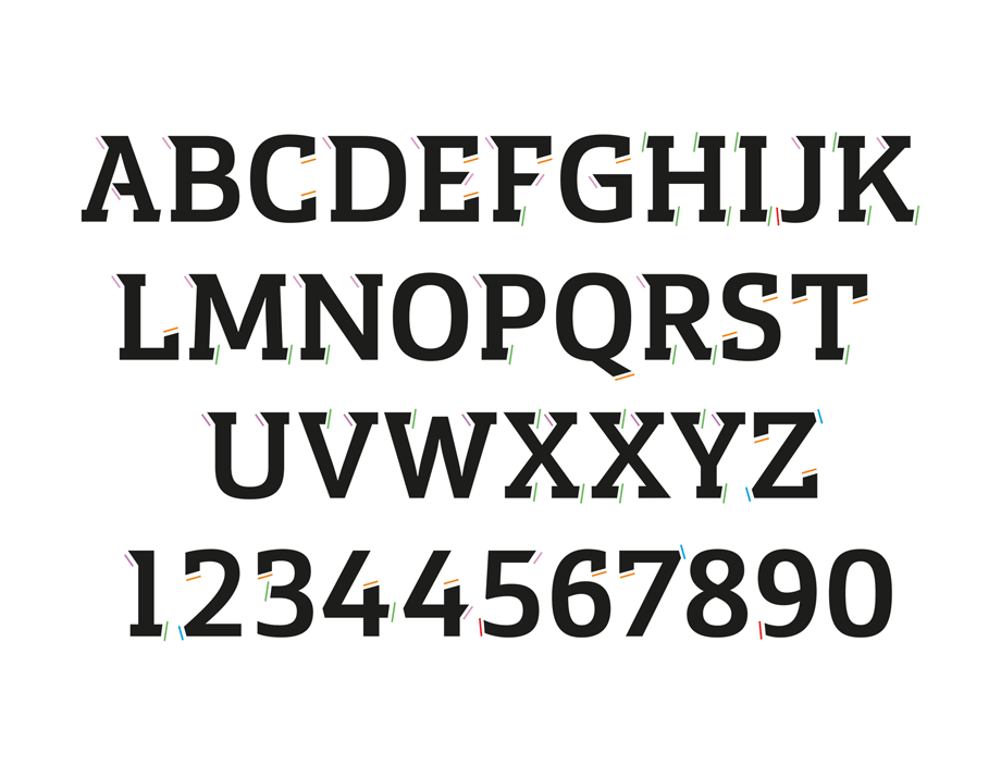
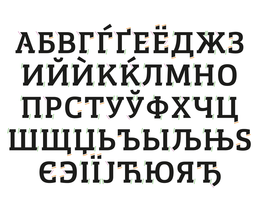
We began a process of exploration around slab serif typefaces, creating a foundation for the design. A large focus of our process was the angles of the terminals, which take cues from the angular identity. These angles went through several rounds of refinement to create a harmonious system. The weights and contrast were then adjusted and defined across the alphabet. Once we had the Latin finalised we expanded the design into the Cyrillic script and Europa Title was born.
Angle refinement – Latin
Angle refinement – Cyrillic
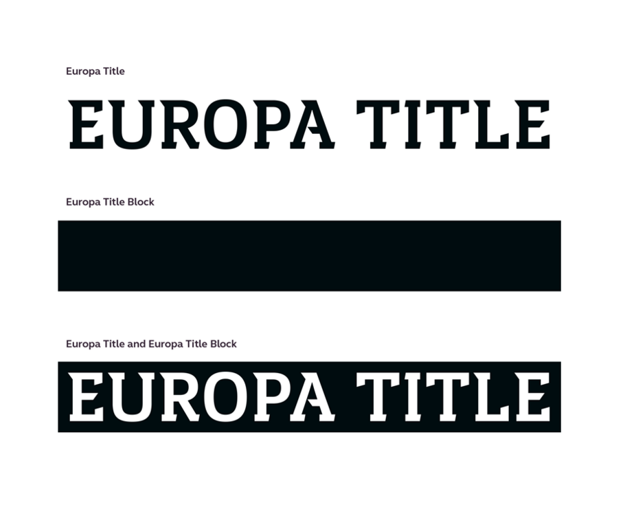
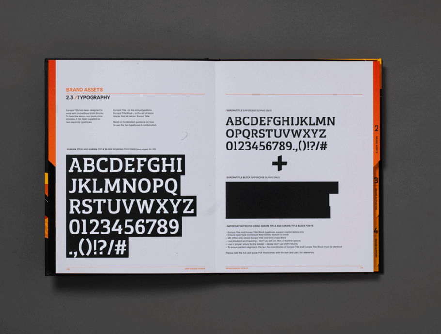
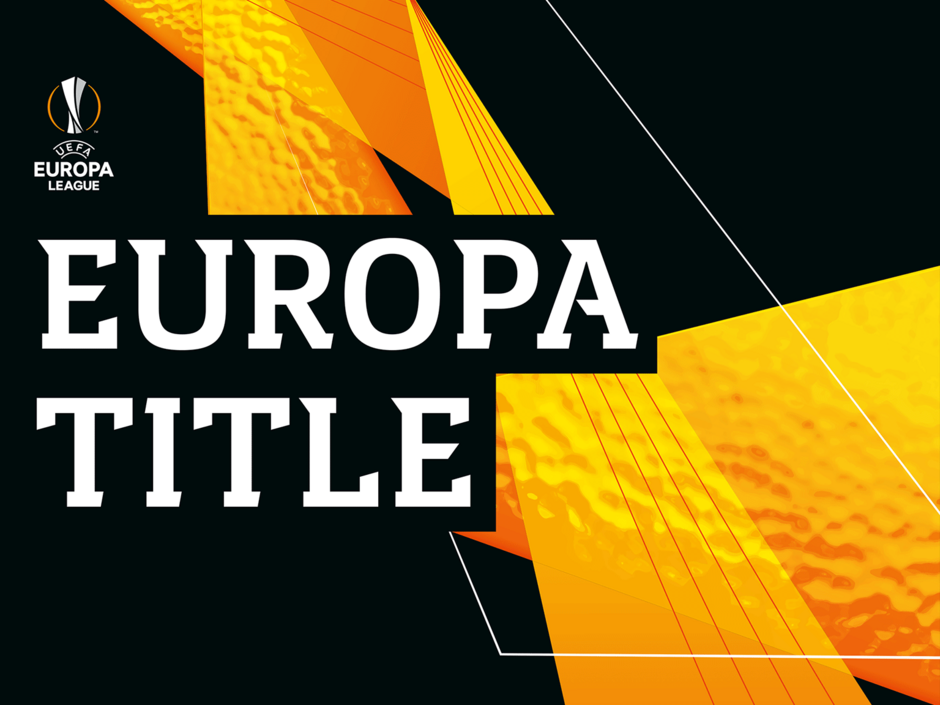
With so many aspects of angularity in the identity there was a need to enforce some clarity around the typography. To allow the typeface to be used on any background we developed a blocking font. Built to the letter widths of Europa Title this font creates a perfectly sized background for the Title font to sit on top.
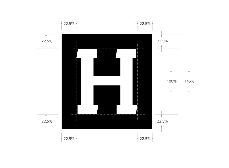
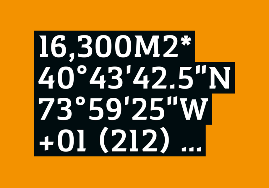
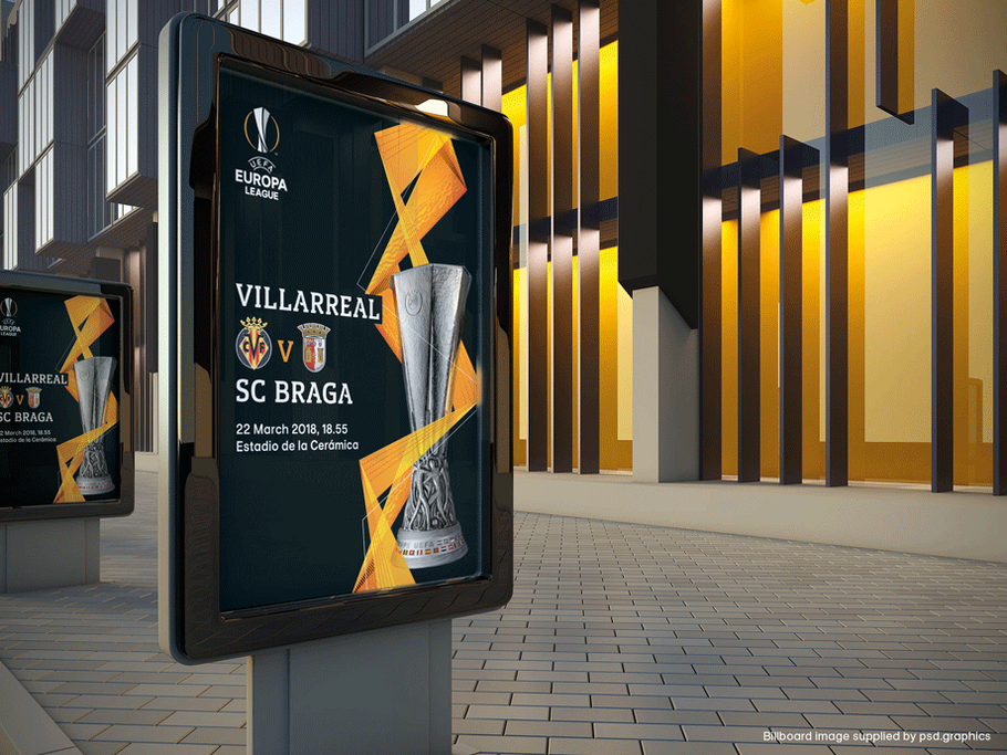
The use of the two fonts together gives impact to the typography when used over the top of photography or other bold imagery. This font is titled Europa Title Block.
We developed a set of guidelines for the fonts to be used in the Brand Manual to help clearly define the correct implementation.
The new identity is set to roll out when the competition kicks-off for the 2018/19 football season and the new typefaces will be used both on-air and off-air.
