Skin deep – typography and tattoos
Skin deep – typography and tattoos
Emily Gosling Inspiration
Tattoos once served as emblems of defiance, danger and rebellion: images that had mothers weeping and careers advisers holding their heads in despair. Today, however, these countercultural connotations have abated as tattooing has worked its way into the mainstream. Many people you know probably have one (visible or otherwise), and the tattoo taboo has softened. According to a piece in The Atlantic, nearly one in five people in the US now sport a tattoo, rising to nearly 40% of marketing’s favourite demographic, those pesky “millennials.”
With the rise in inkings and their wider acceptance, we’re seeing far more than traditional roses, swallows, anchors or well-intentioned inscriptions of lovers’ names. And while a picture is said to speak a thousand words, sometimes words are exactly what people want on their skin, and so typography and tattooing are disciplines more interlinked than ever.
The most common route into tattooing is through apprenticeships, taking anywhere from one to three years, which involve learning the trade on the job as well as studying aspects such as contamination and the more physical risks that could come with badly created work. While many tattooists come from an art background, most learn the nuances of letterforms on apprenticeships or on the job. And of course, considerations around kerning, sizing and other typographic technicalities are very different creating designs for skin compared to for print or digital applications.
Lord Montana Blue (yes, that’s his real name, not an aristocracy thing) has been working as a tattooist in London’s King’s Cross for the past ten years, having studied a degree that combined fine art and graphic design and working as a freelance graphic designer on graduating. “I was getting tattooed a fair bit while I was working as a designer and then thought it was a gamble worth taking to learn how to do it,” he says.
It seems his grounding in graphics and lettering fostered an initial understanding of type forms that was honed as he worked more and more on skin and stepped away from graphics client work.
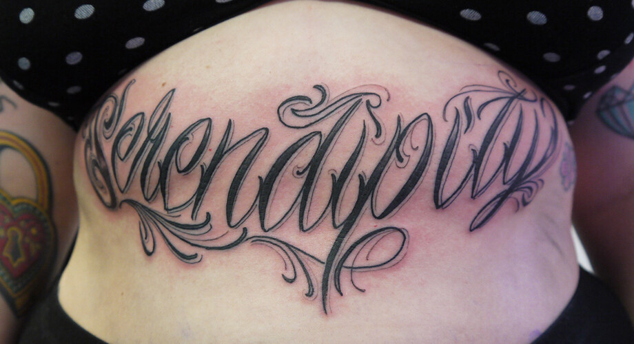
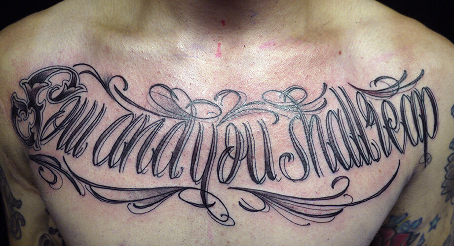
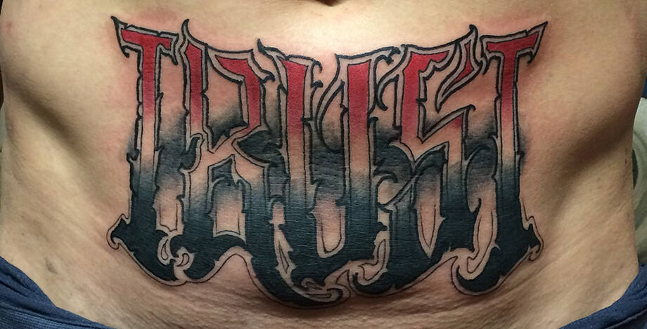
Sow and you shall reap: The intricate ornimented script lettering of Lord Montana Blue (above and below).
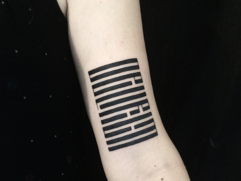
Fellow London-based artist Mishka also got into tattooing having studied art, moving away from a conceptual installation-based studio practise that she says was “haemorrhaging money” to work for a friend who became a mentor and trainer, Kali. Mishka’s lettering work is strikingly bold and geometric, rendered in a style that draws on her Belarusian heritage. “In general the only font I’m interested in is Vyaz, so it’s very geometric using long vertical lines,” she says.
“I’m interested in that style as it’s not only script, but also an image, so it’s not always obvious what’s written. It’s based on an old Slavic church font, so you’re trying to slot letters into one another a bit like a logical puzzle. It’s constricted but beautiful and repetitive – a mix of being creative and rule-driven.”
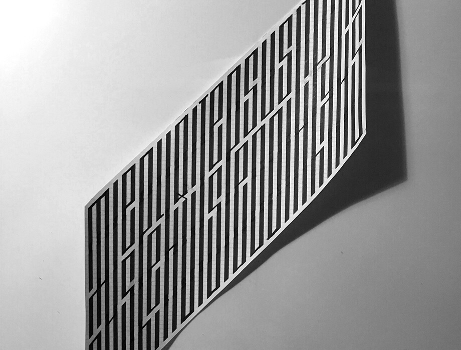
The letterforms Mishka draws from were traditionally used for icons and religious manuscripts in Cyrillic, but in her tattooing she draws her own versions on graph paper by hand either in English or Russian alphabets. “Once you understand the rules you can make them more gothic or Constructivist,” she says. “Personally I like a bold, graphic approach, and I try to do things that are a bit unusual or that not everyone else is doing.”
Ultimately, it’s the role of the artist to guide people into collaboratively coming up with the best solution for the word they want, where they want it, how they want it drawn and ensuring it’s stylistically something suited to their design and personality.
“Not every size of letter and not every font works on skin. Some people come in and say ‘I want this word and this font and I want it here’ then we guide them through things like letter sizes,” Blue explains. “I’ve got books and books and books of different letterforms with different styles so sometimes we try to open their mind a bit if we’re not sure their idea would work, or offer to make them a hand-drawn version. Other people will come in and say they want something that looks cursive, or like Old English, or a little bit ‘gangster’ or ‘horror’, then I’d go away and work on that the same as I would with anything else.”
For Mishka, her process involves sending customers a number of different examples of the word they want drawn in her style, “ranging from the more feminine to the more gothic, or minimalist, or bold.” They then choose from up to 20 versions and she designs a custom font for them. “Some words constrict better and more elegantly than others,” she says. “It’s also very important to determine where they want it on the body, as that determines the shape of the letters. You have to be so careful with curvier body parts as the image can distort so much.”
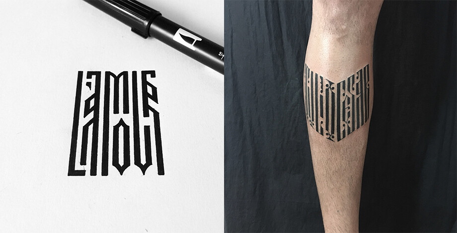
Above: The highly condensed and geometric work of London-based artist Mishka draws on her Belarusian heritage.
As Stewart O’Callaghan, a tattooist currently based in Brighton who learned the trade having been studying for a PhD in psychology points out, most people that come in aren’t aware of things like serifs, and “neither should they have to be.” He considers that having an artistic background could in fact be a hindrance to becoming a tattooist, “as not every art style aligns itself with tattooing.” He explains: “You have to think about line weights, composition and things, so it’s more like illustration. There’s been a growth in stark, illustrative tattooing styles as maybe more people are coming out of illustration degrees and want to apply what they’ve learned to tattoos.”
When working out lettering designs with customers, O’Callaghan finds that many people simply know what they want written and where. “People often find it hard to visually map script, and so it’s your job to be able to draw that from them and guide their hand in the room.” He says that a lot of people want internet-ready type, and so uses the online resource DaFont, an archive of freely downloadable fonts. “But a lot of them aren’t tattooable,” O’Callaghan concedes, “so you have to think about where that design meets the body. I’ll often steer people towards something hand-drawn as I know that suits the sort of work I do.
“One of the biggest problems in lettering on the body is size, because when we do a tattoo the lines can blur a little and even a millimetre is the difference between a ‘c’ or ‘e’. Sometimes with a font we’ll have to make the negative space bigger to make it clearer and be honest about people’s expectations for having a word in a difficult place, like behind their ear. Generally it’s best to push for lettering five or ten per cent larger, as you want it to read well years down the line.”
Mishka also stresses how different skin’s interaction with ink is compared to paper: “Things like the detail and scale are very different,” she says. “The contrast between black and white on paper is one thing, but on skin black becomes blue over time and the skin almost acts like stained glass as the ink ages – it grows, so the lines will get fuzzier and if the negative space in lettering is too small it eventually becomes illegible.”
Blue most often works by drawing an image and creating a stencil, though other artists work freehand onto the body, working in a similar way to how a traditional sign painter might (albeit onto very different surfaces). But as Mishka points out, however you create an image, the most important consideration is its translation onto the body itself, and the individual person. “Anything you do with a tattoo has to accentuate the way the body flows,” she says. “You have to think about the person and the impression you get about their personality. You get a feel for a person, and I try to make something that harmonises with their personality and their aesthetics, or how they carry themselves.”
The advent of social media and image-based online resources like Instagram and Pinterest has not only popularised tattooing and opened up new avenues for inspiration, but it’s provided an easily curated and beautiful shop window of sorts for tattoo artists. The flipside is that it’s also meant a rise in trend-led tattooing work; and even more frustratingly for artists and customers, created a set of unrealistic images that simply aren’t possible. Many are Photoshopped, or cannily shot just as the ink is fresh. As such, there’s little indication of how such designs look in real life, let alone after a few years of being on skin that naturally morphs and changes with the body and in the elements.
Trend-wise, Blue says that “at the moment there seems to be a fashion for a very loose handwritten scrawl that looks like a heartbeat line, but it’s so stretched that there’s no negative space in the ‘o’ or ‘e’ even on paper. Whatever you do the line will always stretch and look different to how it looks on paper just because that’s the line you get with tattooing. You have to think about what it’ll look like in three or four summer’s time, and once it’s been stretched across skin. Bigger letterforms will always work best.”
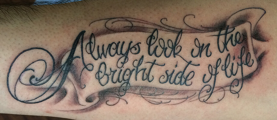
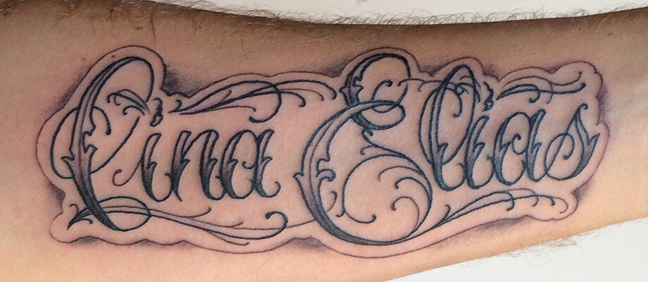
Above: A range of script and lettering styles by Stewart O’Callaghan
O’Callaghan adds that the styles that work least well as those “messy by design,” or that have a sense of rawness about them. “Things with a certain amount of crispness about the design work well, but you have to think about if you’re working with the flow of the body or against it,” he says. “It helps to pick soft scripts or big lines, something like a Chicano reference [Mexican-originated lettering] – that’s interesting because it mixes very heavy, bold letters with very thin cursive fonts. It’s that contrast that makes a very beautiful tattoo.”
“People are often scared that they don’t have the vocabulary to take the creative lead,” says O’Callaghan. “Often they’ll bring in pictures but you don’t want to just recreate another person’s tattoo as it’s against the moral code of tattooing. People who are more concerned about size can give you the threshold of how large they would be willing for the tattoo to go, but you want people to feel part of the creative process and trust you.”
Blue finds social media and online imagery to be both a blessing and a curse. “It’s a struggle,” he says. “People come in with their heart set on something and we’ll give all the advice we can but you have to draw a line in the sand. I don’t want to blame Pinterest and social media but it can give the wrong idea, or an image will have been taken out of context having been reposted and reposted. With tattooing you have to consider the shape of the body, and how something might work differently on male or female bodies. Sometimes you say something can’t be done, and people will then just go to a less reputable artist to get it done there.”
With any sort of tricky negotiation, Mishka says that it’s vital the artist is patient and empathic, and will even show clients an image of a celebrity with their fresh tattoo, and another of the same tattoo six months later to try and demonstrate how mutable things can be. “The trick is to be patient; try and see where they’re coming from,” she says.
The other issue with social media feeds, as O’Callaghan says, is that they act as an “aggregate of popularity and the number of people hitting the ‘like’ button. But that’s not the same as a well executed idea or level of taste. Things can rise to the top that mean great work goes unnoticed.”
Blue and O’Callaghan agree that cursive fonts – particularly Diana – are the most popular requests, and a common challenge is to simplify or enlarge the design to ensure legibility. The same applies to customers who want lettering created in the style of their own handwriting. The key is to maintain an awareness of “what sits well on the body,” says Mishka. “The body isn’t flat pages: a big block of text might mean a lot to somebody, but it doesn’t mean it’ll look good visually. If the script functions like a well-tailored item of clothing, it’ll look good on the body.”
Blue cites an instance of writing the entire Lord’s Prayer across a customer’s arms, using letterforms at just 5mm high. For him, the most fun letter-based tattoos to draw are “around five or six letters long, a big script where I’m given the freedom to run wild.” They also agree that the very true cliché in tattooing is that the smaller the tattoo, the more the customer is likely to fret about style, sizing and placement.
The style and shape of letterforms are one thing, but what about the content? Are there any words, or phrases the artists wouldn’t ink on moral grounds? “Something I always think about is the fact that at some point you’ll be sick and in hospital and can’t speak for yourself, so your body will speak for you,” says Blue. “I’d rather not put something on someone that will have them judged. So sometimes I’ll swerve things where I don’t want to be responsible for anything negative that happens to that person because they’re wearing a certain word.”
Mishka is even more emphatic about where she draws the line, literally and metaphorically. “I won’t do partners’ names,” she says. “I’ll do dogs’ names, kids’ names, gods’ name even, but I won’t do partners names. It’s like a jinx.”
Get some ink
Lord Montana Blue: @montana_blue
Mishka: @mishkatattoo
Stewart O’Callaghan: deadslowco.com