New Fontsmith typeface FS Irwin is inspired by architecture, New York and cosmopolitan city life
New Fontsmith typeface FS Irwin is inspired by architecture, New York and cosmopolitan city life
Tamasin Handley New typefaces
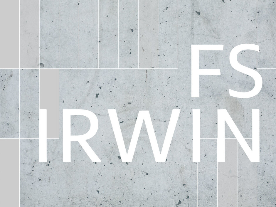
New typeface FS Irwin® takes a transatlantic look at lettering.
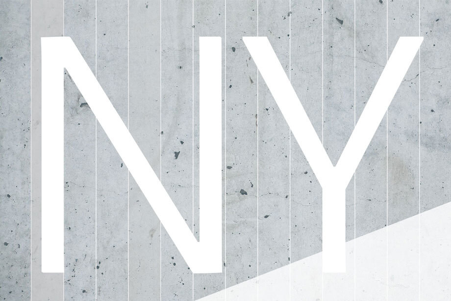
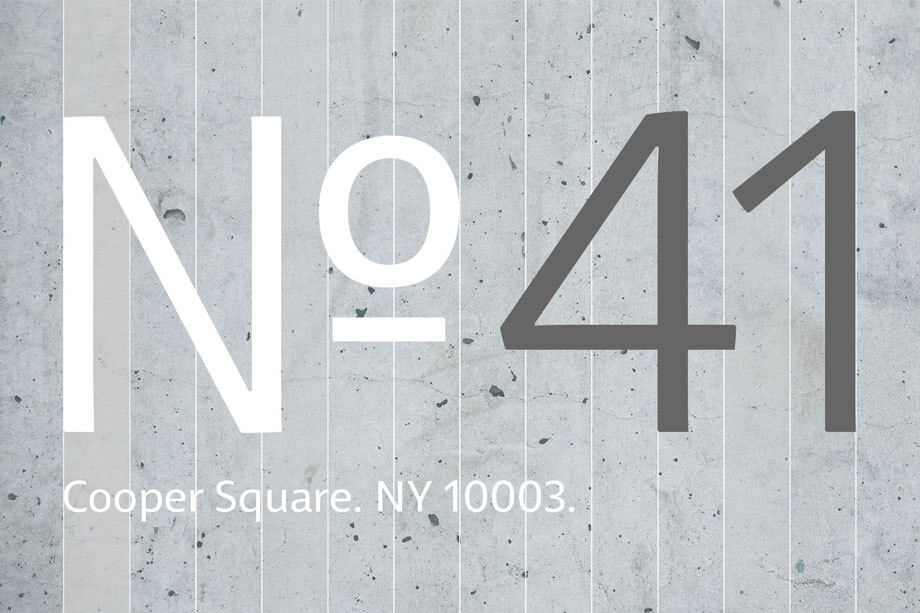
Designed by senior designer Fernando Mello, the font was inspired by New York and his time studying typeface design at the Cooper Union’s five-week Cooper Condensed Program.
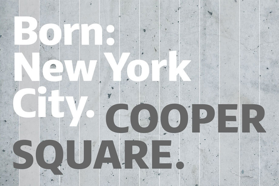
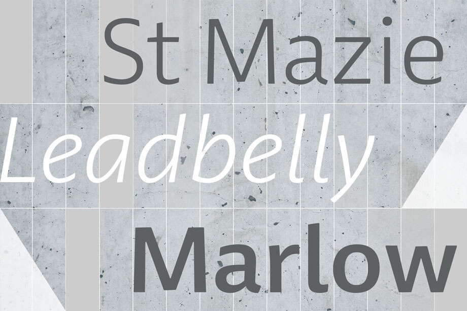
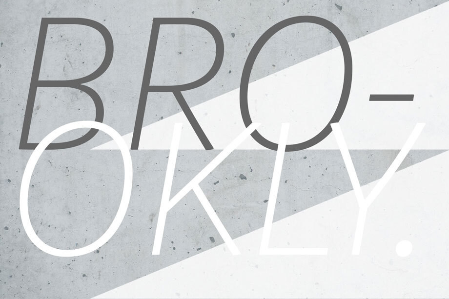
The designs originated in Mello’s studies in inscriptional lettering and calligraphic exercises, as he worked on a brief to design a clear, yet unique typeface that could communicate well, while avoiding loud and overtly mannered design features. His explorations were then digitised and adapted into a more workable humanist sans serif structure.
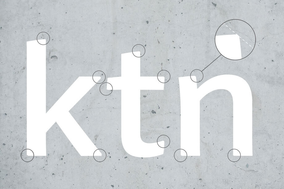
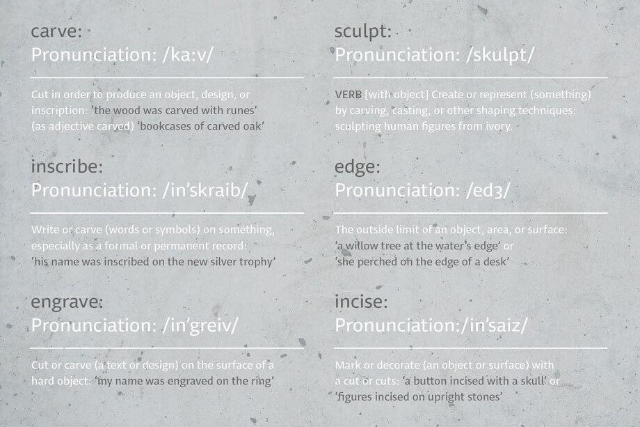
As his design developed, Mello drew influences from the New York subway font. ‘It’s very in-your-face and clear, always in bold,’ he says. ‘It doesn’t shout much but at the same time is very present and unique.
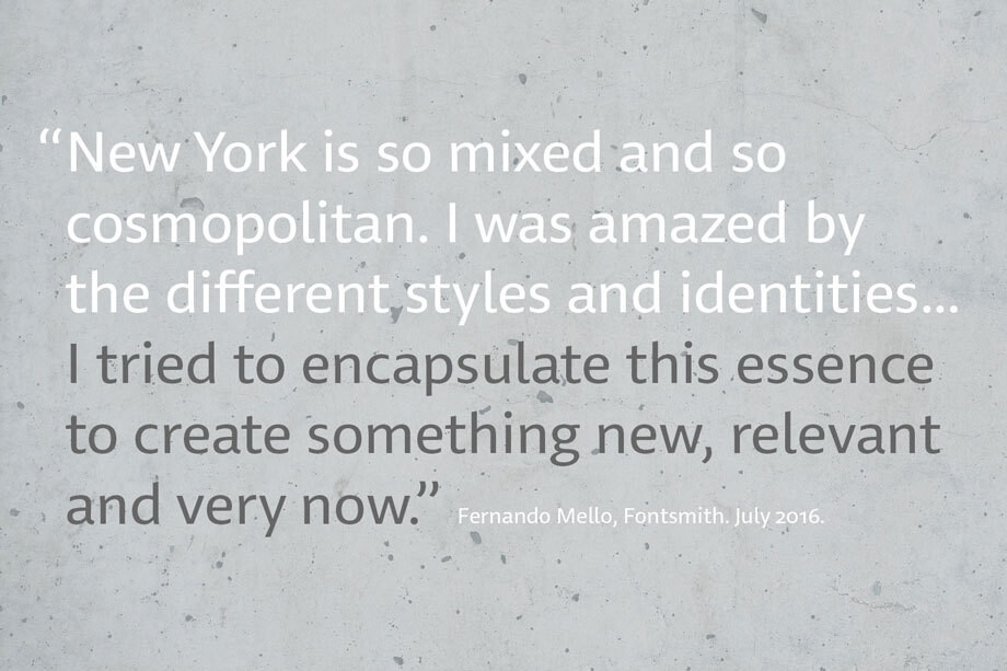
‘The design is completely different but it was this spirit I wanted to capture for FS Irwin. In a similar way to London, New York is so mixed and so cosmopolitan. I was amazed by the different styles and identities I saw there, and tried to encapsulate this essence to create something new, relevant and very now.’
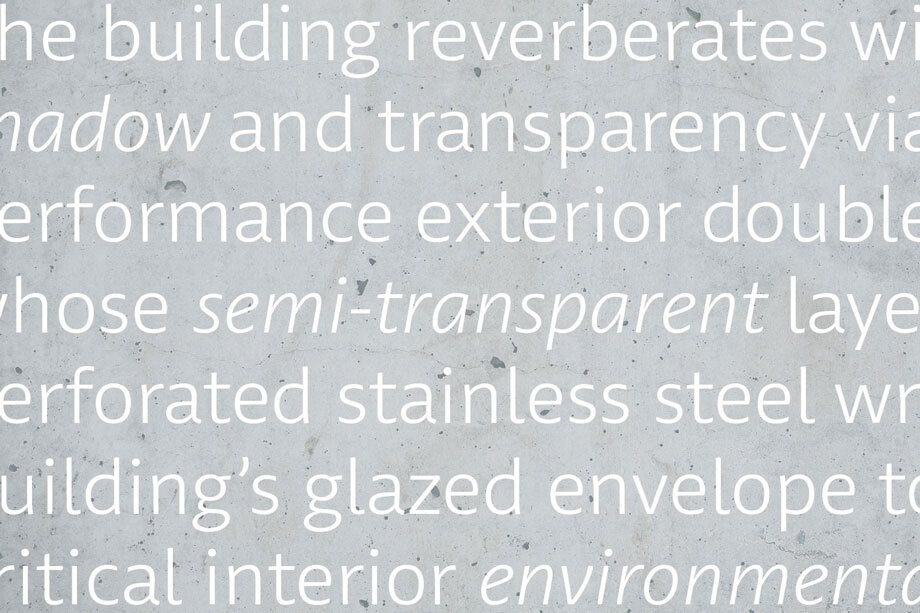

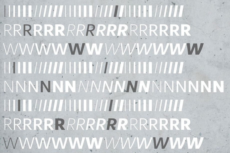
Rather than focusing on quirks or distinctive characteristics, FS Irwin conveys quality design and simplicity. As such, the proportions and details mean it is adaptable across any situation or application, from more playful designs to serious corporate identities thanks to a welcoming, yet sincere tone.
Mello adds: ‘Extensively tested and precisely drawn text-oriented typefaces are what I enjoy designing the most. There is a beauty and a different approach, a different way of making them interesting, sellable and usable rather than adding flicks or unexpected details.’
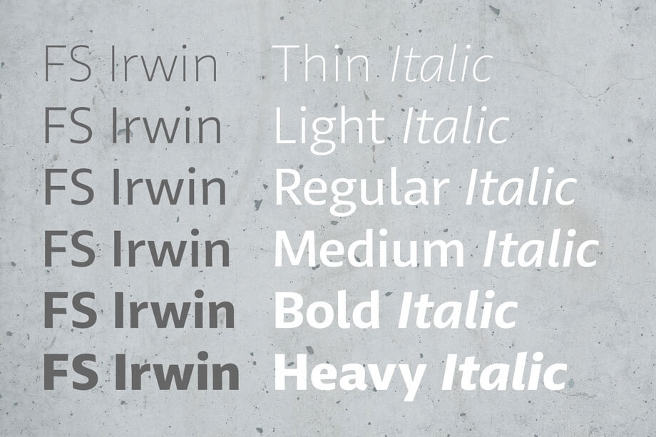
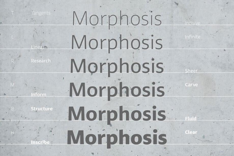
Fontsmith founder Jason Smith says: ‘I saw a need for a typeface which got back to a singular view and quality of core forms. A lucid design which would stand out for its simple quality rather than unusual characteristics. Fernando started the design in New York back in 2014 and we’ve been perfecting it over the last couple of years. I think that is evident in the quality of the finished product – it will stand the test of time.
‘This sort of high quality text typeface is perfect for brands to take as a base for their own identity. It will look completely different depending on its setting.’

