FS Siena wins a Print Magazine Typography and Lettering Award

FS Siena wins a Print Magazine Typography and Lettering Award
Tamasin Handley News
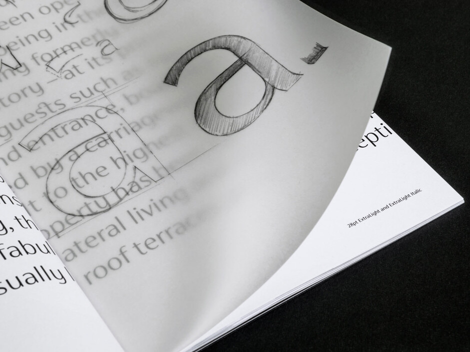
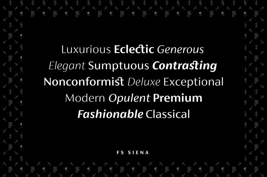
Contrasted sans serif typeface FS Siena has been selected as a Merit winner in the Typeface Design category of the Print Magazine Typography and Lettering Awards. Fontsmith founder Jason Smith first started the FS Siena design 25 years ago while studying at Reigate School of Art. When type designer Krista Radoeva joined Fontsmith in 2014 he knew she was the perfect person to finish it off. Both Krista and Jason were determined to preserve its subtly nonconformist and eclectic spirit – FS Siena was finally launched in July 2016.
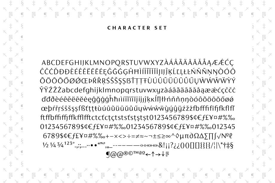
Its construction and proportions are descended from classical broad-nib calligraphy and humanist typefaces, with a high contrast between the thick and thin strokes. The angle of the contrast is vertical, more in the character of pointed-nib calligraphy and modernist typefaces. This vertical stress helps to give FS Siena a strong, cultured presence on the page.
Jason Smith had this to say about the win: ‘FS Siena was my very first design at the age of 18 so this was quite an emotional project for me. The typeface is unusual and we weren’t sure how people would react but the response has been overwhelming. Krista did a great job and I’m very proud of the result.’
Krista Radoeva said: ‘Having studied at Type and Media in The Hague this project was a challenge for me at first because Jason wanted to go against some of the principles of type design that I was used to following and I didn’t know if it was going to work. Some of the letters have smooth connections, others have sharp, there is a mix of constructions (a double-storey ‘a’, single-storey ‘g’, cursive ‘y’), only certain characters have curved strokes. The typeface is very eclectic but all these features balance each other out to create an unusual but coordinated font.’
Visit the font page to read more or trial FS Siena®.

