How to measure typographic accessibility: Infographic

How to measure typographic accessibility: Infographic
Stuart de Rozario Knowledge share
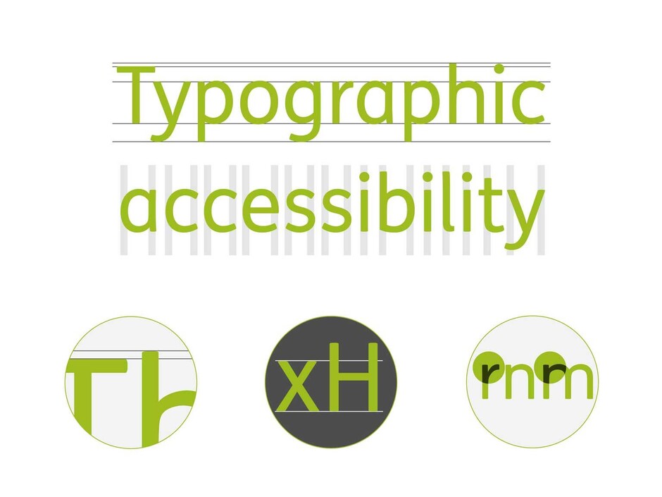
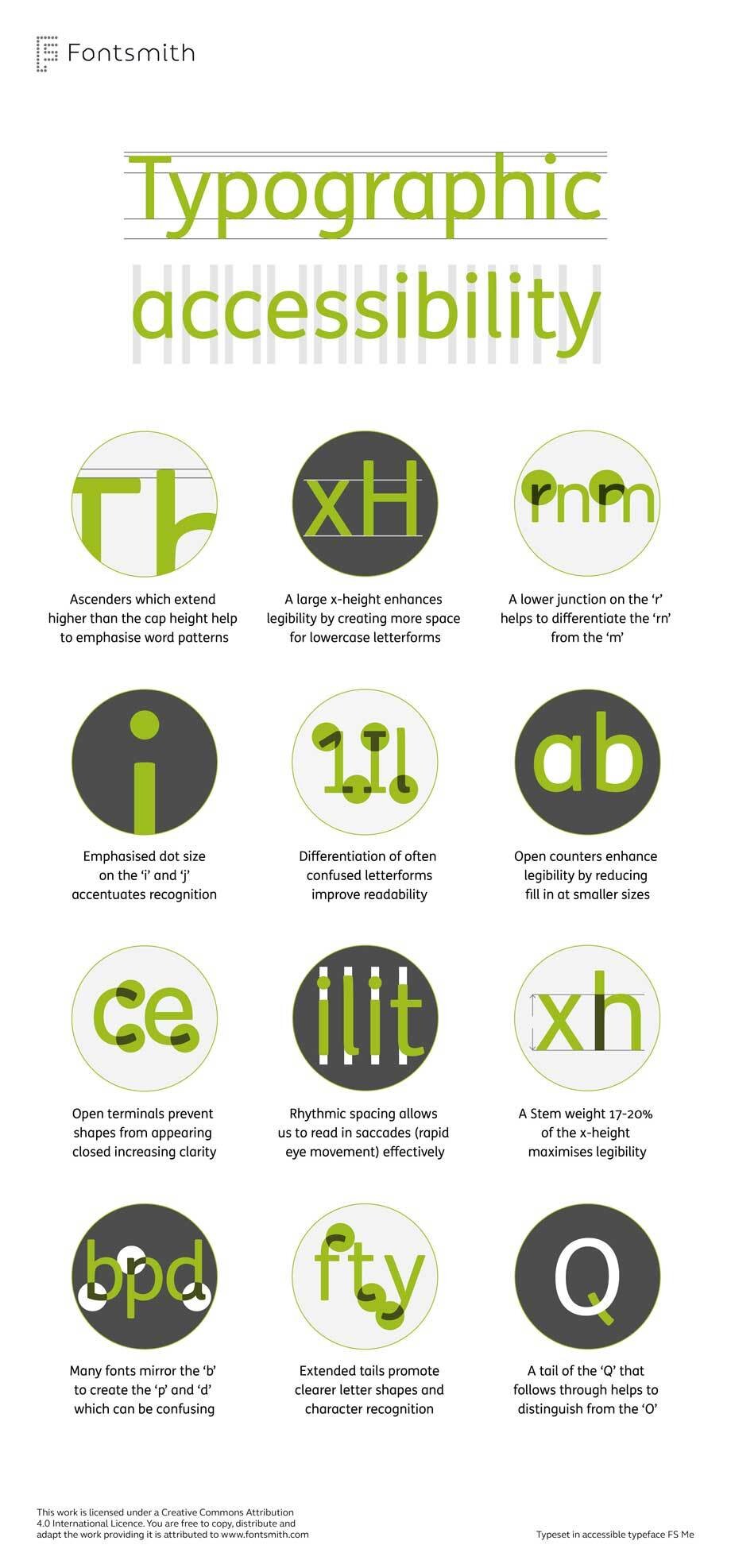
We have produced an infographic to help designers gauge how accessible a font is. The illustrations use one of our most accessible typefaces FS Me® which was researched and developed with charity Mencap and designed specifically to improve legibility for people with learning disabilities. The infographic outlines some of the main features to look out for if you’re selecting an accessible font.
Accessibility in typography is not an exact science and there is no such thing as either accessible or not. It is better to imagine a sliding scale where certain speciality typefaces are highly accessible at one end and some eg. script or display fonts are very inaccessible at the other end. Most fonts lie somewhere in the middle. As with all design decisions it is important to know who your customers or end users are and make choices based on what will suit them best.

FS Me® is available to test drive and buy on our website. Mencap receive a donation for every sale.
Siobhan Lewis, Mencap National Centre said: ‘Through Fontsmith’s extensive research and deep understanding of Mencap as a charity, they produced FS Me, a font that represents the ability within the learning disability. It is a tool we use every single day, and is an embodiment of who Mencap is as a charity; inclusive, caring and positive.’