How not to butcher a font in 4 easy steps

How not to butcher a font in 4 easy steps
Krista Radoeva Knowledge share
1) Don’t stretch, compress or slant fonts
Design software nowadays has numerous functions that allow the user to manipulate fonts. But just because there is a software function that does it, doesn’t mean you should use it. There is an expert knowledge behind making a typeface family in a range of styles: an Italic is not automatically slanted Roman, a Bold is not automatically outlined Regular, a Narrow is not automatically compressed Regular, you get the picture. Choose the right typeface for the job, with all the necessary variations you need, instead of butchering fonts.

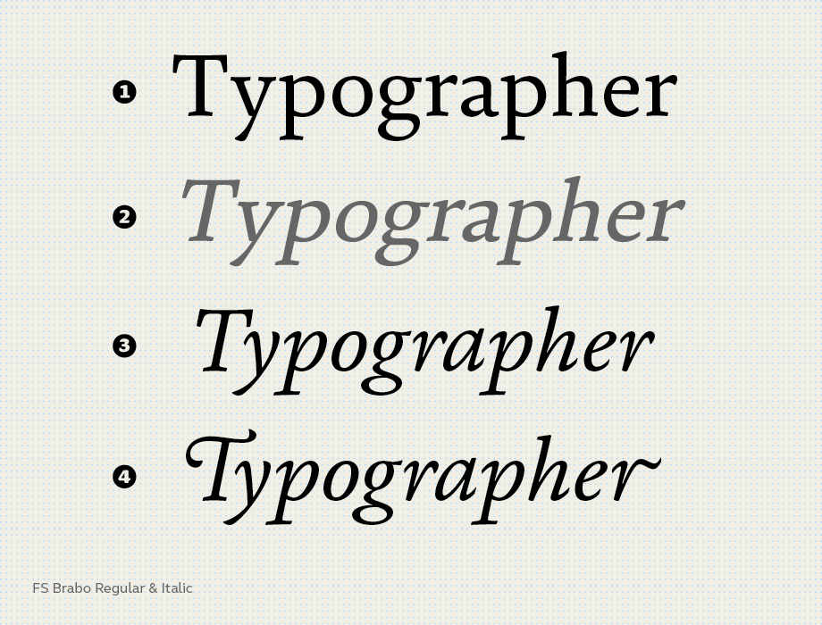
Line 1 above shows FS Brabo® Regular. Compare this with the automatically slanted version (line 2) – the details of the original typeface are distorted. The third version shows FS Brabo Italic. Every shape is carefully designed, proportioned and adjusted. Some letters such as ‘g’ and ‘a’ have a completely different construction to the Regular. In FS Brabo Italic you can also take advantage of the OpenType swash features for an even more dramatic difference (line 4).
2) Don’t mess with lowercase spacing
Spacing is a crucial part of type design. If you have chosen the right typeface, there shouldn’t be a reason to adjust its lowercase spacing: it obstructs readability and legibility. Of course there are exceptional cases, but generally reducing or increasing spacing should be kept to a minimum. If a designer is constrained by space, it is a much better idea to consider changing the point size or choosing a different typeface.

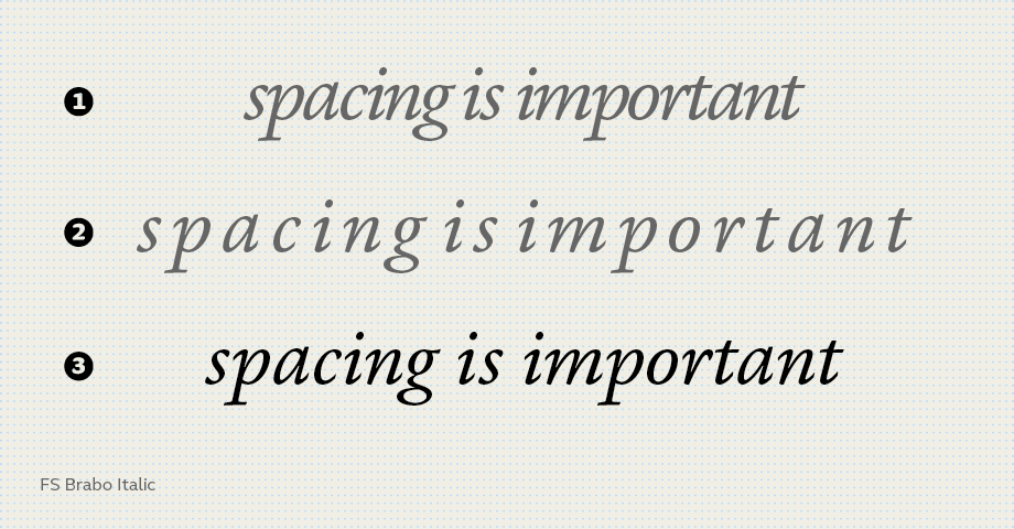
When the spacing is reduced like in the first line letters and words blend into an unreadable mess. When it is increased (line 2) it gets hard to distinguish the words. The default spacing has a balanced rhythm between letters which is much easier to read.
3) Adjust spacing when setting in all-caps
When setting words in all-caps (in a heading for example), the letters often look too tightly fitted. That’s because typefaces are usually spaced to work best in uppercase to lowercase combinations. It is good practice, therefore, to add extra space between the letters on an all-caps setting.

In the image above you can see that the capital ‘C’ looks balanced with the lowercase. The default spacing in the second line looks a bit too tight, not great for a large headline. With tracking and manual adjustments the same word looks more elegant in line 3.
4) Get your kerning settings right
A high-quality typeface takes into consideration the spaces between all possible glyph combinations. This sometimes means that a font has thousands of kerning pairs, special rules for particular combinations of glyphs to improve the overall spacing. Designers, please remember: Make sure you switch on kerning where software allows. Also, where possible, make sure that the kerning is set to ‘Metrics’ (this uses the original values as set by the typeface designer), not to ‘Optical’ (which overrides the original spacing and kerning and produces questionable results).

In the top example kerning is off and there are noticeable gaps between certain combinations. With kerning on and set to ‘Optical’ in the second example, the Y/e and r/d gaps haven’t quite been solved and other letter combinations are too close to each other. In line 3 kerning is on and set to ‘Metrics’. Besides the immediately visible improvement in Y/e and r/d combinations, there are minor adjustments to other letter combinations which all result in a much more harmonious and even typesetting.