Punctuation series: The ampersand

Punctuation series: The ampersand
Fernando Mello Knowledge share
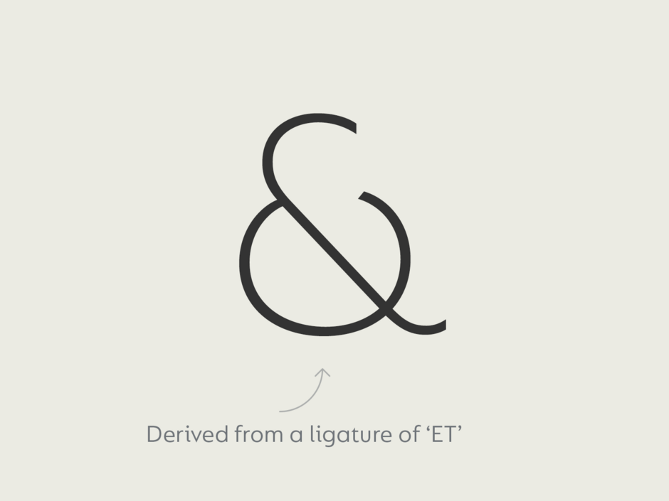
The ampersand is an interesting symbol because its origins lie in a ligature. Tracing back to the Latin word ‘et’ meaning ‘and’ it was created when the E and T were joined together, ET evolving over time to become the figure we recognise today ‘&’. In earlier examples it is easier to see the 2 letterforms, the modern day ampersand has morphed into a character in its own right and it is many type designer’s favourite one to draw.
Famous typographer Jan Tschichold collected hundreds of examples of the symbol throughout history for his study: ‘The ampersand: its origin and development’ which can be seen in this Shady Characters post. One of the earliest examples is thought to be a piece of graffiti on a wall in Pompei, preserved by the eruption of Vesuvius in 79AD.
The name ampersand came much later than the character itself and derived from a mispronunciation of ‘and, per se and’. When school children were reciting the alphabet they preceded each letter with ‘and, per se’ and at that time the ‘&’ was the 27th character of the alphabet. Eventually ‘and, per se and’ slurred into ‘ampersand’ with the word being added to the English dictionary in 1837.
The contemporary version of the symbol, usually has either a connected or open top loop and a diagonal middle stroke followed by a tail. It can be very tricky to get right and demands good eye judgement to achieve a balanced result, especially for darker weights. The ampersand and the lowercase ‘a’ and ‘g’, are considered key characters in the typeface’s personality. They usually derive from the other letters, but that isn’t a fixed rule, and the type designer might want to experiment with them at the very beginning of the design process. It is an important sign, playing an important role in logotypes or initials, and also in tweets and texts where people use shorthand.