Serif fonts in the digital age

Serif fonts in the digital age
Stuart de Rozario Knowledge share
From the stone to the tablet: is there a place for serif fonts in the digital age?
In a world where digital is the principal medium, most modern brands choose to use clean sans serif typefaces as they tend to render more crisply on a range of screen sizes and applications. Serif fonts have traditionally been associated with books and newspapers but as screen resolution improves will they become more popular online? They have long been used by publishers to aid readability for longer passages of text offline but does this translate online and if brands are increasingly becoming publishers themselves will they start to follow suit in terms of font selection?
Serif fonts were conceived by the Romans, using a wide brush the sign writers of the time painted letters onto stone and finished the end stroke with a flick. The stone mason then chiseled into stone on the ancient monuments like the ones we see in Rome today. Medieval scribes developed the serif using a broad nib pen and their beautiful calligraphic manuscripts gave way to a new printing press technology in c.1440.
Today there are many different types of serif font each with their own personality. Variations include Old style, Transitional, Modern, Bracketed, Tuscan and Slab. Each have different characteristics and offer a distinctive tone of voice to enhance a certain mood.
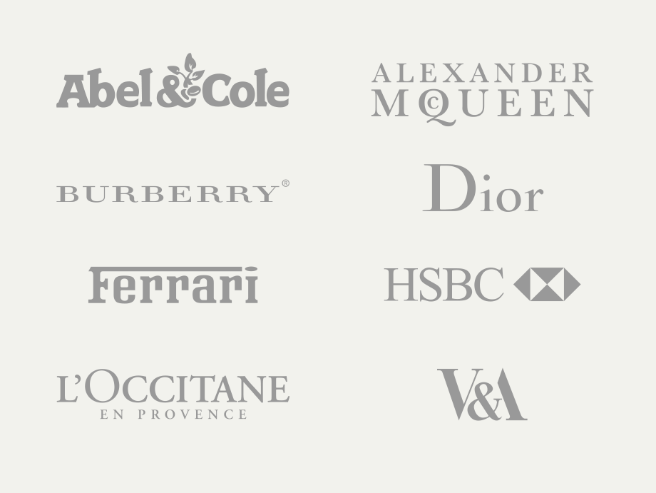
Serif typefaces are great for premium brands as they convey elegance, prestige, heritage and authority. For this reason they are used by luxury brands across various sectors including automotive, fashion, beauty and food and drink as well as museums and financial institutions:

Although used widely for logos they’re less common when it comes to online text. It’s very difficult to find a brand that uses a serif font for body copy although a few like Reiss use them for headlines with a sans for body text. As technology improves displaying serifs has become less of a problem but brands are still wary of using them for smaller sized body text.
It’s a different story when you look at newspapers and magazines, here there is much more of a mix. I have noticed serif typefaces being used more and more in print but they’re not uncommon online either. Broadsheet newspapers lead the way in using serifs for online text, The Guardian uses their serif typeface across their website and the app, as does The Times. Serifs are also popular for high end fashion publications like Vogue and Harpers Bazaar where they’re used for body text on desktop and mobile. Interestingly it’s common to see headlines in sans serif and body text in serif on design blogs, for example Dezeen and It’s Nice That. Of course this is because serifs aid readability so we know they’re good for longer pieces of content. But if I can read an article on my phone in a serif typeface with no problem why not a product description from a retailer or manufacturer? High end fashion site Net-A-Porter uses a mix of serif and sans serif text but also take a very editorial approach to their content.
The truth is many brands choose sans serif typefaces because of a misconception that they’re the only ones that work on multi-screen devices. Although it’s true to say that Old Style serifs like Garamond aren’t legible at smaller sizes we’ve come a long way since then and most foundries now design typefaces that will work across modern applications and employ rigorous testing before launch. Improvements in technology give us more and more flexibility in terms of design and I’m excited about what this means for typography. The serif has come a long way since the hammer and chisel and as consumers we are driven by fashion, technology and functionality. I see a huge opportunity for brands to achieve differentiation in a sea of similar looking websites, mobile sites and apps. Serif typefaces aren’t right for all brands and I’m not saying sans serif fonts are going out of fashion any time soon but I expect to see more variety as technology advances and designers and consumers look for something new.