FS Brabo – The Eloquent Type
FS Brabo – The Eloquent Type
Fernando Mello Inspiration
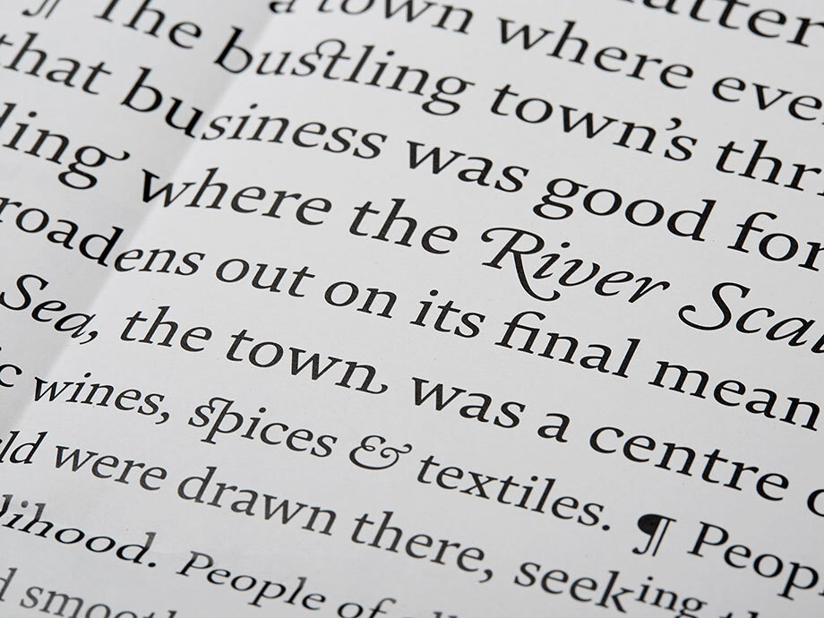
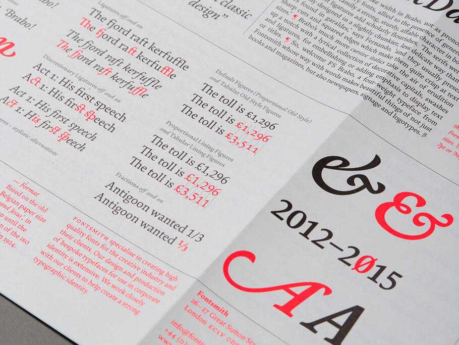
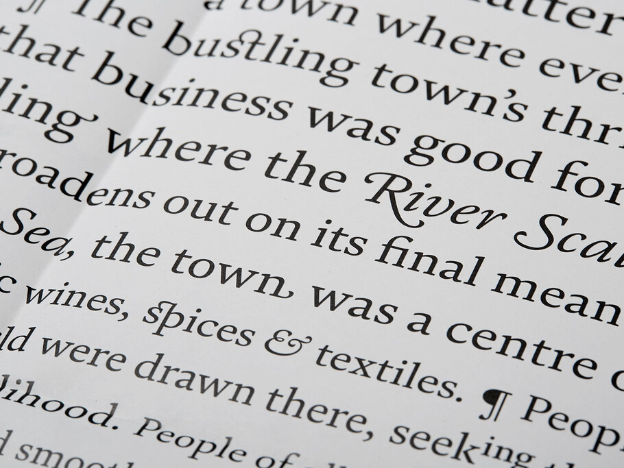
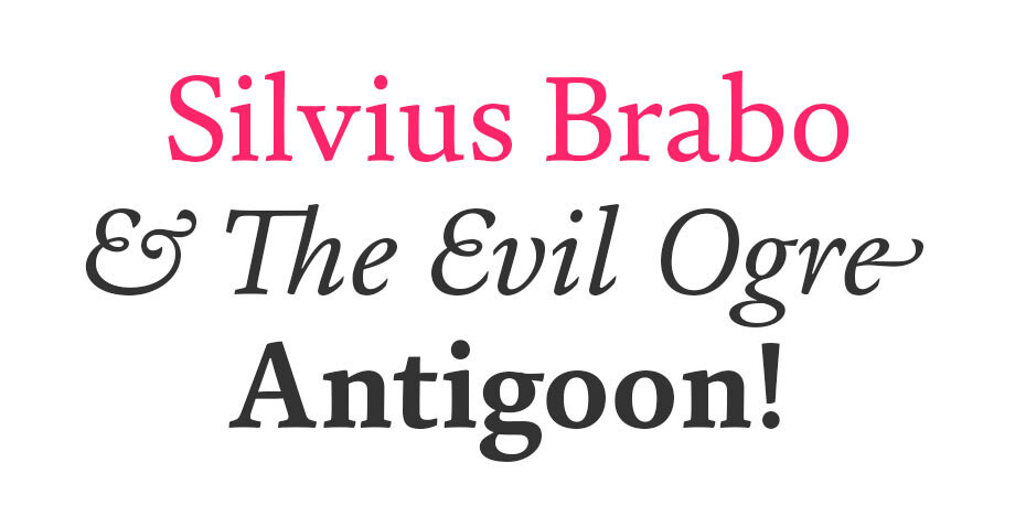
FS Brabo is a four-weight, serif font that reinterprets early book typefaces and whose swashes and ligatures bring colour and character not just to editorial projects but also signage, advertising and identities. A beautifully bookish personality for hardworking modern applications.
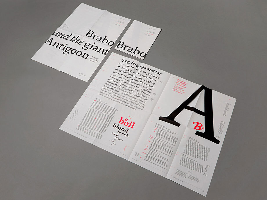
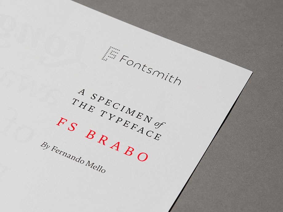
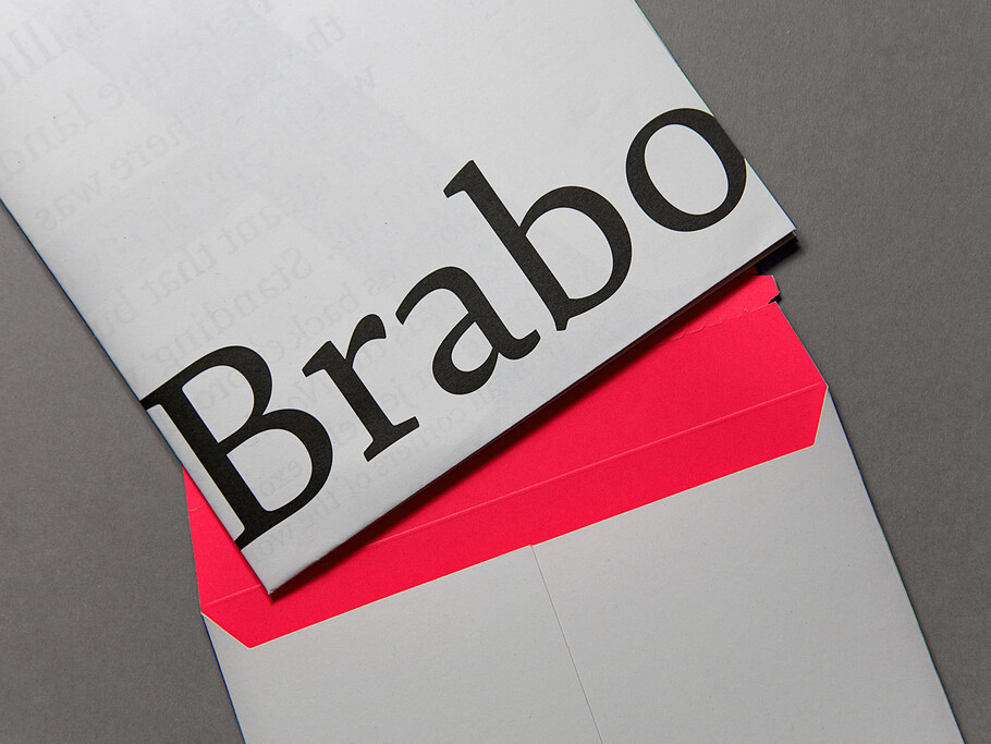
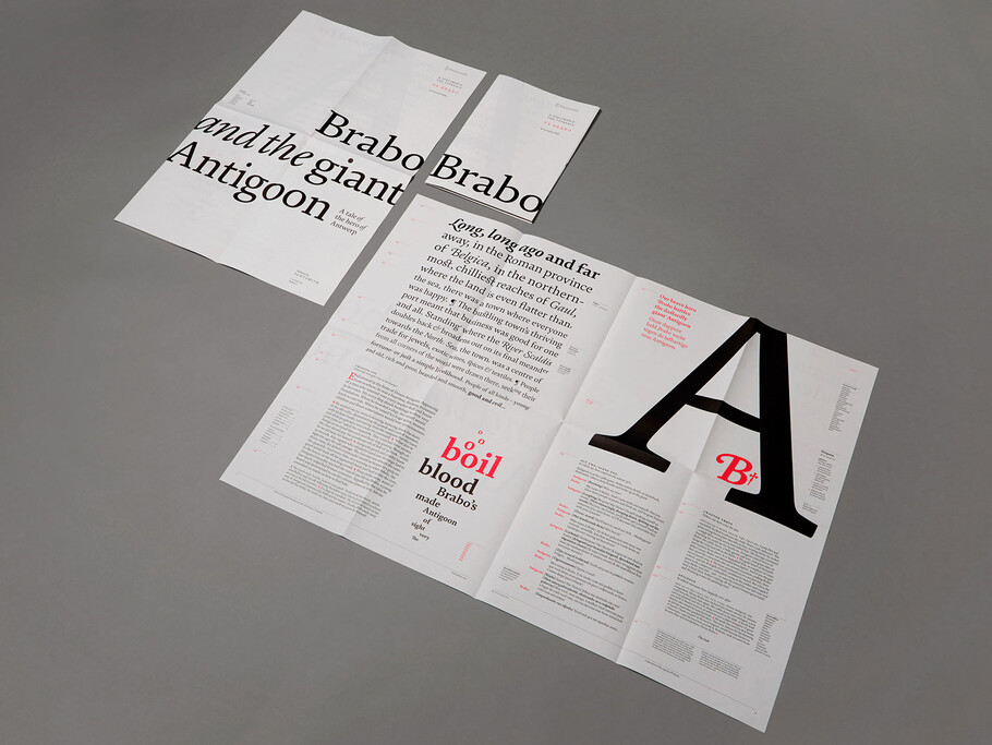
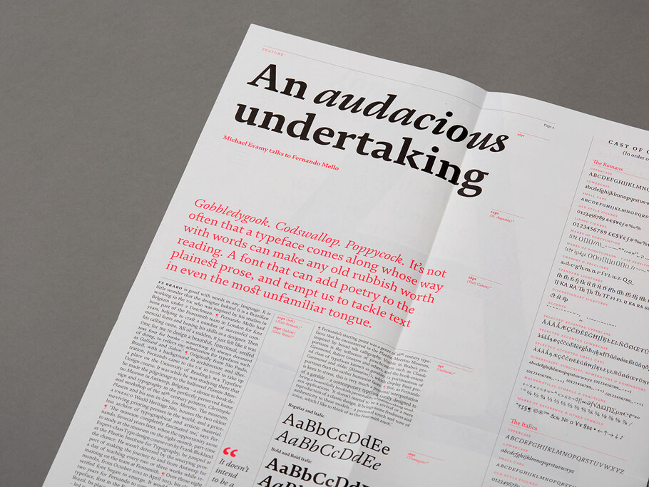
FS Brabo makes its debut in a specially-commissioned four-page specimen designed by traditional type specialists, The Counter Press, to celebrate FS Brabo’s literary leanings.
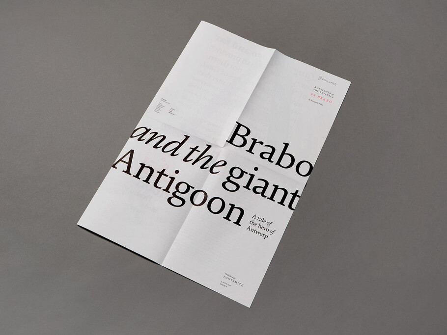
In addition to the specimen, The Counter Press also designed and press printed a limited edition print which is featured in the above movie.
Created by Fontsmith’s Fernando Mello, FS Brabo takes its inspiration from a class of book typeface that originated in the 16th century. ‘Garaldes’, which include Bembo, Garamond and Plantin, have rounded serifs and moderate contrast between strokes. FS Brabo’s serifs are chunkier and squarer than a garalde, to give it crispness in text.
Fernando was inspired by the extraordinary archive of early book typefaces at the world-renowned Plantin-Moretus Museum in Antwerp, which he first encountered while attending Frank Blokland’s Expert class Type Design course at the Plantin Institute of Typography. It was there that he became engrossed in the collection of early metal type, matrices, punches and type samples by figures such as Garamond and Granjon. So much so that he took on the mighty task of developing ‘a beautiful, functional, serifed text font’ of his own.
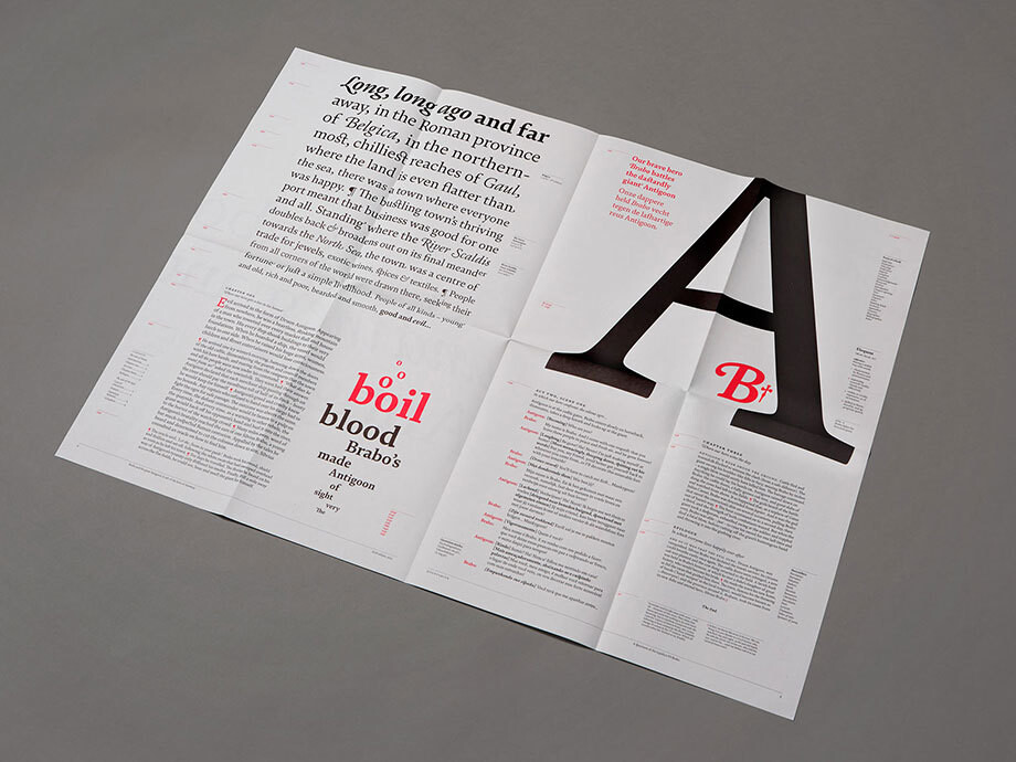
For the four-page sampler, The Counter Press have produced a typographic tour-de-force, displaying FS Brabo in all its variations and sizes. Taking its cue from the font’s literary lineage, the sampler employs a number of different typographic formats, including book title page, chapter openings and a play manuscript. The series of texts re-tell the legend that inspired the name of the font, of the Roman hero, Silvius Brabo, and the evil giant, Antigoon – the same tale that is said to have given Antwerp its name.
Antigoon had been charging ships’ captains extortionate tolls and chopping off the hands of those who refused to pay up. Brabo finally downed Antigoon after a long and terrible duel, cutting off the giant’s own hand and throwing it into the river Scheldt, unwittingly giving the town its name: the Dutch for ‘hand-throw’ is hand werpen.
