Personal pages
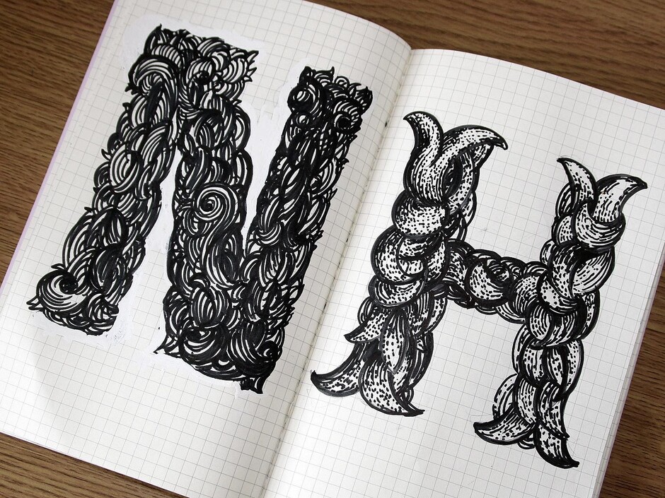
Personal pages
Phil Garnham Studio life
The logotype for ITV, typefaces for Channel Four and BBC One… These and most of Fontsmith’s other creations sprang to life not on a computer screen, but on the pages of our designers’ sketchbooks. Before the high-precision on-screen business of digitally mapping individual characters, the distinctive personality of a new font is pinned down with pencil and paper, sometimes on just one or two letters, or just elements of letters – the crossbar on a ‘t’ or the serif of an ‘n’.
It’s here, in rough sketches and notes, that the gold of great type ideas is found, according to Fontsmith founder, Jason Smith. ‘We employ people based on the strength of their sketchbooks, not their abilities with FontLab. We’re looking for evidence of thinking and ideas, whether in written note form or sketches – it doesn’t matter.’
You’ll find Jason and Fontsmith’s other designers sketching constantly, in meetings, in the studio, on the train, tube or bus. Not every thought ends up as a finished font, so we asked a few of them to show us their favourite pages, and talk us through their deepest, typiest doodles.
Phil Garnham, Fontsmith typeface design director
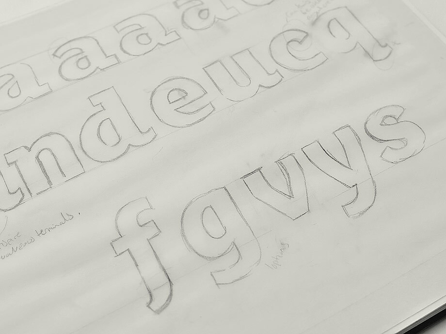
Ray Davies found his Lola in a club down in old Soho. Phil Garnham found his in a sketchbook, as an innocent 24-year-old. He’d been sketching the mechanical, modular, slightly cumbersome skeleton of a font, and wanted to make it more ‘usable’.
‘This sketch from 2004 represents the later phases of that transition,’ says Phil, designer of FS Alvar®, FS Emeric®, and FS Kitty®. The turning point is the second line on the page, when Phil turns from slab serifs to flicks. His scribbled note, “Flicks may inspire more creative terminals”, defined the new font’s allure. ‘That led to the idea of playing with the notion of square vs soft… and the name Lola was born.’
Stuart de Rozario
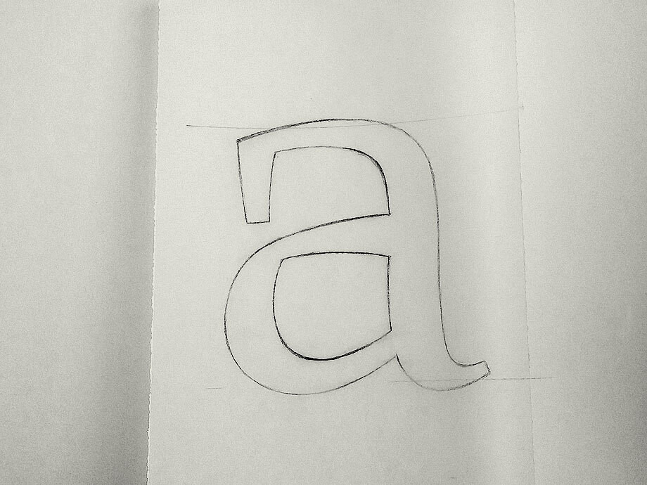
‘I tend to doodle a lot,’ says Stuart, ‘sometimes letting the subconscious moment flow.’ Stuart’s doodles can evolve into nothing or something major – like FS Millbank®. Stuart’s sample pages, from 2012, bring to light the beginnings of an as-yet unrealised serif typeface that he named Parker, after the very first calligraphic pen he was given, aged nine.
‘It’s a serif with a large, legible x-height, and a sharp, calligraphic, chiselled serif that echoes the movement of a broad-nibbed pen. The lowercase “a” echoes forms of early medieval manuscripts which had a huge influence on my early typographic upbringing.’
Fernando Mello
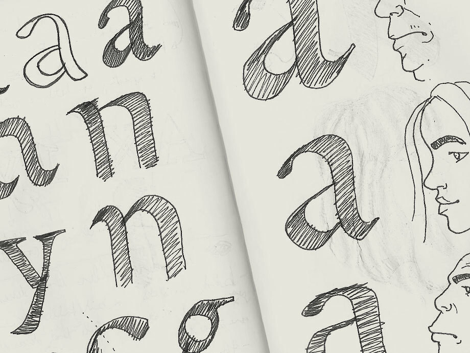
It’s not just typographic characters that populate our designers’ private pages. In 2012, Fernando was travelling by train from London to Antwerp to attend the expert class Type design course at the Plantin Institute for Typography… and caught himself musing on characters of a comic-book kind. ‘Grabbing a pen or pencil stimulates me to draw not only type but funny things such as cartoons – I was drawing comics in my younger years.’
While exploring initial ideas for a serif font, he started matching different styles of lowercase ‘a’ with his comic-book human profiles. ‘I guess I had in mind to experiment with the widths and character of the font.’
It was the start of something. Watch out for a high-contrast serif font soon to be released – the product of Fernando’s character development.
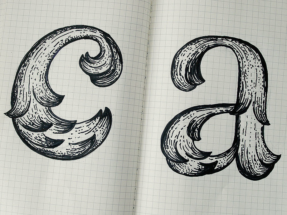
Krista Radoeva
Krista can allow herself to ‘go crazy’ in her sketchbooks now: ‘I don’t spend hours on a single sketch, I don’t worry if I mess it up.’
It wasn’t always the way. Her love of drawing ornamented lettering had led her to study typeface design in The Hague. ‘One of the first things they told me there was to “stop drawing like an artist” and get rid of my pencils. So I quickly got used to drawing really large letters on tracing paper, using fat markers and white-out. I stopped treating sketches as precious artworks, started using them as a way to quickly test ideas.
‘It was a very important step that really changed the way I develop typefaces now – constantly switching between digital and hand-drawn.’