How to make a handwritten script

How to make a handwritten script
Phil Garnham New typefaces
FS Shepton® is the first release by Fontsmith designer Andy Lethbrige whom Jason spotted after seeing his exquisite hand lettering on Instagram and later his degree show. For his first brief, Jason asked Andy to experiment with a range of media to develop a collection of three alphabets with similar character but very different texture and style.
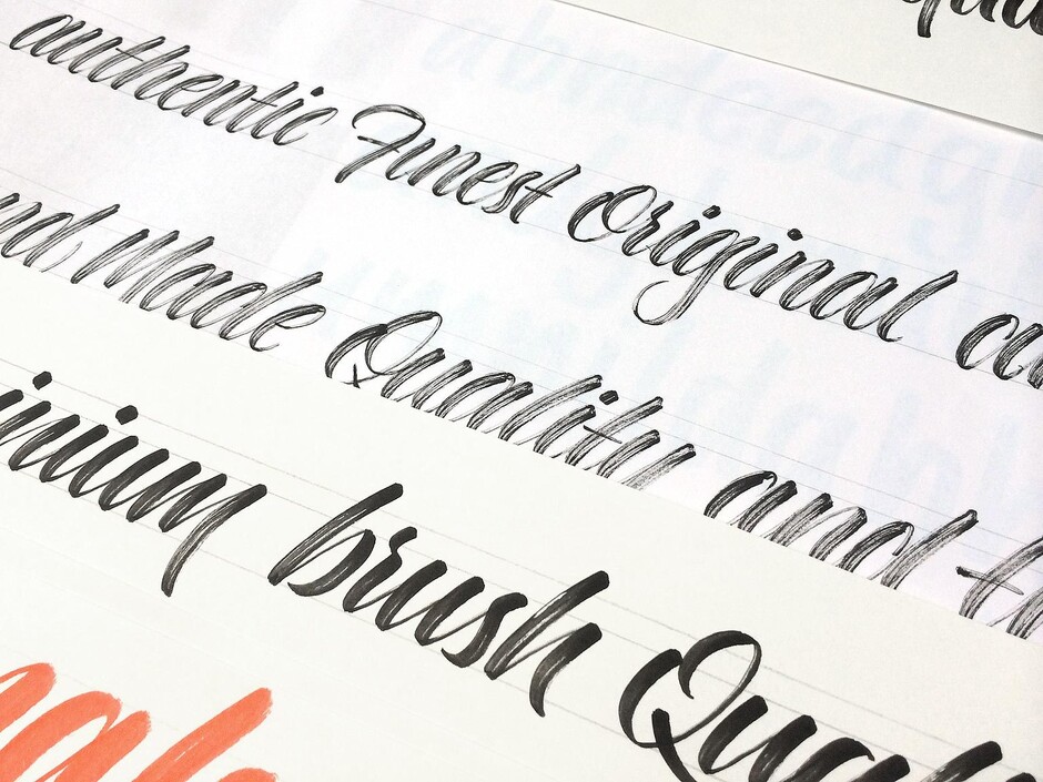
Most ‘handwritten’ typefaces are created entirely digitally, not FS Shepton. From the start, Jason and Andy wanted to create something that was 100% hand-drawn and purposely imperfect, with the kind of inconsistent, organic shapes and textures that you might see in a deli or greengrocers.
Andy’s first stop was the art shop “to stock up on papers and tools that I could use to experiment with. I spent the first few weeks playing – just trying out different pens and tools on different papers and surfaces. I had to consider how each style and texture would translate to screen and type.
“They aren’t perfect – just like real hand writing, they have quirks and inconstancies because they’re written not designed. I think this adds to their character and helps them stand out from the crowd.”
FS Shepton Regular, drawn with a wet brush pen, is solid with a rough outer edge and a casual but controlled feel.


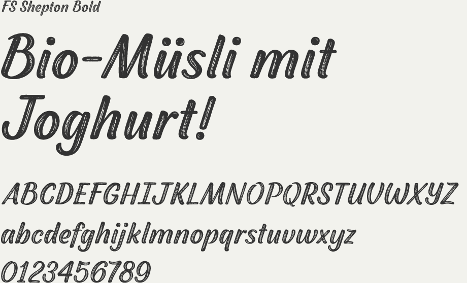
FS Shepton Bold, drawn using a wider, looser dry brush pen, has a woody grain in the middle of its broad strokes and greater solidity where the brush moves more slowly. In contrast, the letterforms of conventional script fonts are simply fattened digitally to generate heavier weights.
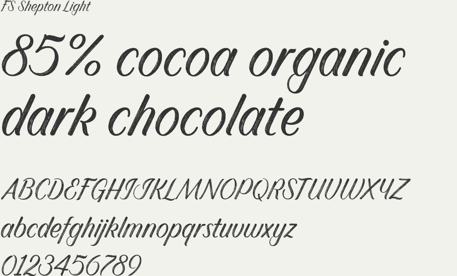
The dry brush used to create FS Shepton Light gives it more inner texture and a more formal, slanted, calligraphic style.

The most difficult thing, according to Andy, was “creating full and uniform character sets. Even the same tool can produce lots of variation – the same brush pen gave me different textures depending how much ink it had left.
“Digitising the textured calligraphy was also difficult because I had to retain the original texture and form of the letter but minimize the data and create a font that works technically.
“Despite, or maybe because of all the challenges, I’m proud of FS Shepton. Although each alphabet is very different they all have a hint of each other because the same hand created them.”