Emotive Automotive
Emotive Automotive
Stuart de Rozario Font modification
The morning the brief landed we were pretty excited. It’s not often you get the chance to revitalise the word mark and typeface of an icon like Renault.
Since 2012 they had been reimagining the design of their cars – finding ways to reinforce a connection with customers. Now they were looking for a visual identity to do the same.
Collaborating with the team at Interbrand who were shaping the overall visual identity, we wanted to create something that captured Renault’s heritage yet felt forward looking, vibrant and somehow human. It was thrilling to work directly with Renault’s design team – a group of designers who share the same love for designing cars that we have for type.
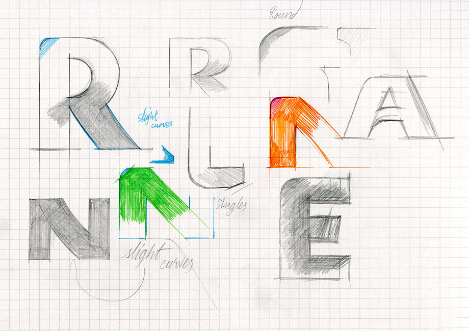
The result is a semi-serif typeface, which has a human look and feel that conveys a sense of accessibility and momentum. With elegant and visually dynamic semi-serifs the new font gives both an alluring and robust tone of voice. The confident, balanced characters with wide, almost square, proportions and the unique geometry make the typeface feel more human. The monolinear strokes make it clear, legible and accessible. The ‘u’ serif is placed to create synergy with the ‘u’ in the logotype, the lower curves relate to the squareness in the logo curves. Similarly the new serif angle on the ‘n’ and ‘r’ reflect the subtle tapering of the logotype. The ‘C’ and ‘S’ letter terminals hint at the more refined nature of the logo serifs. The open counter shapes for are meticulously honed for clarity.
Although the structure, shape and colour of FS Hackney® remain, the layers and layers of details that went into “Renault Life” mean that the end result has so much more and is uniquely theirs. It functions with a modest clarity and distinction while at the same time human, with an engineered structure.
Interbrand came up with the first idea for the evolution and we began by exploring what the new wordmark could look like. Our brief was to modernise the typogram while staying timeless and easily legible. We needed to retain the heritage of previous word marques by using serifs on the letterforms. We also wanted to make sure that the A shape evoked the elliptical curvature that was being developed for their new diamond shapes. This was an opportunity to create a strong brand signature. We supplied our design proposals to the team at Renault and Interbrand who finalised the work to meet their needs.
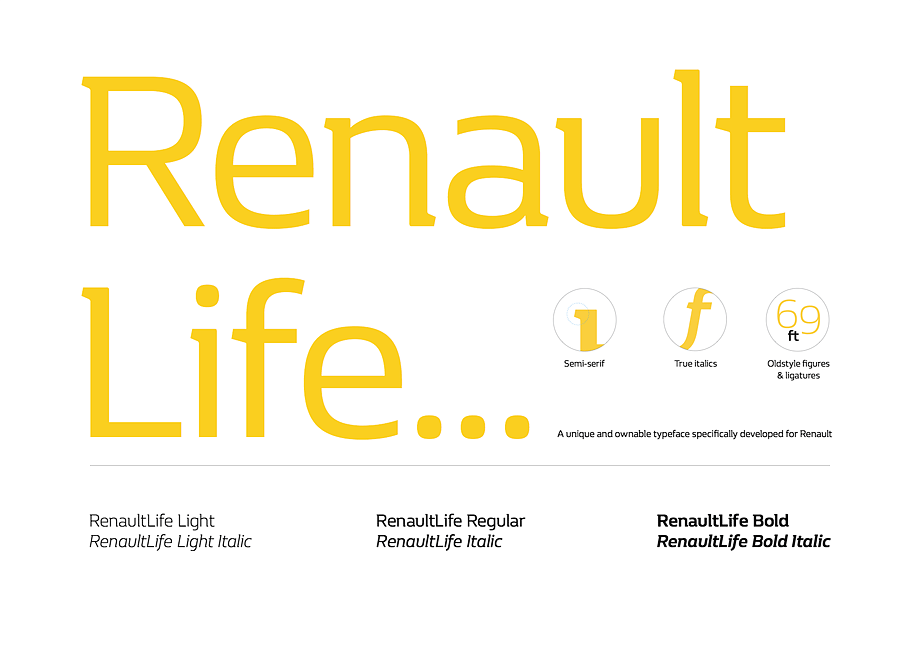
We then began to design a sympathetic typeface that captured the DNA of the wordmark – something that would allow for a broad range of expression throughout the brand. As a starting point, we tried out a number of our library fonts to get a sense of what worked. Renault, as much as Interbrand and Fontsmith, agreed that FS Hackney would give us a skeleton to work with – something to strip apart and rebuild – even if felt like a strange choice initially. Then we began working on different variations by adding layer upon layer of detail until we had created something that felt uniquely Renault. Andy Payne, the Group Creative Director at Interbrand, worked closely with us on the requirements and overall vision.
