A typographic tour of Clerkenwell
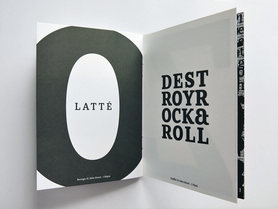
A typographic tour of Clerkenwell
Phil Garnham Inspiration
More than ten years ago we were designing typefaces in a cold, whitewashed studio space in Northburgh Street, Clerkenwell.
Our aim was to take inspiration from the architecture and designers around us. The area has a Victorian feel about it with intricate brick buildings converted into modern bars, restaurants and offices. Sort of traditional with a twist on the inside.
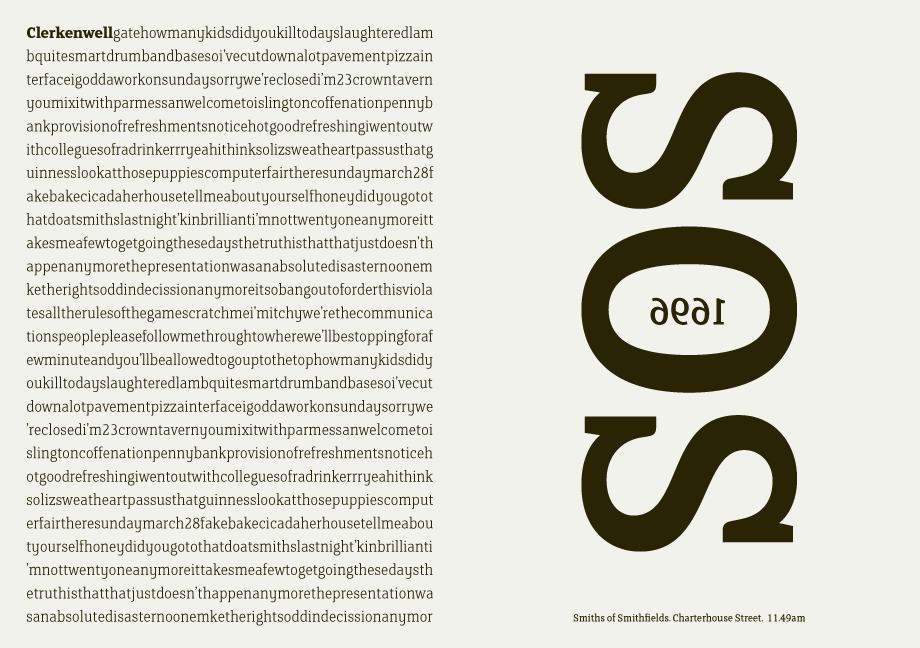
To launch FS Clerkenwell, we asked designer Ian Whalley to walk the streets of Clerkenwell and capture the fragments of conversations he heard on the streets. We then set them in our font and crafted this small book of typographic conversations.
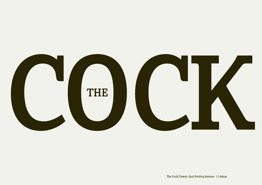
We could jut feel that Slab serifs were on the brink of another revival and all we wanted to do was have a play with the slabs - to go as far as we could within what was acceptible and readable. We were also becoming very influenced by the designer grime outside the studio space.
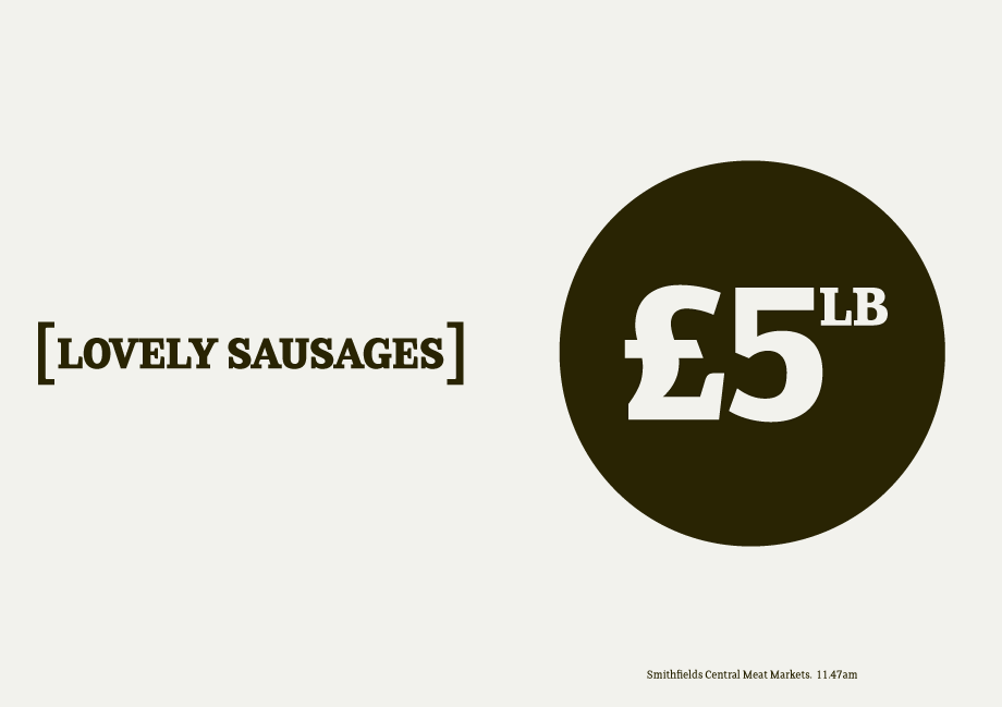
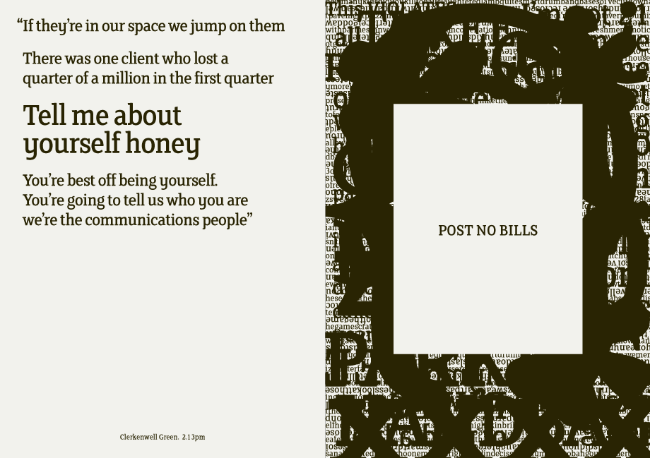
We began by drawing stems on-screen. The key aspect of the font is the upward bend of the leading shoulder serif, the way it kind of ramps up and then plummets back down the stem.
The regular and light characters are quite narrow – great for text but the bold is quite wide and chunky – better for headlines. I think ‘y’ is quite different for a slab design. We call it the Fontsmith ‘y’.
Ten years on, it still true to the spirit of this area, if not the price of sausages.