FS Millbank – Readability
FS Millbank® – Readability
Stuart de Rozario Knowledge share
We can sometimes take reading for granted as it is something that we just do, it’s a natural process and for as long as we can remember we have been able to make sense of words and pictures. Reading and typography are part and parcel of everyday life (subconsciously or not), whether we read the newspaper, play with a mobile device, search for train times on arrival / departure boards – even understanding street and road signs. On our travels, type and iconography play a crucial role in helping us get from A to B in the most efficient way and this visual information needs to be legible and clear, presented in an uncluttered manner or expression. Swift recognition is key.
Designers have thousands upon thousands of typefaces to choose from – every font has defining characteristics that have been created to solve certain design problems. Ask yourselves would you use Times New Roman for a wayfinding system in a city? or Comic Sans for a financial journal? (This is where you say ‘HELL NO’!). Some letter shapes can be misleading to the reader so it is vital to choose a typeface appropriate for it’s purpose. Signage fonts have to be as clear, legible and readable as possible – neglecting to recognize the importance of this in wayfinding is a missed opportunity to help and enable the viewer - essentially under-mining the wayfinding process.
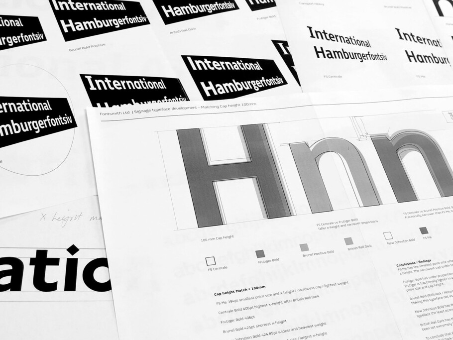
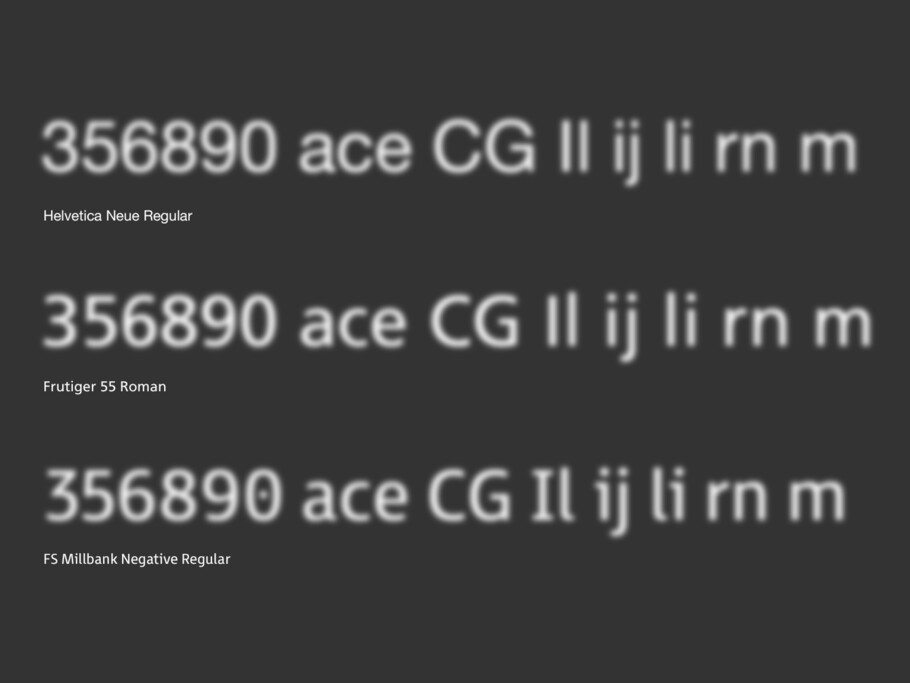
After researching a plethora of books, blogs and recommendations on all things about legibility and readability, it was my task to design FS Millbank as an effortlessly readable typeface. I scrutinized key glyph characteristics, assessed the line length of other signage typefaces and their basic stem weights, proportions and glyph features. I conducted blur and angle tests, these tests gave me surprising results and impacted the final outcome, not only did these tests tell me that some of the most used typefaces in signage appeared too wide, heavy and not very legible but also that they were also misleading to the reader.
Viewing letterforms at varying angles can have a detrimental effect on readability and legibility – the spacing is tighter, the counters close up and vertical strokes become narrower, making it more difficult to distinguish between similar letter shapes CG, QO, DO, FP, OQ, HN, O0 (zero) and confusing figures such as 3, 5, 6, 8 and 9. Also, closed terminals in the key areas of the lowercase a, c, e, f, g, j, s and t characters are even harder to decipher, especially for those who are partially sighted, I realised that I needed to design a typeface with significant characteristics, personality and somehow create more internal space. I decided to design glyphs with open and approachable shapes by adding tails to the a, d, l, u enhancing definition and personality.
Once I had determined the basic weight and cap to lowercase proportions, I made the decision to include wide ink traps across the diagonal characters A, K, M, V, W, X, k, v, w and x as a font feature because at small sizes in print and on-screen I found that conventional junctions were far too dark and needed to be widened internally. This enabled these letters to appear clearer whilst eliminating dark areas. It also helped to improve readability at differing perspectives.
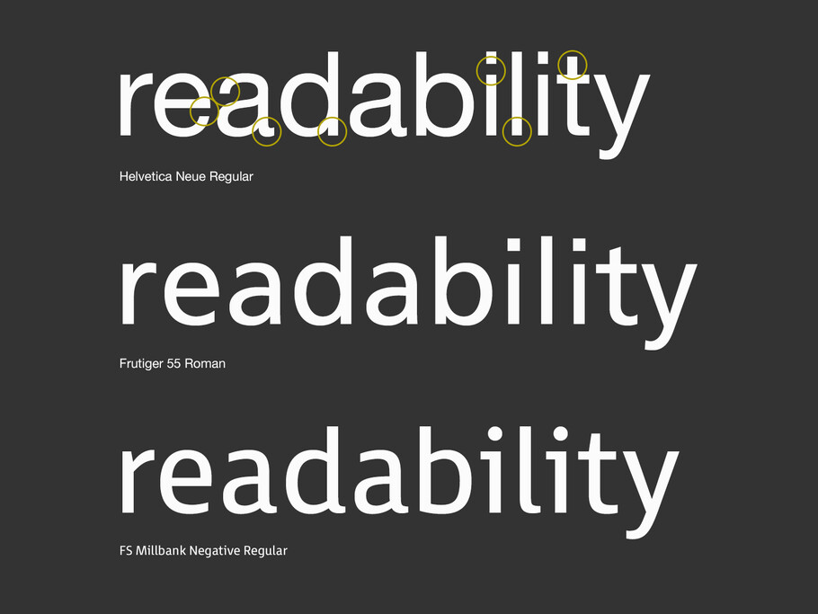
It’s widely known that people read by patterns as well as character shapes – Capitals are thought to be less legible as the variation in shape does not change, whereas lowercase are more readable than their capital counterparts, because when we read, our eyes bounce along the tops of the more recognisable forms enabling us to read efficiently. Large x-heights accentuate the letters and become more legible, Optimal Character Recognition is crucial for a readable typeface and FS Millbank’s subtle design features address the readability of the often mis-read letter combinations such as ft, lt, ce, ea, ij, li, !i, hb, bd, pq, hy, gy, rn and m. Special consideration was also taken with the letters 1, I, i, l and J so that they are more distinctive – enhancing the readability.
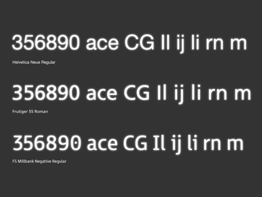
The illustration above shows a example of Helvetica Neue Regular, Frutiger 55 Roman and FS Millbank Negative Regular as a comparison of characteristics. The Figures from Helvetica Neue are closed, neutral, difficult to distinguish, plus the spacing is very tight – making Helvetica hard to differentiate. Frutiger is more open but also has a neutral personality and again it’s hard to decipher the difference between the Capital I and lowercase l. FS Millbank has open approachable shapes, defining characteristics and a large x-height which accumulates to a more readable typeface.


