Just ad type: How advertising agencies choose the right typeface
Just ad type: How advertising agencies choose the right typeface
Emily Gosling Inspiration
The choice of typeface can be make or break a brand or ad campaign, so how do ad agencies make sure they choose the right one?
A cursive, scripty pair of alliterative words, rendered in red and white can only mean one thing: Coca-Cola. Typography is almost always at the heart of a brand’s recognition. It has the power to persuade, desuade and sell; and as such, it’s the key that unlocks a good ad campaign and makes it great.
While a typographic word mark and visual identity are often in the hands of a branding or graphics agency, rather than the ad-people, the lines between these sort of agencies is becoming increasingly blurred. And of course, there’s only so much a great typographic style can do if the advertising messaging and propositions aren’t up to much.
We all know how obsessed the graphics crowd is with everything type-based, but how does ad-land feel about lettering? We spoke to three creatives from some of the most renowned agencies in the world to find out.
For Erik Kessels, co-founder of Amsterdam, London and Los Angeles-based agency KesselsKramer, a good campaign is first and foremost about the idea. He says: “Typography should always follow and serve the idea that is being made. Typography is never a starting point, but can only compliment the idea and the design concept. It’s just one soldier in the whole battalion you could say.”
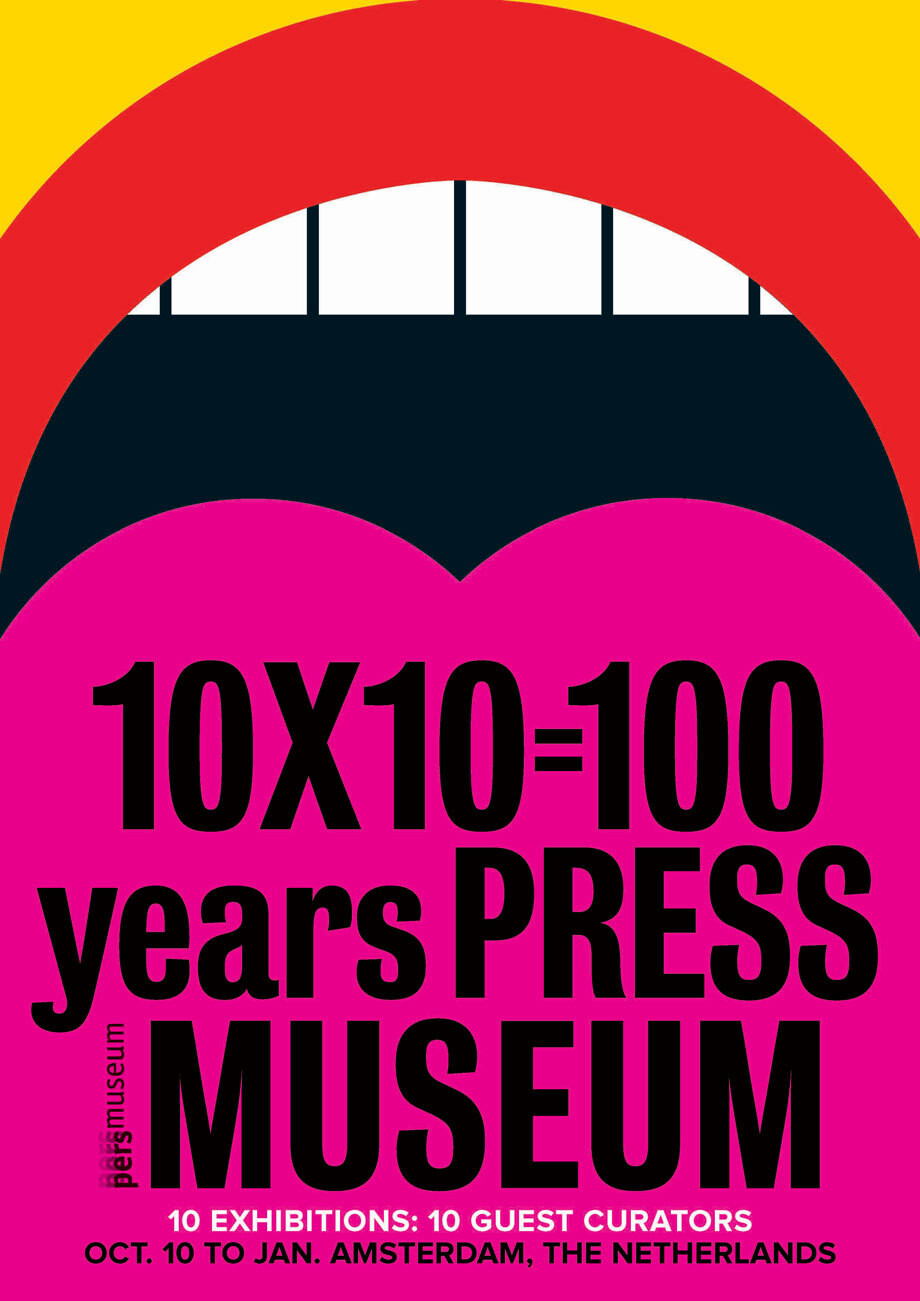
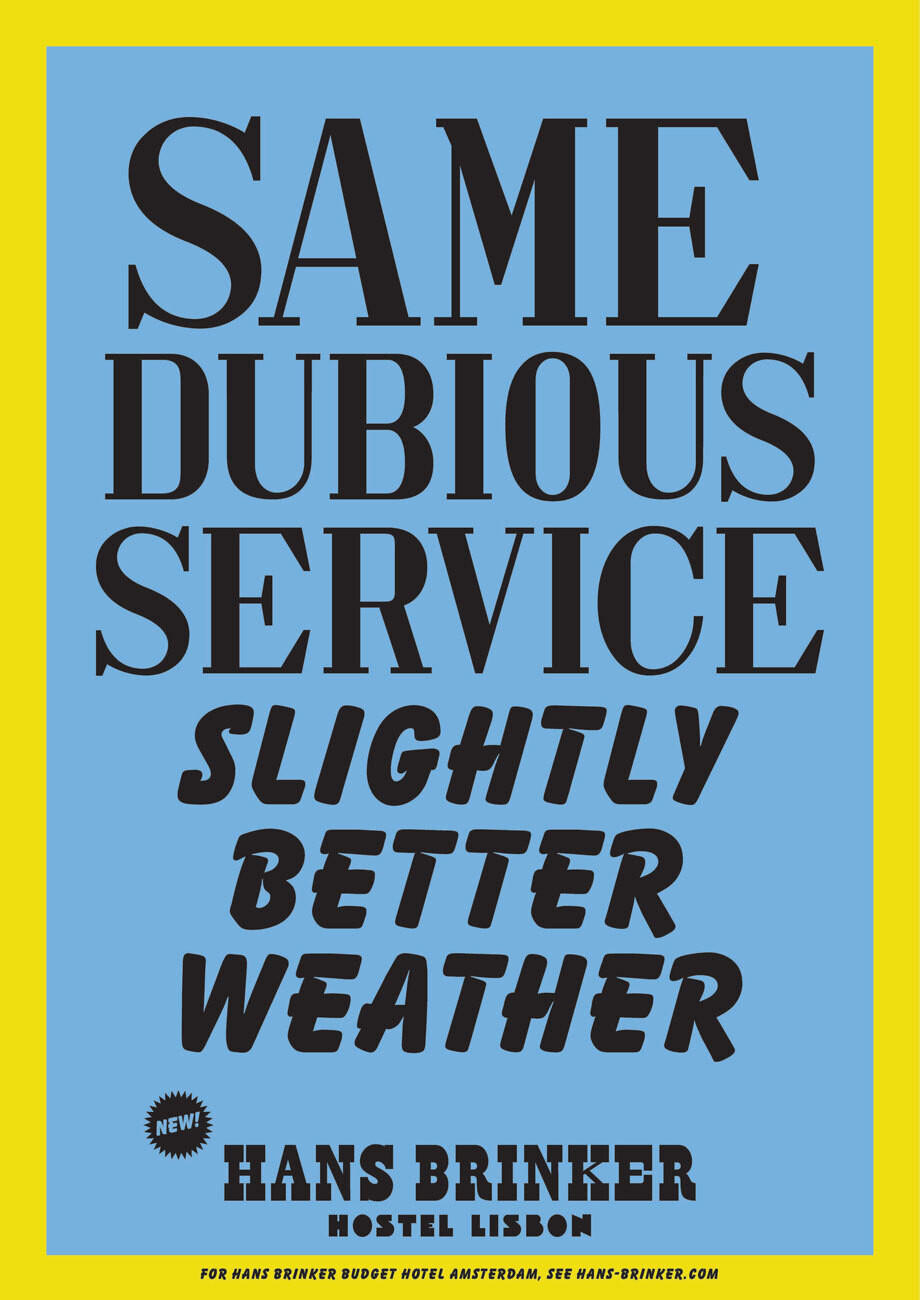
Pers Museum and Hans Brinker Hostel, kesselskramer.com
Even for the likes of the most impassioned typophile, it’s about message first, font later. Simon Warden, head of typography at M&C Saatchi describes himself as “seriously very interested” in typography and its history, and when working on campaigns says his choice of typography style “has got to hit the right tone of voice for the message to be conveyed as sincere, authoritative, jovial (tick as appropriate), at the same time not crowd the art direction but to know its place in overall scheme of things. It has to compliment everything, sometimes be the boss, and sometimes merely whisper.”
For Warden, this means choosing a foundry or type designer on a project by project basis. “I try to be aware of interesting output from interesting people,” he says. “Of course budgets don’t always allow for bespokeness, but when they do you definitely need the number of the right person to call. At that point you need to have put in the groundwork and fostered relationships with designers of foundries. I’ve worked closely with Jason and Phil at Fontsmith, Paul and Christian at Commercial Type, and Kris at Klim Type Foundry.”

Britain runs on rail campaign by mcsaatchi.com, fonts by Fontsmith
There’s a very important yet subtle psychological element to how we react to certain typefaces. Countless experiments and studies have shown that information presented in one face will be taken far less seriously than that shown in another. Would you trust medical notes written in Comic Sans? Probably not. This comes down to many things: our inherent memories of how and why we’ve seen certain lettering styles before, associations with different brands or sectors, and legibility.
A few years back The New York Times ran an experiment on their readers (with their knowledge) to see whether different typefaces made a text more believable. Of course, the results showed almost unanimously that they did. Typography can be a matter of whether we read something as truth or lies. Advertising is all about persuading us that something is true; so naturally typography is hugely important. We have to understand its nature to sell or persuade, and while much of that can be based on instinct, it means that substance is always, always as important as style. “Can we separate the form of the writing from its content? Usually, it’s difficult if not impossible,” the author, Errol Morris, concluded.
Designer and founder of his own eponymous agency, Craig Oldham, is keen to point out the wider associations with particular typefaces, and how these affect their suitability for a project. “Typography is itself embedded with cultural, and sometimes social and political contexts, origins, and associations so naturally those things should be considerations of the communication, used to further a point or idea and support it,” he says. “It might not sound central to the piece, but it is fundamental.
“Typography is part of the communication toolset, predominantly (but, granted, not exclusively) part of the manifestation of creative thinking, as such I think if the problem is solved correctly, how it should be expressed, and the typography of the piece, will present itself.”
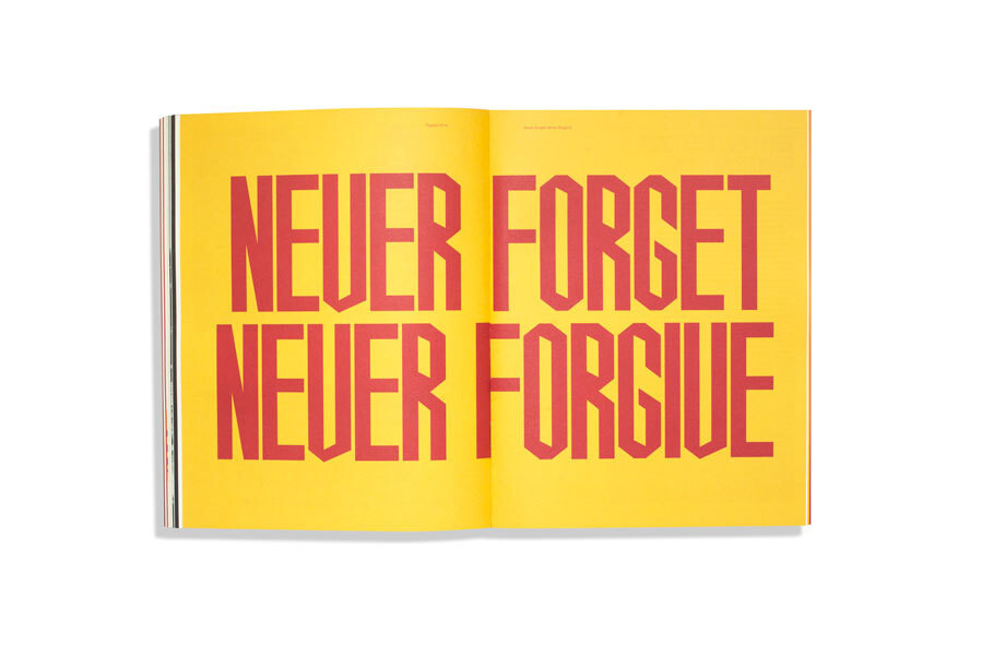
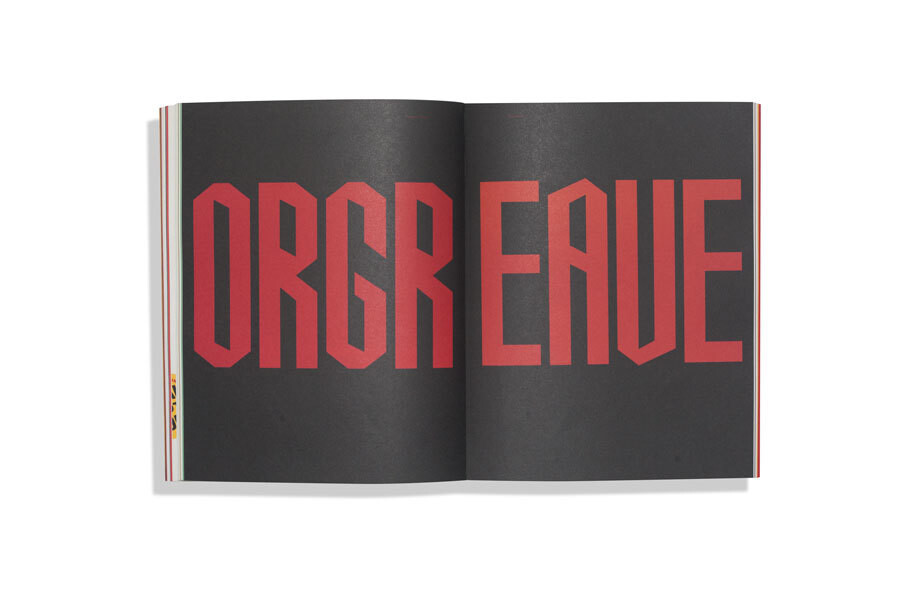
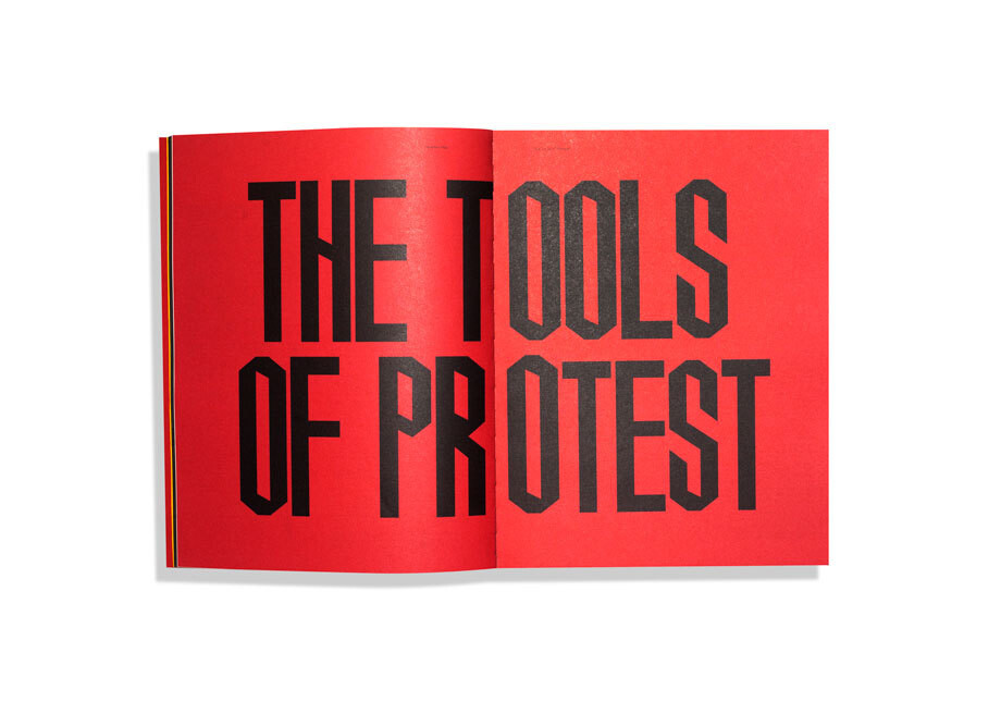
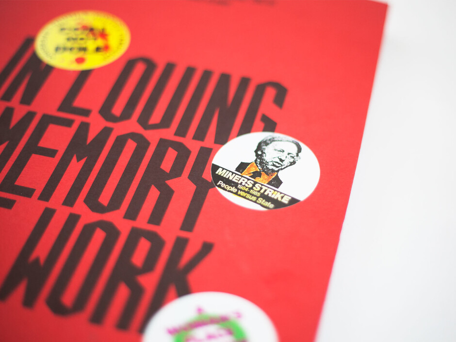
The headline typeface used throughout In Loving Memory of Work is designed based on the Liaison Committee For The Defence Of The Trade Union placards which were distributed and held aloft at various demonstrations during the 1984 - 85 miners’ strike inlovingmemoryofwork.com.
When it comes to choosing a foundry or type designer, it seems that advertisers look far and wide to find the best fit for each project. “When it comes down to type, I’m not very faithful,” says Kessels. “There’s a whole ocean full of typefaces and when I’m looking for one of them, it comes down to intuition. I take the one that I like the most at that time and that serves my idea the best.”
A passion for typography is, in the grander scheme of things, a rather niche interest. While those working in design and advertising are likely to have at least an understanding and appreciation of the importance of letterforms, their clients may not be so open to how vital type design can be to a project. So how do you persuade a client that one face is better than another? Kessels advises that the designer or advertising creative should instead persuade a client on the importance of a project as a whole. “If the complete project communicates and you’re sure it’s going to work for them, it’s a bit nonsense to remind them of the importance of the typography of this project,” he says.
Warden agrees, though adds that in all client relationships, “clarity and a firm belief in my knowledge of the subject” is key. Essentially, he’s saying do your homework: “know your subject, and there will be an emotional resonance between your type of choice and their brand.”
So what makes a great typographic word mark? “Typography is a only a part of the execution of the idea…A good word mark is the result or the outcome of a good idea. And the stronger and more simple the idea the better the word mark,” says Kessels. “It’s funny now that we can make any word mark in seconds with the computers or computer programmes and technology we have, but the design of them doesn’t become any better. It’s very important to think of an idea in your head, before starting to work on the computer. Many designers have forgotten about this.”
This is why simple, concise word marks are the ones that stand the test of time. Alan Fletcher’s typographic word mark for the V&A for instance looks as fresh today as it did when it was created back in 1989. “Typography is seen—in my opinion mistakenly—as a democratic tool, but it’s actually the closest thing we have to a trade in the creative industry these days. It takes a craft and a real skill to create them ‘properly’,” says Oldham. “Their use is democratic of course, but not their making… you have to go to the right people to create the right typeface and just like agencies, foundries have different creative approaches, definitions, and skills when it comes to creating type. You need diversity in typography just like life.”
This article first appeared in TypeNotes magazine issue 1.