Accessible web typography: Design, application and technicalities

Accessible web typography: Design, application and technicalities
Phil Garnham Fonts for accessibility
Responsive web design has come of age and new modes of reading and engaging with text have emerged. Combined with recent developments in responsive ‘variable’ font technologies that enable fonts to display in varying widths, weights and contrasts, an awareness of accessible font attributes is now more important than ever.
Choosing an accessible typeface can appear to be a daunting task. The shear plethora of information regarding accessible type design, application and code methodology is quite staggering. One thing is clear: readability of content is probably the main goal for almost every website. The points here aim to be a sounding board for consideration and assessment when selecting a typeface for your brand.
Typeface design
Legibility vs readability: Legibility is concerned with the question ‘Can you recognise this letter or word?’ ‘Can you interpret and comprehend this word?’ Readability is concerned with ‘How comfortable are you in the reading experience?’ Accessible design is both legible and readable.
Serif vs sans: Our research in conjunction with Mencap indicated that sans serif fonts were considered the most accessible style. The level of detailing within serifed letters was considered overly complex by those with reading disabilities. Sans fonts have a simplified structure; their forms feel closer to our learned handwriting and therefore were deemed more legible. In browser, mono-linear sans letters display more cleanly at smaller pixel sizes, particularly in the harshest rendering environments.
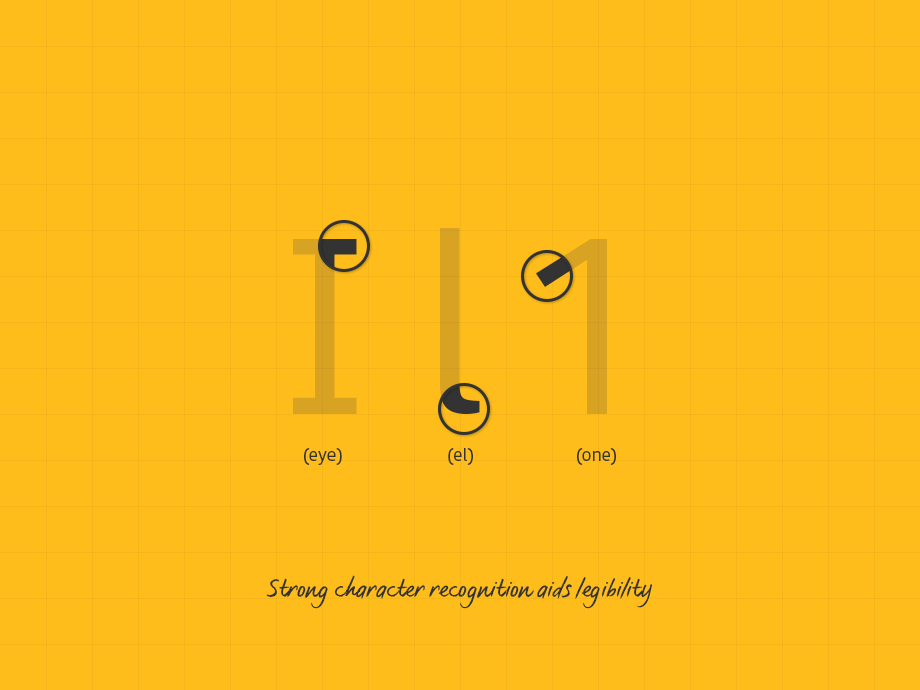
Letter shapes: Choosing a typeface with strong character recognition qualities aids legibility. Those with visual impairments can find certain letters confusing, therefore it is important that potentially confusing letter shapes are clearly defined. Common offenders are the ‘I’ (eye), ‘i’ (lower-eye), ‘l’ (el) and ‘1’. A closed shape ‘C’ can look like an ‘O’ at small pixel sizes. Open counter shapes aid reading. The combination of ‘r’ and ’n’ can read like an ‘m’. Long ascenders and descenders are important too. They help in defining outer word shapes that the eye can scan and interpret swiftly.

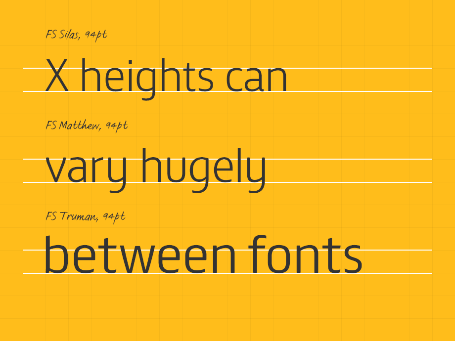
Font proportions: A large x-height and moderate to wide proportions is most accessible. The x-height of a typeface is important because it often infers a greater white space inside a letter, aiding definition and clarity. Often condensed and compressed width styles are promoted as enabling a fluid and more responsive layout. It is important to realise that by implementing a condensed font where space is limited (mobile) you could also be reducing accessibility. Extensive testing of the fonts used in context is key.
Hinting: Hints are an added layer of data within a font that describe the degree by which a pixel should be turned on or off to improve the quality of a letter at a specific pixel size. Despite improvements in screen resolution, font hinting is still an essential type design process. Most foundries automate hinting and achieve very good results, but keep expectations in check. No amount of hinting will make a heavy weight font look good at 12px size.
Type application
Weight: Establish a hierarchy by assigning roles for each font. A hierarchy enables the eye to break down information into a clear experience. Use open, mid-range weights for sub-heads and body. Set up a test to evaluate across various browsers and environments or use Browser Stack for an overview. Weight can change dramatically from one environment to the next. If desired, implement Type Rendering Mix to balance out appearance.
Size: Size is important. Be mindful that every font sits at a different scale on the type-body and that actual sizes can vary hugely between fonts. 14px in one font can be equivalent to 18px in another. The average size for body ranges from 14px — 16px. As a general rule 16px plus is considered the most inclusive. Font-size can also impact on rendering quality. Find the sweet-spots that deliver the best rendering results for your primary platforms.

Line-height: Give type room to breathe. Your eye needs to be able to track from one line to the next with ease. The Web Content Accessibly Guidelines recommend a value of 1.5 for body copy. Evaluate, reduce or increase as necessary.
Line length: Scanning long lines of text is testing for your eyes. Research indicates that the average online line length is around 70 – 80 characters. Limit lines to no more than 16 words.
Type alignment: Centered text is not accessible text. The act of centering creates different starting positions. This creates issues for the visually impaired.
ALL CAPS: Never use ‘ALL-CAPS’ in body copy setting. Use Small Caps if short-length capitalisation is required. They are great for emphasis, abbreviations and sub-headers.
Ligatures: Consider the design of ligatures — fi, fl etc… These combined letters can add harmony, but can also add confusion for those with reading disabilities.
Colour: Like all visual elements, type must have adequate contrast. Grey type on white can be difficult to read if the greyness and font weight is too light. Our FS Untitled® has finely ‘graded’ weights to help users balance it’s appearance. White type on a dark background will ‘glow’ onscreen, it will appear tighter and some fonts may require letter-space adjustments as a result.
Type technicals
Font loading strategies: Slow connections (mobile) and large font files make for slow text load times. A single WOFF file with a full European character set will size 30KB – 50KB. The states of FOUT (Flash of Unstyled Text) or FOIT (Flash of Invisible Text) need consideration. FOIT is the predominant browser default and in aesthetic terms FOIT is desirable, but in accessibility terms FOUT is certainly the way to go. Seeing some content is better than no content at all. Aim to show text in a fallback until all web fonts load. Implement with Webfont Loader and set a cookie as this minimises FOUT as the viewer moves further into the site. Alternatively, you can set the new CSS descriptor font-display which enables font loading configuration through CSS. More info on that here.
Fallback fonts: Selection is limited particularly on mobile. Jordan Moore’s mobile fallback compatibility table illustrates the problem. When selecting a fallback, shoot for similar weights and proportions. Tweak fallback metrics to match your chosen font size. Inform your decision by overlaying your chosen accessible font on top of the fall back and judge appropriateness.
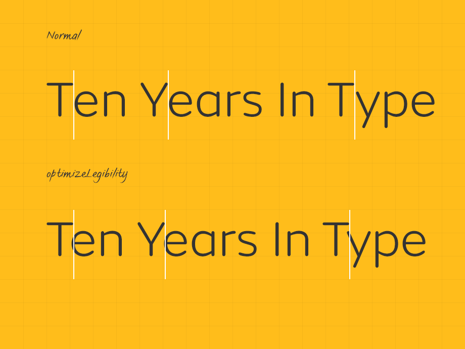
text-rendering: Use optimiseLegibility to enable kerning and improve rendering quality. This setting also enables ligatures, so review the design of the ligatures and their shape complexity. If necessary disable them by setting: .classname { font-feature-settings: “liga” 0; }

Protecting fonts: It takes years of effort and investment to develop a high-quality typeface. It’s only fair that given the important role that type has in all web projects that you take steps to protect the investment in them. Use CORS to deploy fonts, ensuring that only permitted sites have access to the files.
At Fontsmith, we aim to make type as accessible as it can be. Our accessible font FS Me® is available with a Pro set covering over 150 languages. We have worked with signage and environmental groups to create a 21st century wayfinding typeface FS Millbank®, aiming to aid navigation in busy environments.
An earlier version of this article first appeared in Net Magazine.
Variable web font files are on the horizon and the flexibility of a now standard font family is soon to be blown wide open. Both designer and developer will be able to tailor the weight and width of the typefaces that are used on a site and in specific environments. Let’s create a more readable web with the basic principles of accessible typography online.