The making of a luxurious type specimen
The making of a luxurious type specimen
Tamasin Handley New typefaces
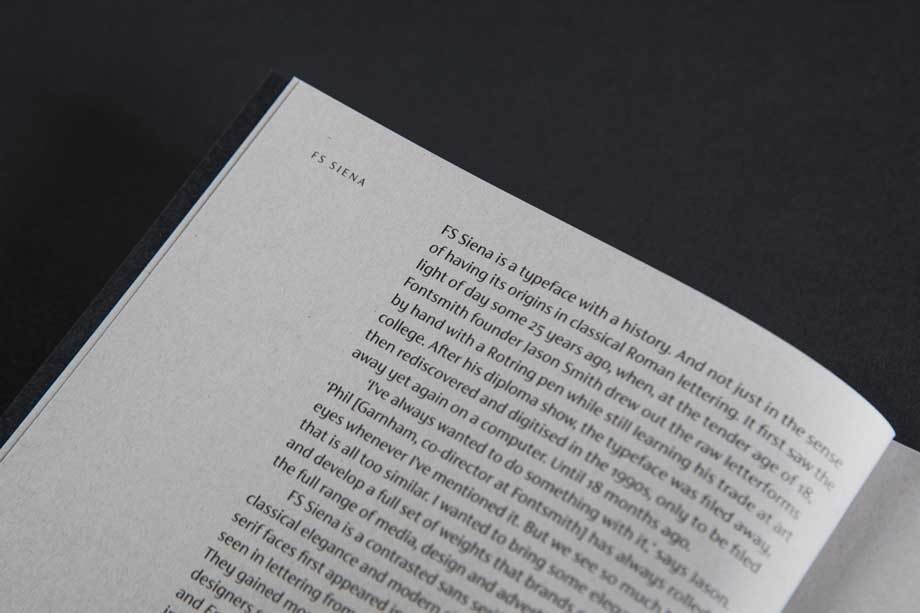
FS Siena® is a contrasted sans serif typeface aimed at luxury brands from fashion to beauty, automotive, property and editorial. It already has a long heritage of its own – the design was first conceived 25 years ago by Jason Smith when he was at art school. It was filed away but not forgotten about until about 18 months ago when Jason asked designer Krista Radoeva to finish it off.
The typeface is elegant and luxurious so the specimen needed to be something quite unique.
Jason Smith, Founder and Creative Director at Fontsmith said:
‘We wanted to show examples of our vision for the font in use but the problem with doing that is that the images start to look like adverts in their own right, rather than a type specimen and we didn’t want to lose the message that this was a typeface.
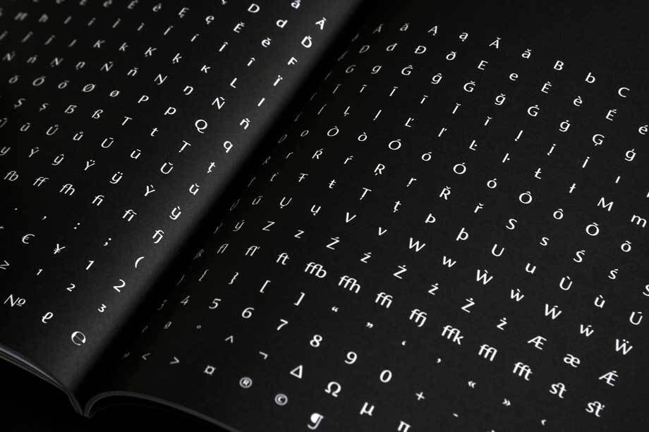
We’ve worked with The Counter Press in the past (most recently on the specimen for FS Brabo®) and they understood and were totally on the same wavelength for our brief. We wanted to share the craftsmanship that has gone into creating this typeface by including sketches and zooming in on some of the unique features. The specimen needed to be very high-end like the brands we envisage using it. We wanted to convey quality and luxury, letting the font take centre stage. The materials, colours and finish would be very important.’
David Marshall of The Counter Press had this to say:
‘FS Siena has such a strong and beautiful aesthetic, having been designed especially for high-end and luxury brands, we knew the print and launch campaign had a lot to live up to.
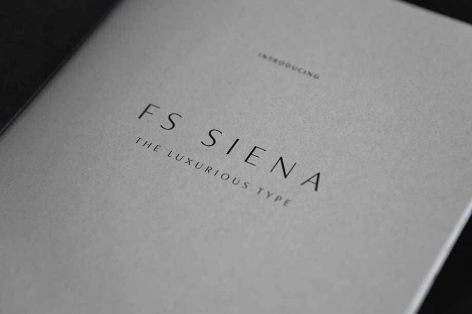
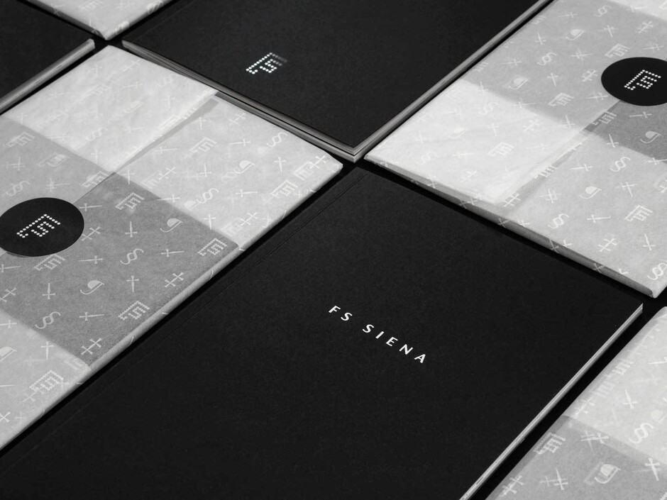
The idea was to treat the typeface specimen as a luxury item in its own right, drawing on high-end visual cues such as the patterned tissue paper, a minimal black & white colour palette, and both matt and gloss finishes, to demonstrate the finesse and elegance of the characters.
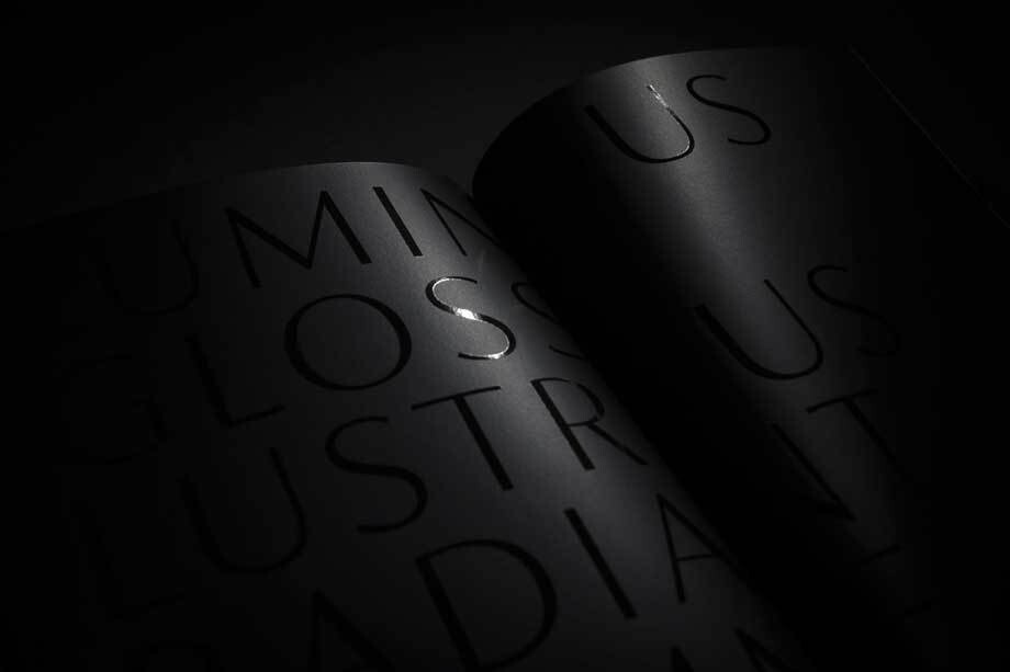
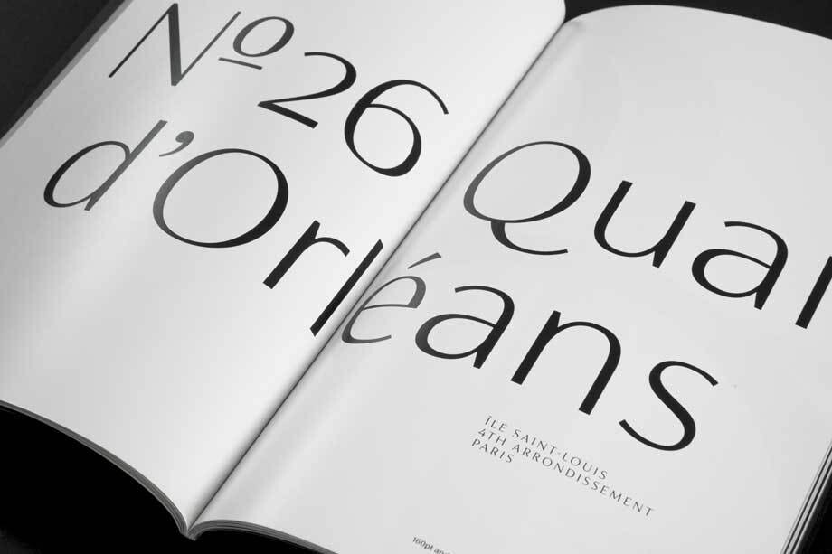
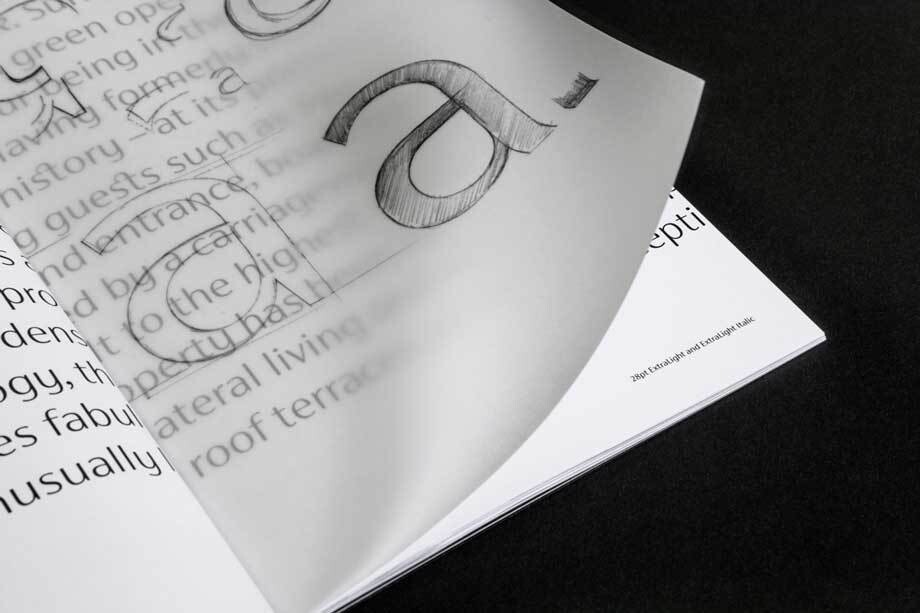
Showing a typeface in use is always a little tricky: we didn’t want to make up fake brands or make it feel too contrived. Instead we created examples but left deliberate spaces where the brands would be and only hinted at suggested product, creating a clear context but leaving just the typeface displayed.
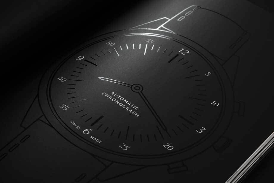
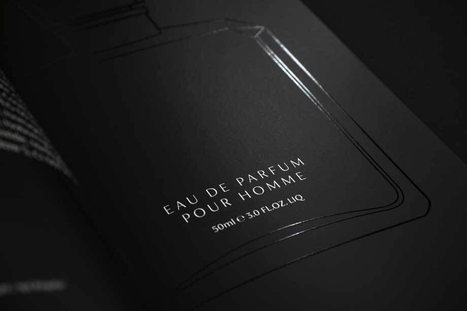
The result is a limited edition brochure that features a variety of paper stocks and a range of textures and finishes, all wrapped by hand in bespoke tissue paper, giving the luxurious feel the typeface commands but hopefully allowing FS Siena to shine.’
