What really matters with webfonts?

What really matters with webfonts?
Jason Smith Knowledge share
We’ve moved on a lot from the times of web safe fonts and there is now a huge array of typefaces to choose from. The difference between what we see online and what we see in print is still vast but is the gap closing as technology advances? According to the HTTP archive 60% of websites now use custom fonts/embedded webfonts but there are still many misconceptions when it comes to what works online. Things move quickly and the rules are changing all the time, couple this with confusing and often conflicting advice in various publications and blogs, and it can be hard to know what current best practice is.
The impact of this is that brands opt for what they perceive to be a safe choice and miss out on a massive opportunity to stand out from their competitors, when the typeface is often the only visible brand asset. Some of the most commonly used fonts like Arial and Helvetica are not the most legible and the licensing costs for ubiquitous typefaces on websites can be staggeringly high. Too much emphasis is put on designing fonts for very small screens upward. Brand and UX design should expose brand architecture through all touch points and if designed properly brand fonts should translate down as well as up. Interface, UX design and typography is not about getting the font as small and as clear as possible. It’s about making the information as clear as possible. Size is important online as it is in print, so be sensible with both .px and .pt sizes.
It is widely accepted that clean sans serifs are the safe choice for multiple screen sizes but the truth is well crafted serif fonts can work too and also aid readability for longer pieces of text. To add a little more confusion, all foundries offer webfonts but some specialise in web specific versions of their typefaces while others design specifically for the web.
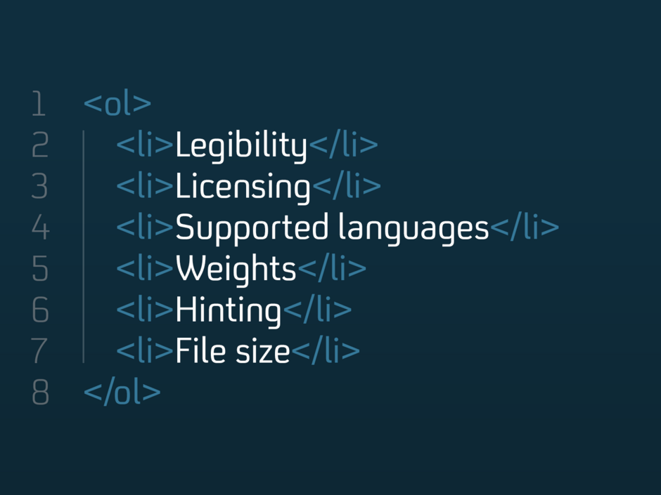
So what are the most important considerations? Here are my top tips:
1. Legibility is and always will be important. The main things to look out for are a large x-height, low ambiguity between characters and open counters and terminals. This is important for offline printed materials too but online there are more variables to consider like screen sizes and the effects of backlit displays. It’s worth considering who your audience is, the devices they’re using and how to make your content as accessible as possible. For more detail take a look at this post on choosing accessible typefaces.
2. Licensing: Most webfont licences are based on the number of monthly pageviews and costs can be very high for popular websites. It’s therefore important to understand your current and future traffic and how this might effect pricing for the options you’re looking at. Subscription models can appear cost effective but are usually more suitable for small companies, for large brands the fees tend to be huge and sometimes only kick in after a year when the brand has already committed. It’s important to read the small print and check out any additional charges like using the font on apps or more than one subdomain.
3. Check which languages are supported. Even if you only operate in one country are there any plans to expand into others and could this cause issues if for example Russian is not supported but is a potential area for growth. Typeface matching (where an existing similar alternative is found) is often sufficient for language scripts with a very different structure to Latin like Chinese or Arabic and can be more cost effective.
4. Weights are very important. On the web there needs to be a big difference between Regular and Bold. Colour and anti aliasing effects the blowing of pixels and fill in. Positive and negative backgrounds should also be tested as they can make the weights appear quite different. Typefaces like FS Untitled® or FS Millbank®, which have a large number of weight variations can help solve these issues and ensure a better result overall.
5. There are two main hosting options to consider: Self hosting or hosting through a third party like Adobe TypeKit. With the latter option you don’t receive the font files yourself, instead you get a small snippet of code to put on your website. The main benefit of this option is that it can be considerably cheaper for small sites and you get access to many different typefaces from different foundries. The benefit of self hosting is that you licence the font files yourself which means you don’t have to rely on a third party service to keep your fonts working.
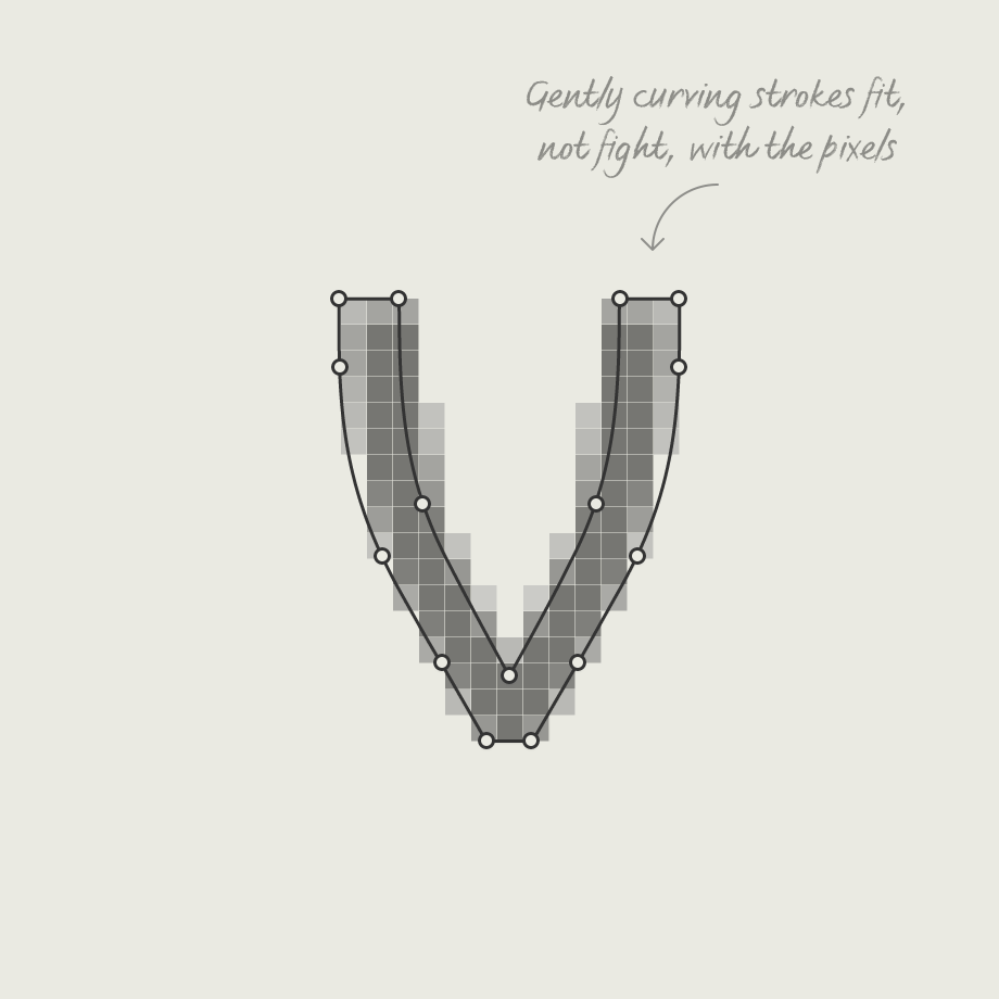
6. Hinting: Despite improvements in screen resolution font hinting is still an essential process. Once the typeface has been designed it is adjusted for maximum readability on computer screens taking into account how the shapes render when converted into groups of pixels. This used to be very time consuming but now full manual hinting is much more straight forward and shouldn’t cost the earth. Most foundries automate the hinting process and have some clever tricks in place to achieve a very decent result. Some typefaces are designed to be pixel friendly from the offset, reducing the reliance on hinting even further.

7. File size of the font. Unlike images file sizes for typefaces are usually relatively small but load times are important so it is still worth keeping them to a minimum. Make sure you purchase a genuine webfont licence as the files will have been optimised properly by the typeface designer for maximum efficiency. Converting desktop files into WOFF or EOT via third party software can increase the file size (as well as being a massive breach of licence terms).
Overall as screens and technology improve in leaps and bounds, font choices will widen and digital brands will start to stand out from each other more and more.