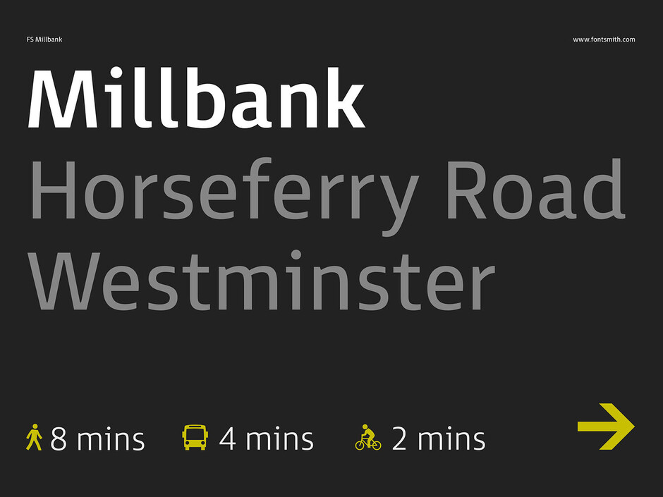
FS Millbank® – How should wayfinding typography look?

FS Millbank® – How should wayfinding typography look?
Stuart de Rozario Knowledge share
Type and typography are part and parcel of the modern world we live in today. Now, more than ever we are surrounded by signs, icons and visual information that tell us to go here, there and somewhere – Can you imagine a world without graphical direction or visual guidance?
Jason and Phil approached me with the idea of creating a signage typeface – something that would rival and challenge the tried and tested, almost ubiquitous Frutiger and Helvetica signage forms that we see around us so often today. After looking at the hand full of fonts that service signage typography, I extensively researched the wide ranging criteria of what makes a successful signage typeface, and a core part of that research was meeting with leading industry wayfinding designers about the demands that they faced when selecting typefaces appropriate for their projects. Top of the priority list was legibility and functionality, my research findings also told me that in this fast paced tech-world we demand much more of fonts and how letterforms and words react to differing environment conditions – such as poor lighting, varying viewing perspectives and trying to decipher information in crowded spaces whilst on the move. Considerations also had to be taken into account, about how the type also looks on-screen in various sizes for devices, apps, route finders and electronic displays as well as in print. An arduous but exciting journey lay ahead of me. Through analysis of widely used signage faces on various line length tests, how they differ in proportion in relation to cap to x-height, the inter-character spacing, glyph characteristics, letter combinations, stem weights or thicknesses and proportions, apertures and the effectiveness of serifs on key letters such as ‘I’, ‘i’ and ‘l’, all of this information gave me a spark of inspiration to design something new.
Using my preferred method of sketching with pencil and paper, this allowed me to think visually, I could get my thoughts and ideas down quickly – the initial rough sketches formed a great starting point. I then proceeded to draw the basic letters more accurately A, H, K, O, a, e, g, n and the figures 1, 2 and 3. I knew which direction I wanted the typeface to go. Something bold and punchy, solid and robust, but human and full of personality, effortless and versatile whilst hoping to create a typeface that will stand the test of time and still look fresh in years to come.
With the aim of designing and developing a highly legible, functional but distinctive typeface, the driving force of my thought process was to make sure that the font was as clear as possible – I wanted to eliminate any possible ambiguous characters. The best way to do this was to test the font in a variety of sizes to replicate small size use, like on an information totem pole from 6pt to large digital departure displays at 900pt. When illuminated displays are in a backlit situation, letters and words appear to glow, distort and cause halation (the spread of light beyond its proper boundaries causing a halo effect that surrounds the letters making the font appear heavier), I created on-screen blur tests to replicate this effect. My research also defined a desire in wayfinding designers for both positive and negative weight sets. I created a negative range of weights to achieve the correct visual balance between using FS Millbank on a bright or dark colour. Positive and negative tests using the font in varying point sizes on-screen and in print were all used as part of the overall testing process.
Viewing the blurred and distorted letters allowed me focus on the basic skeletal structure of the glyphs and emphasise certain parts where the forms became illegible or difficult to decipher, for an example; Does a single tiered ‘a’ look like a ‘o’? also the lowercase ‘l’ can look like a figure 1. The letter spacing can also become fragmented and merge together if not considered appropriately.
Although no signage font can be complete without a set of icons that complement the typeface family. Designing an Icon set creates its own design challenges – Would the icons be able to hold up at small sizes? Are they instantly recognisable? These are paramount issues when developing the icon set. All icons like letters in a typeface, need to relate to each other visually, so I started out by devising a complex circular grid using the fonts Cap proportions and sketched key icons such as the figures, Arrows, Car and a Aeroplane to assess the general character and personality that I felt was appropriate. The FS Millbank Icon set comprising of 172 icons covering a wide range of applications from Arrows, Transport, General Information and User Interface designed to help people on their way.
FS Millbank provides the perfect solution whenever optimum clarity is absolutely essential. The overall result is a font with its own distinctive beauty. It flows exquisitely, is defiantly human and brims with personality. Yet fundamentally, it’s utterly legible and expertly crafted for clarity.
—
Many thanks to City ID, Commercial Art, Holmes Wood, Populous, Maynard and Wolfströme for your much valued wayfinding expertise and support during the project. Very much appreciated!